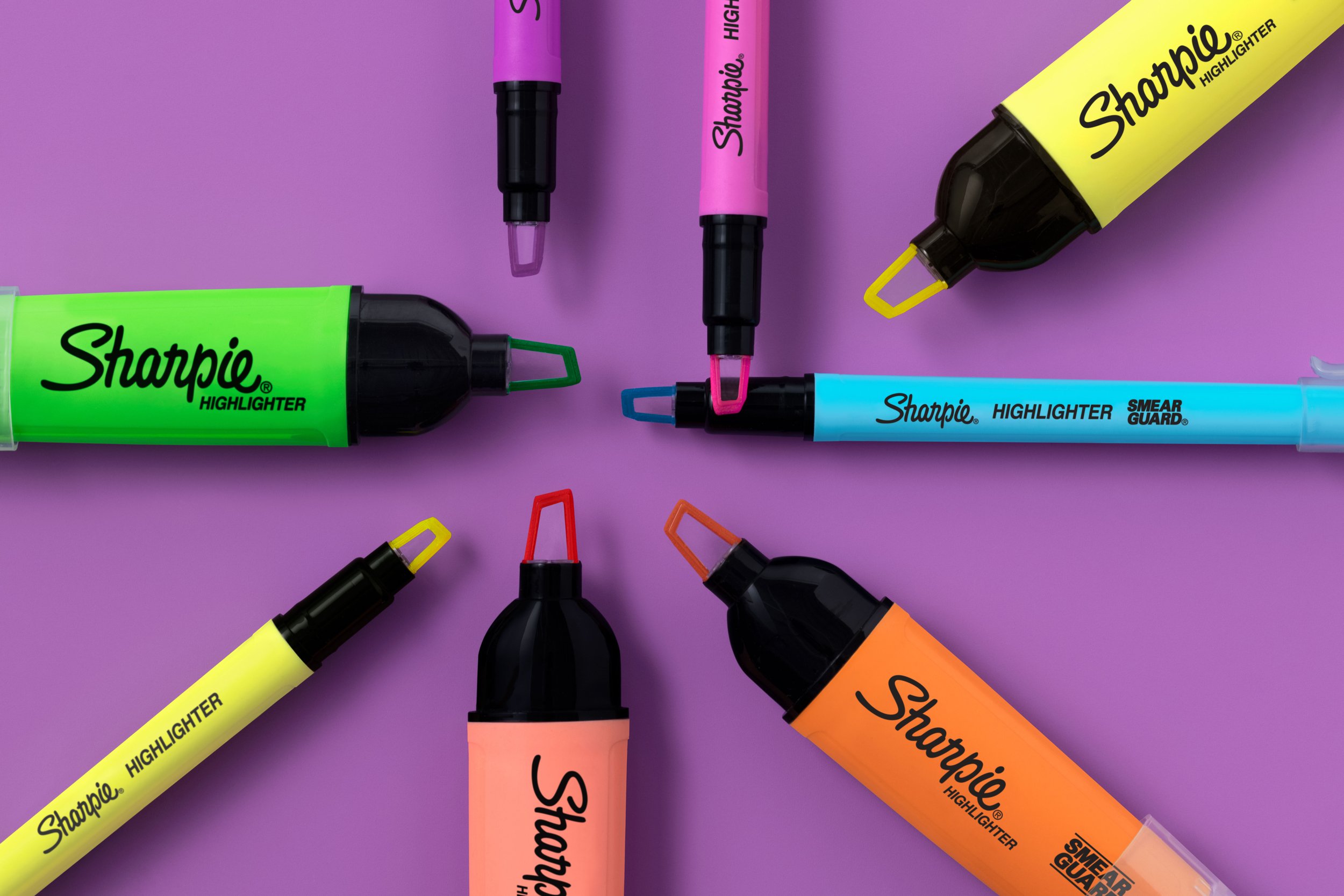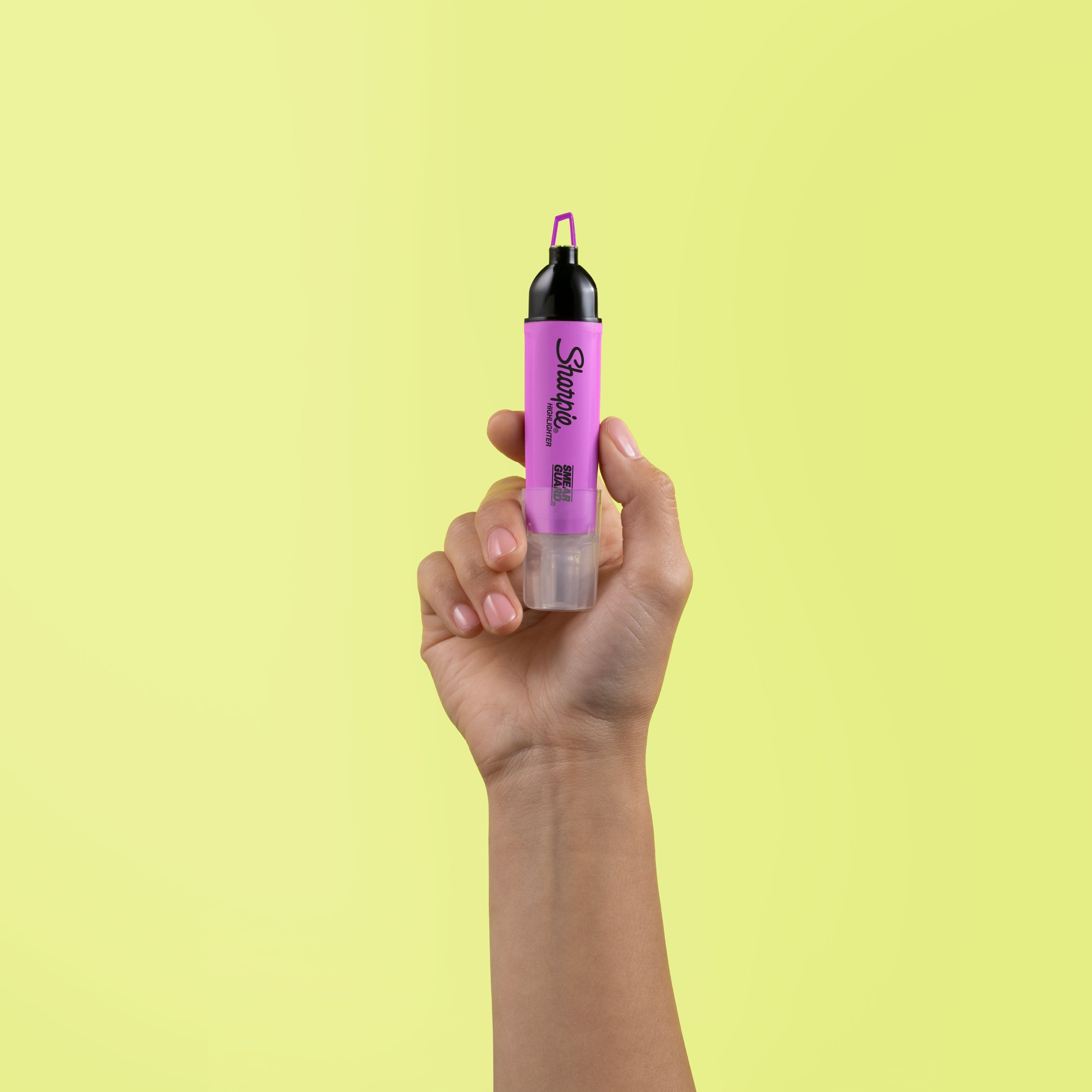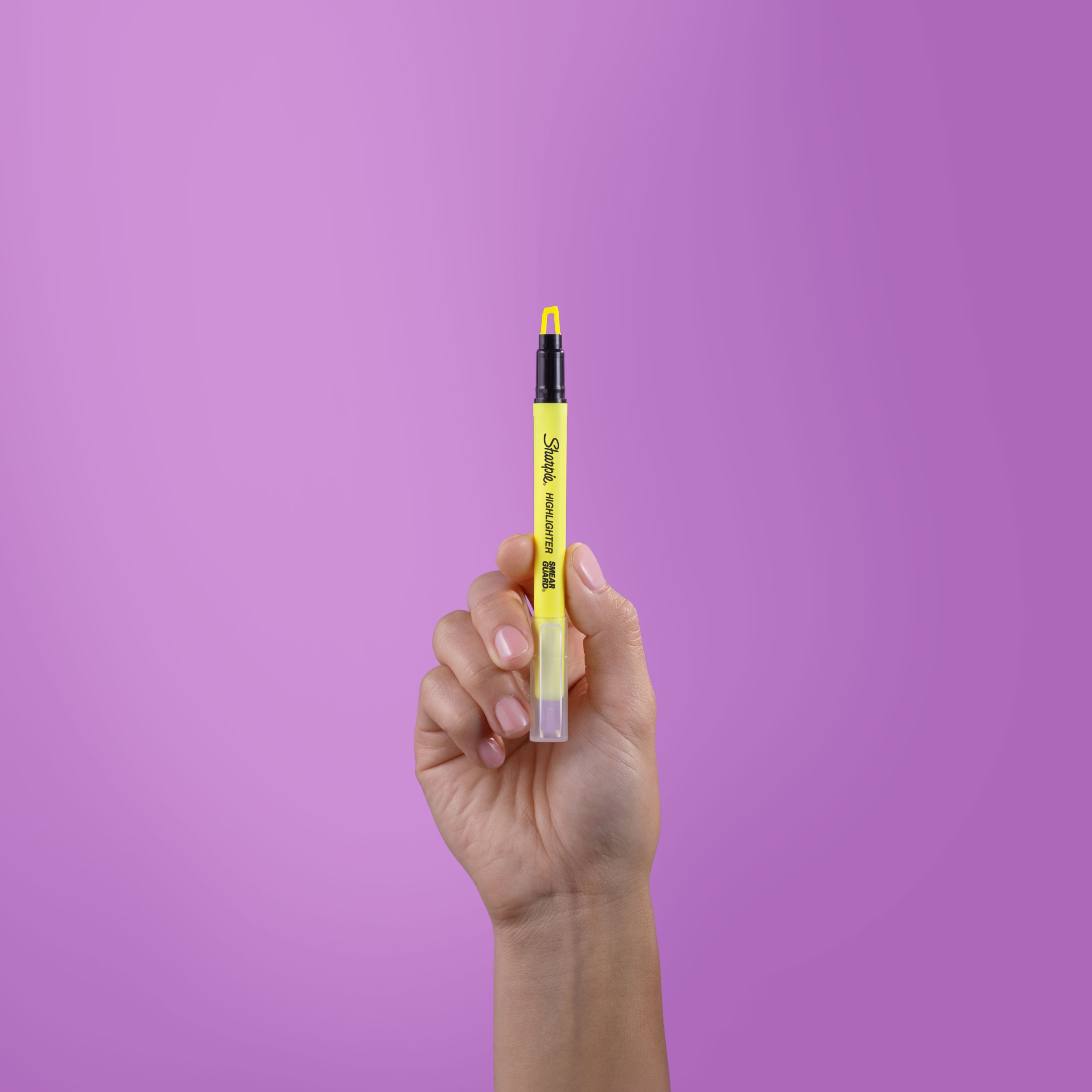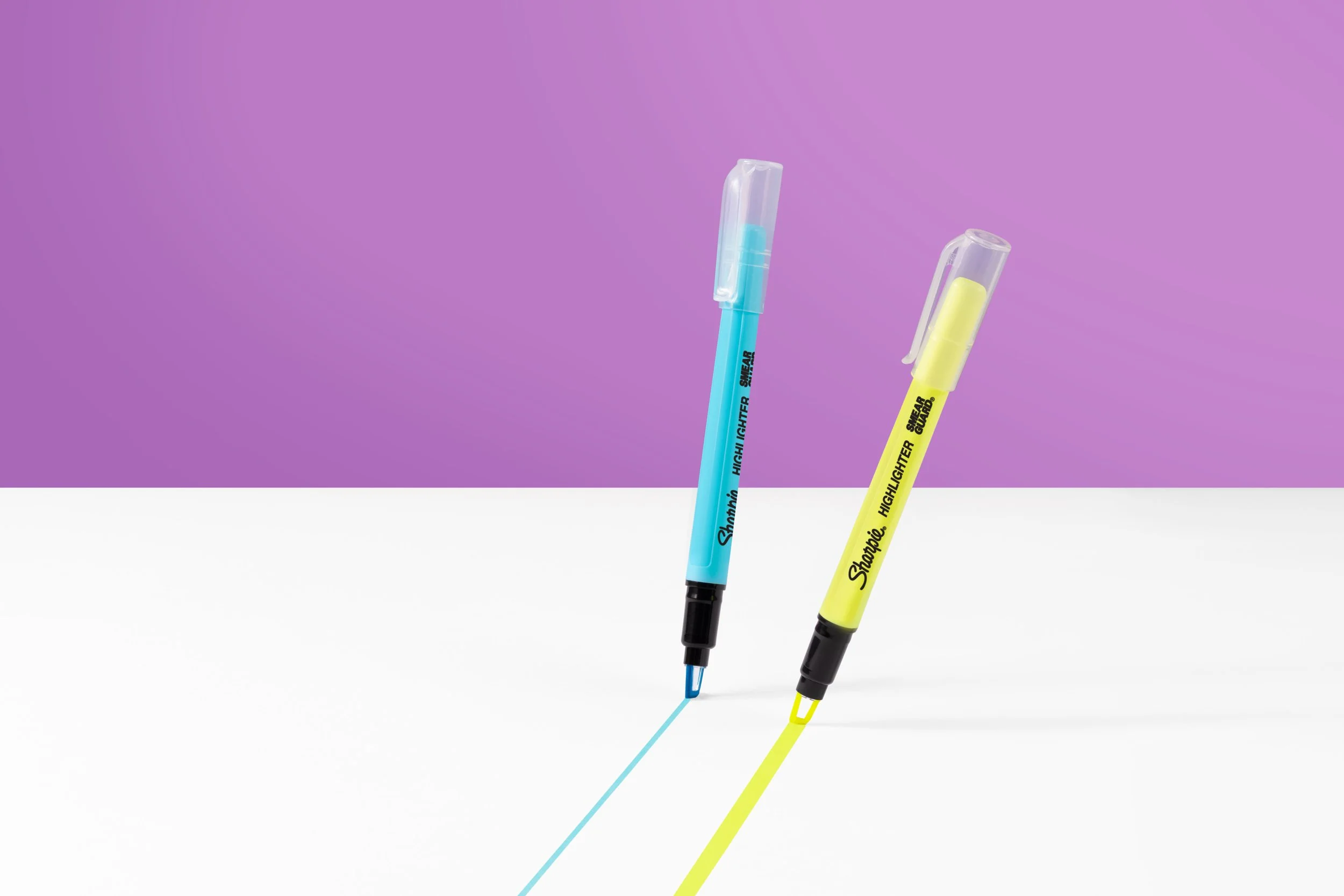
Sharpie Clear View Highlighters
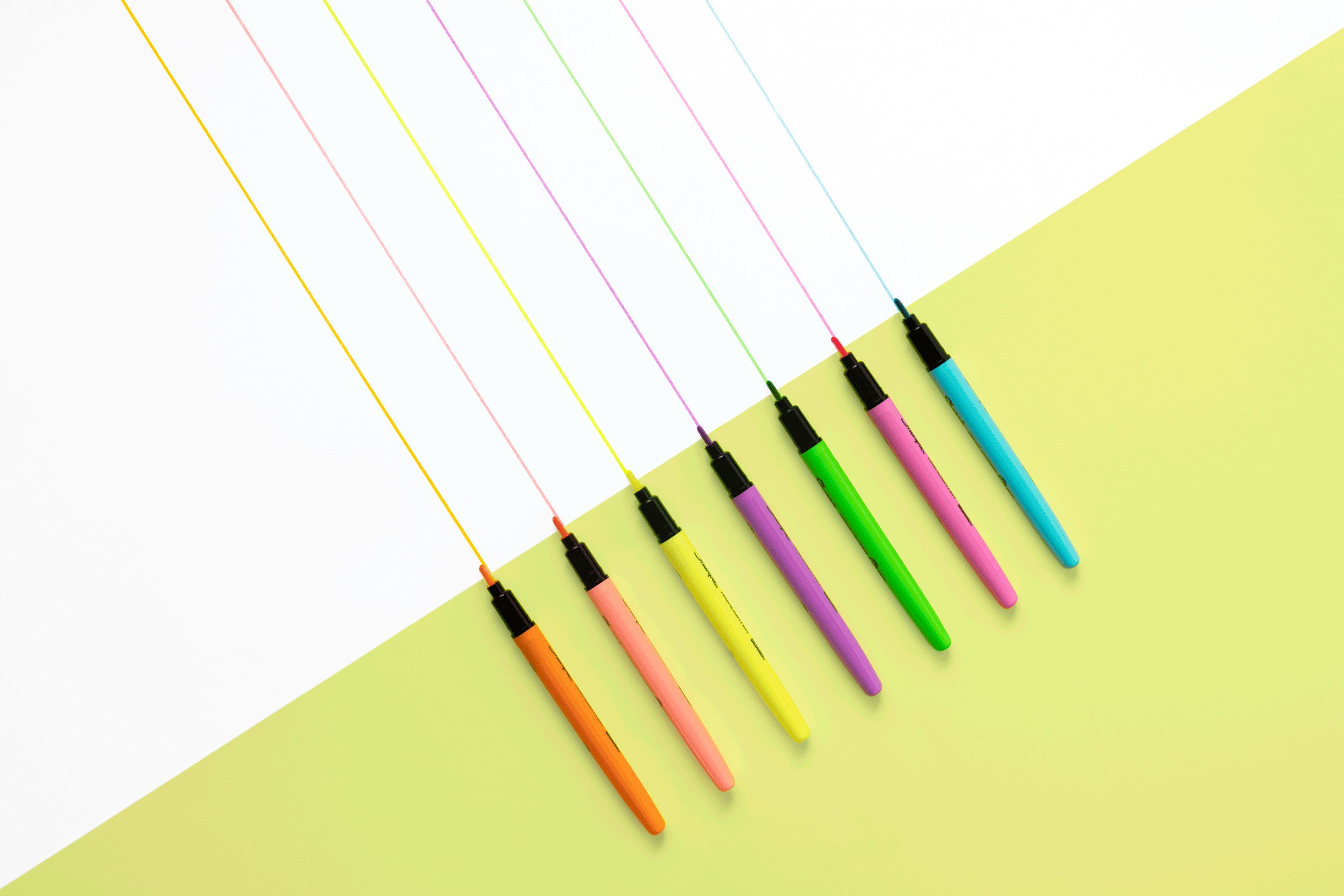
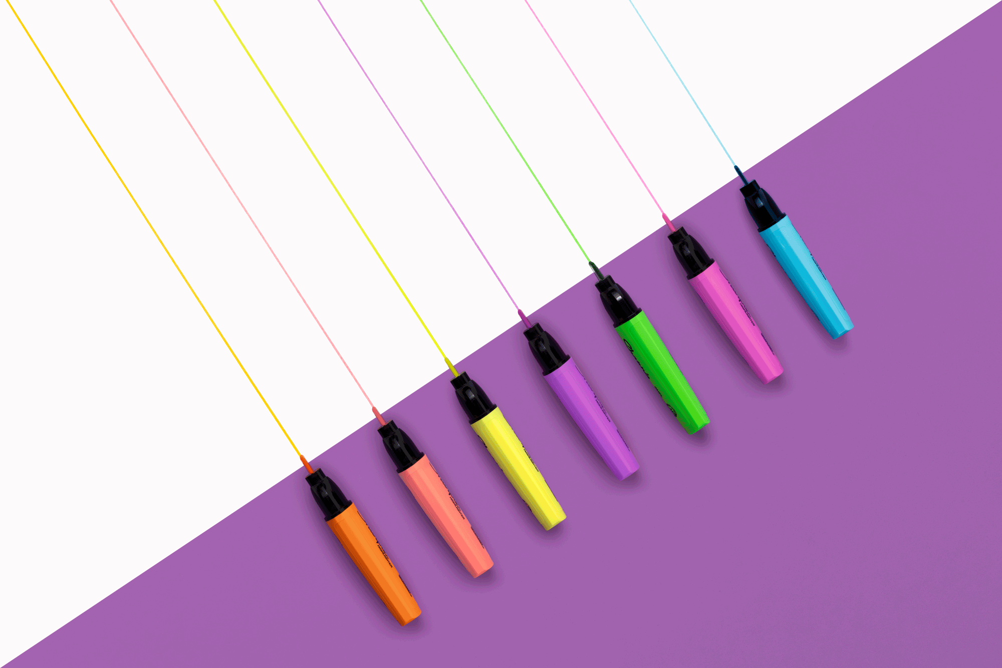
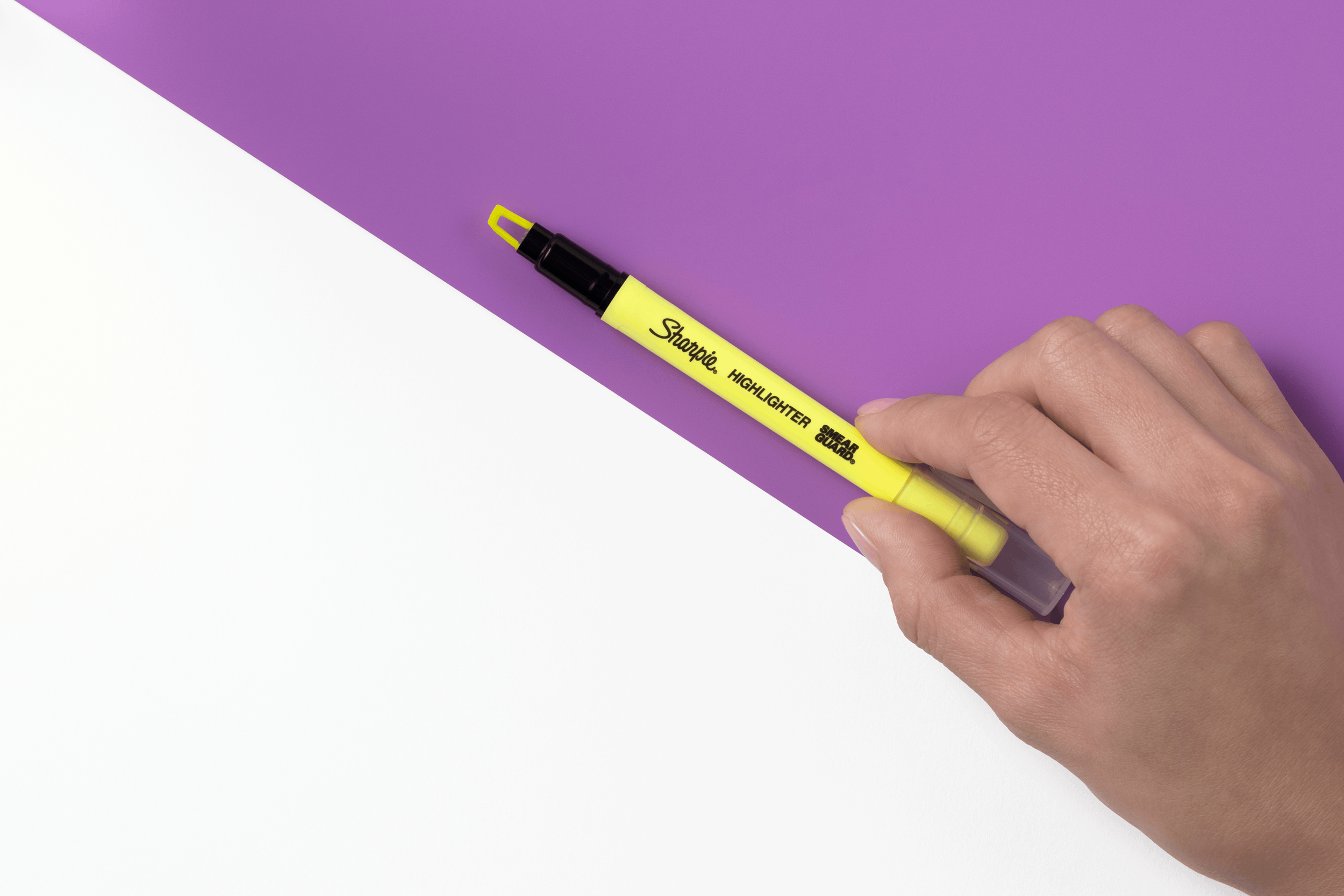
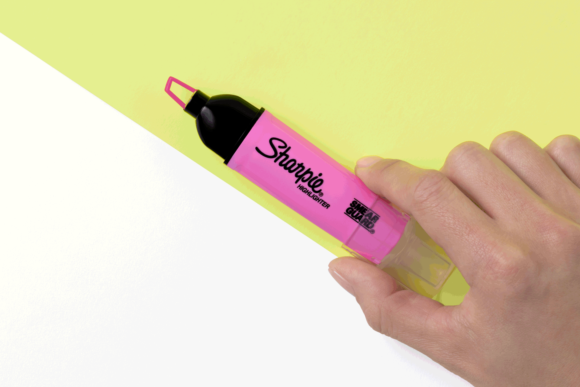
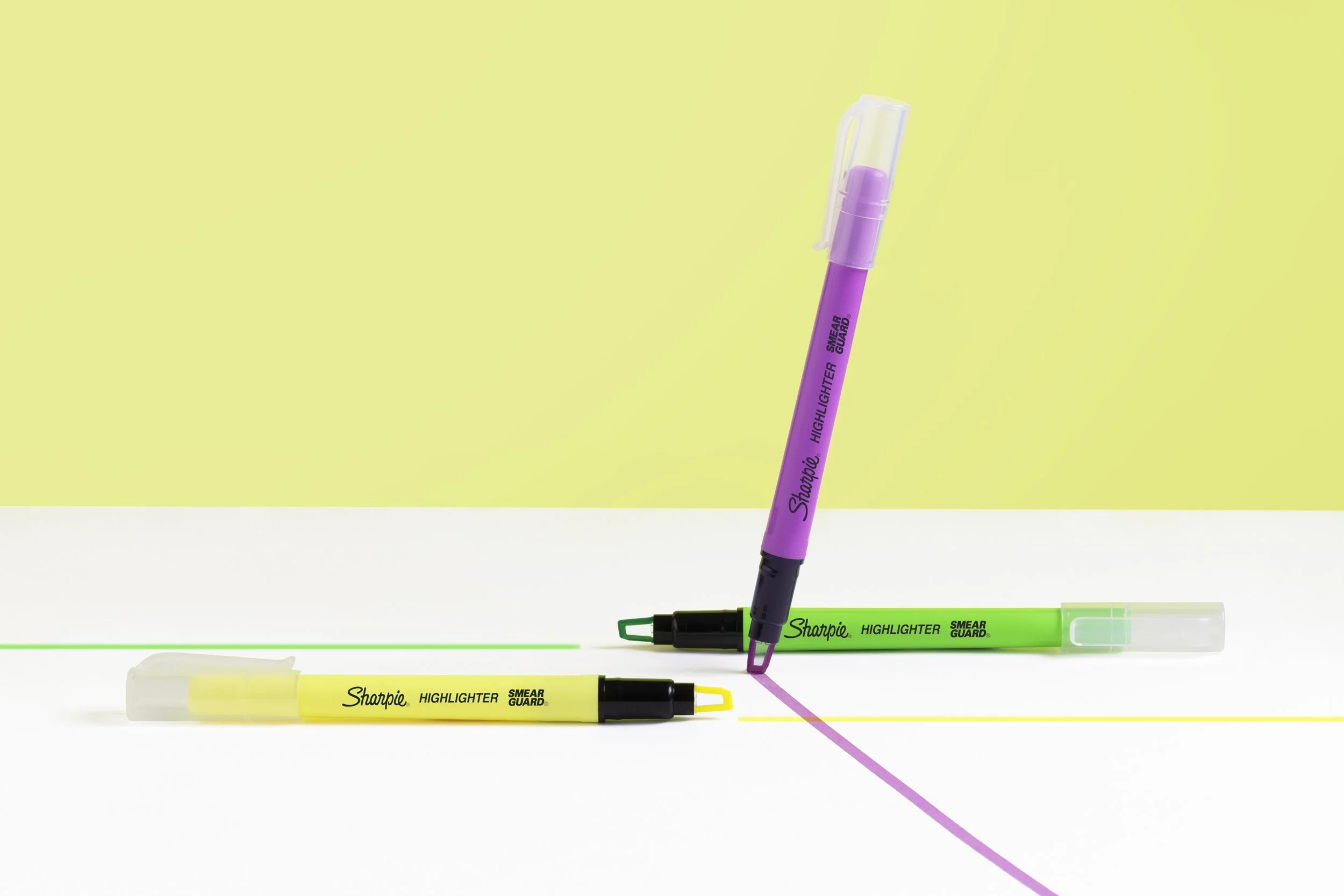
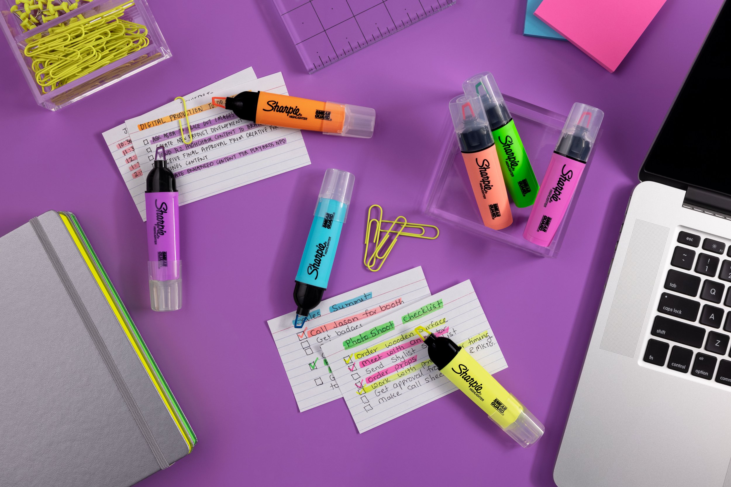
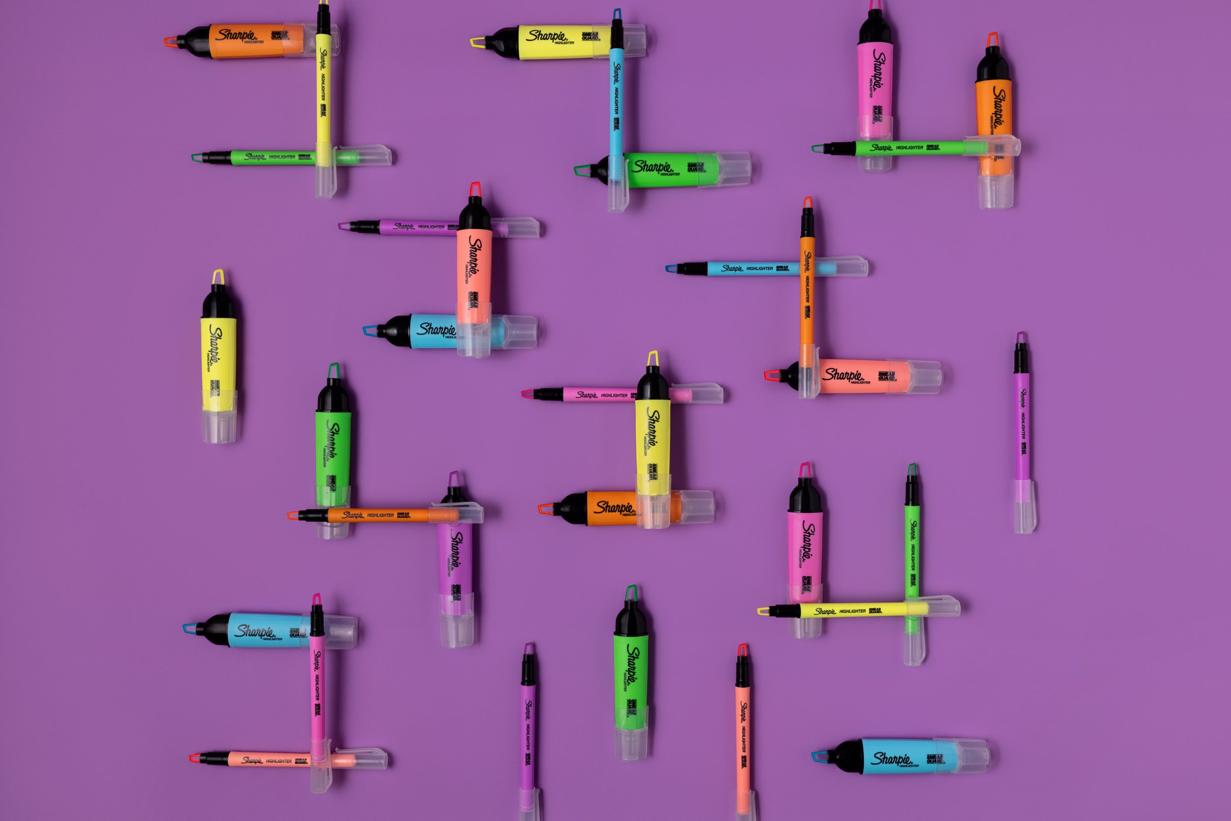
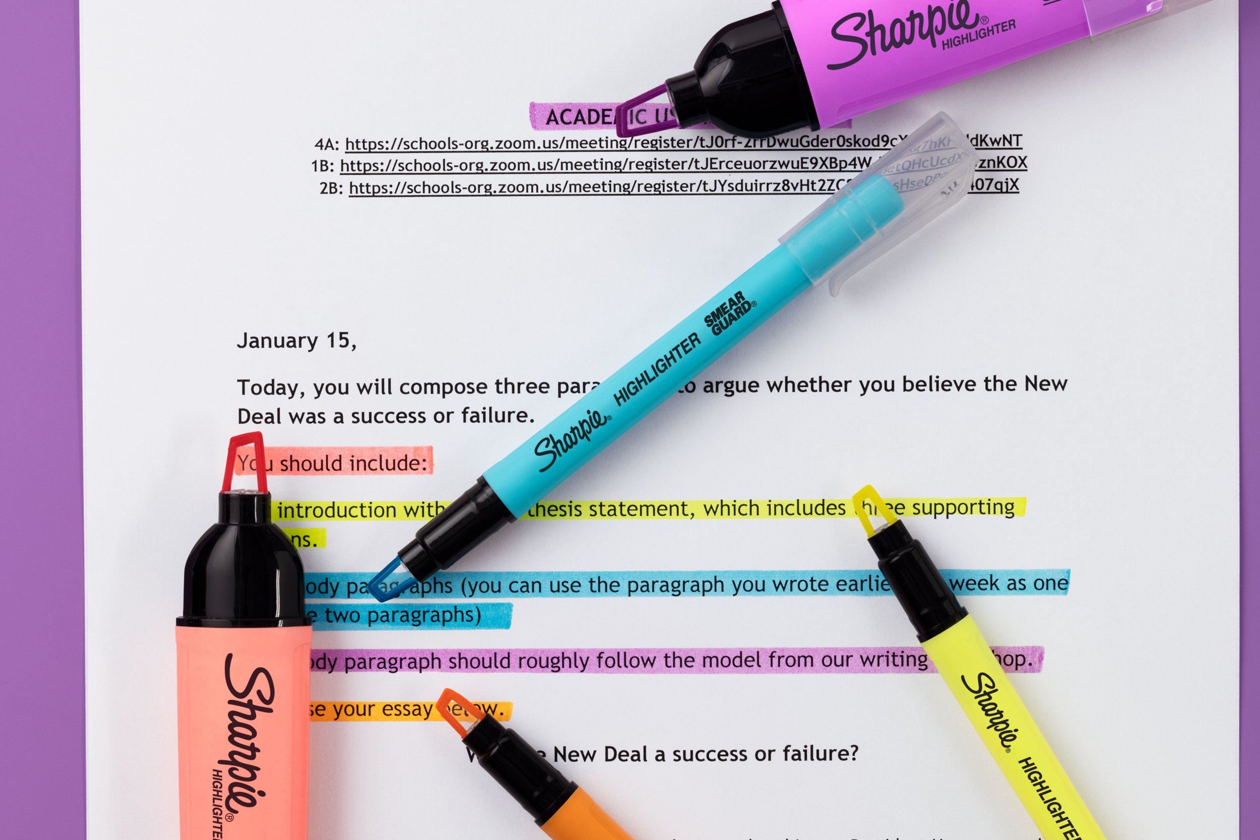
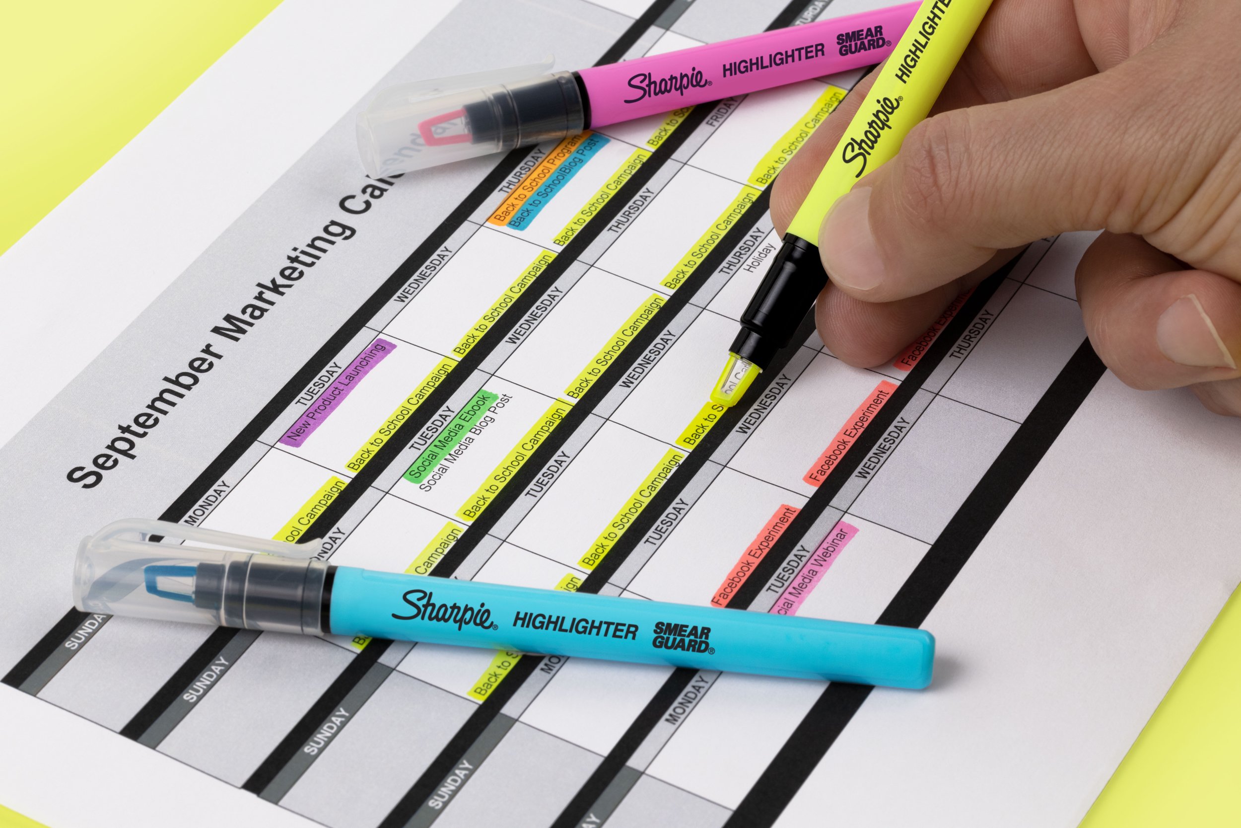
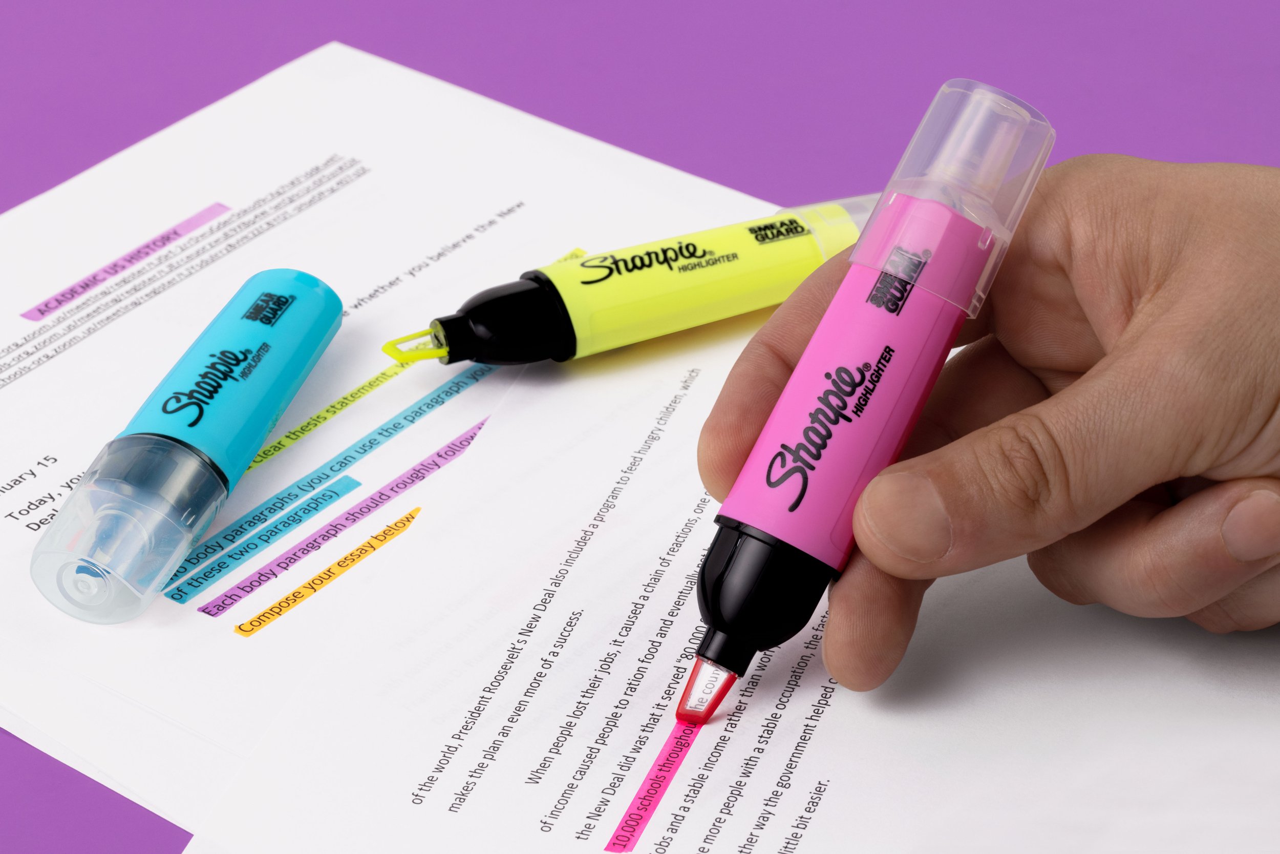
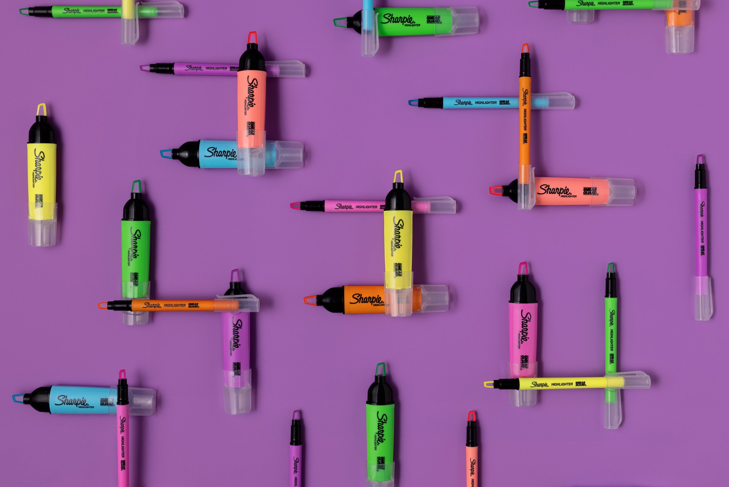
For this product launch, I developed multiple creative concepts, ultimately refining a direction with the product team that showcased the highlighter’s two defining features: its clear tip for precision and its dual-line width functionality. The goal was to create a visually striking yet minimal aesthetic—hyper pop colors, clean composition, and a youthful energy that felt fresh without being overly trend-driven.
As Art and Photo Director, I led all aspects of the shoot, from concept development and shot list creation to hands-on collaboration with photographers, stylists, and set designers. I provided sketches for each setup and worked closely with the team to ensure that every shot clearly communicated the product’s key benefits. Despite the challenges of a COVID-era production—including a smaller crew, remote approvals, and logistical hurdles—we adapted by refining colors through lighting techniques and post-production adjustments to align with brand expectations.
The final assets were met with enthusiasm and went on to define a distinct visual style for Sharpie and Paper Mate’s product photography. Used across A+ enhanced content, social media, and digital placements, these images set a new creative standard for the brand’s future campaigns.