Prismacolor Technique
Cinematographers:
Jason Montalvo
Nick Kral
Eric Carlson
Photographer:
Mike Troast
Video Editors:
Melissa Marcus
Daniel Munoz
Eric Carlson
Creative Director:
Tim Petrochko
Copy Lead:
Fotios Tsaganis
Senior Producer:
Kassandra Cook
Art Director:
Jorge Concha
Content Artist:
Flux (John Malloy)
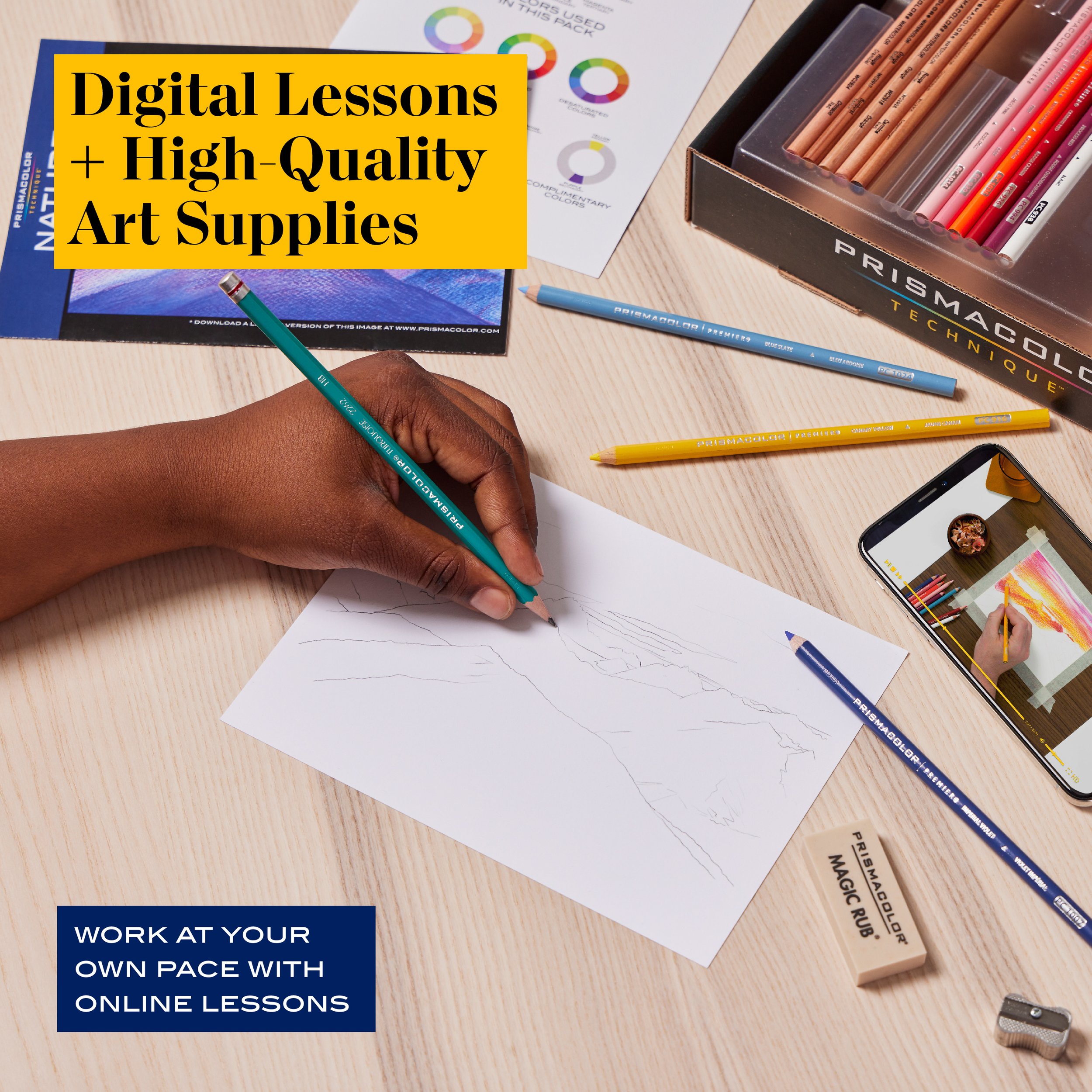
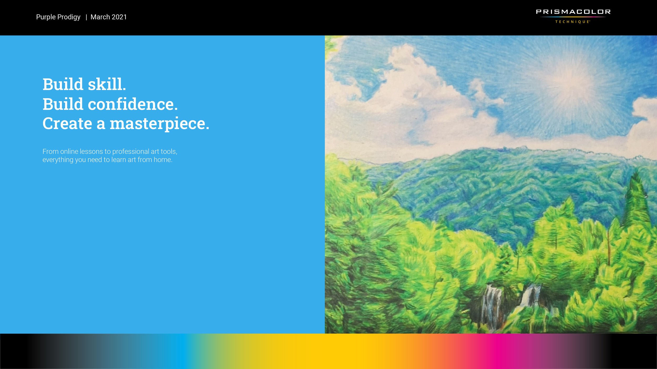
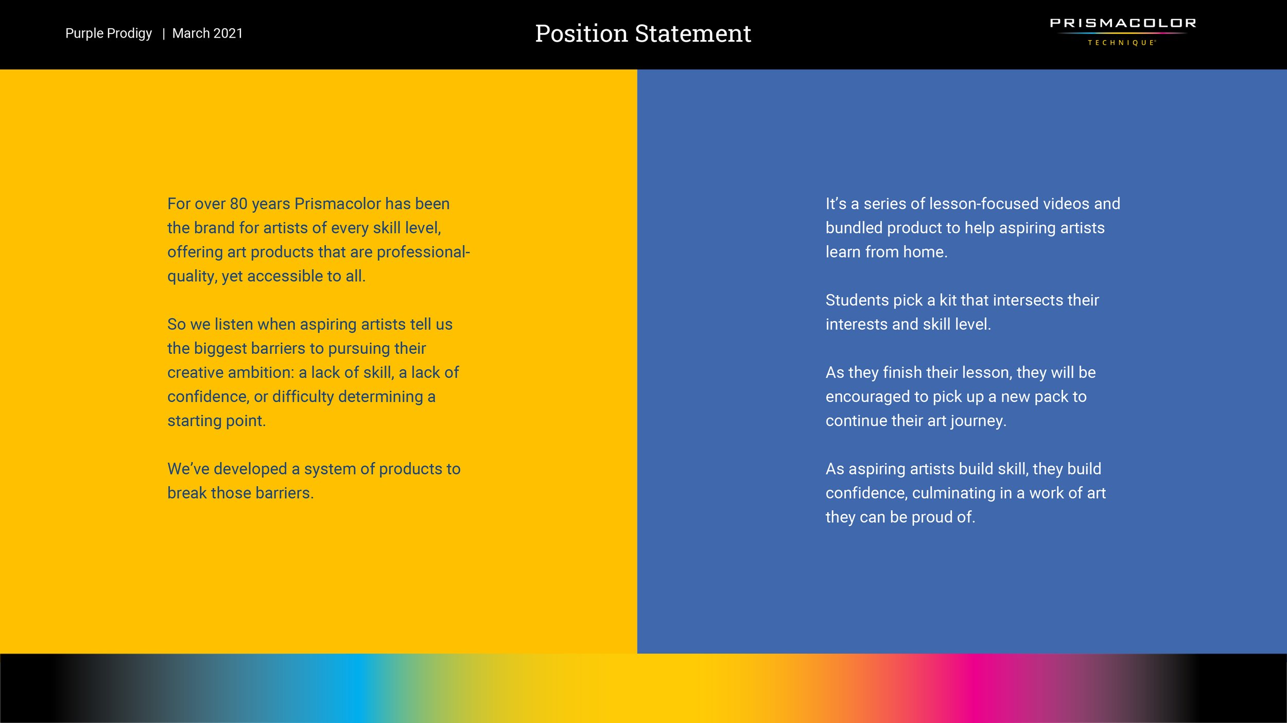
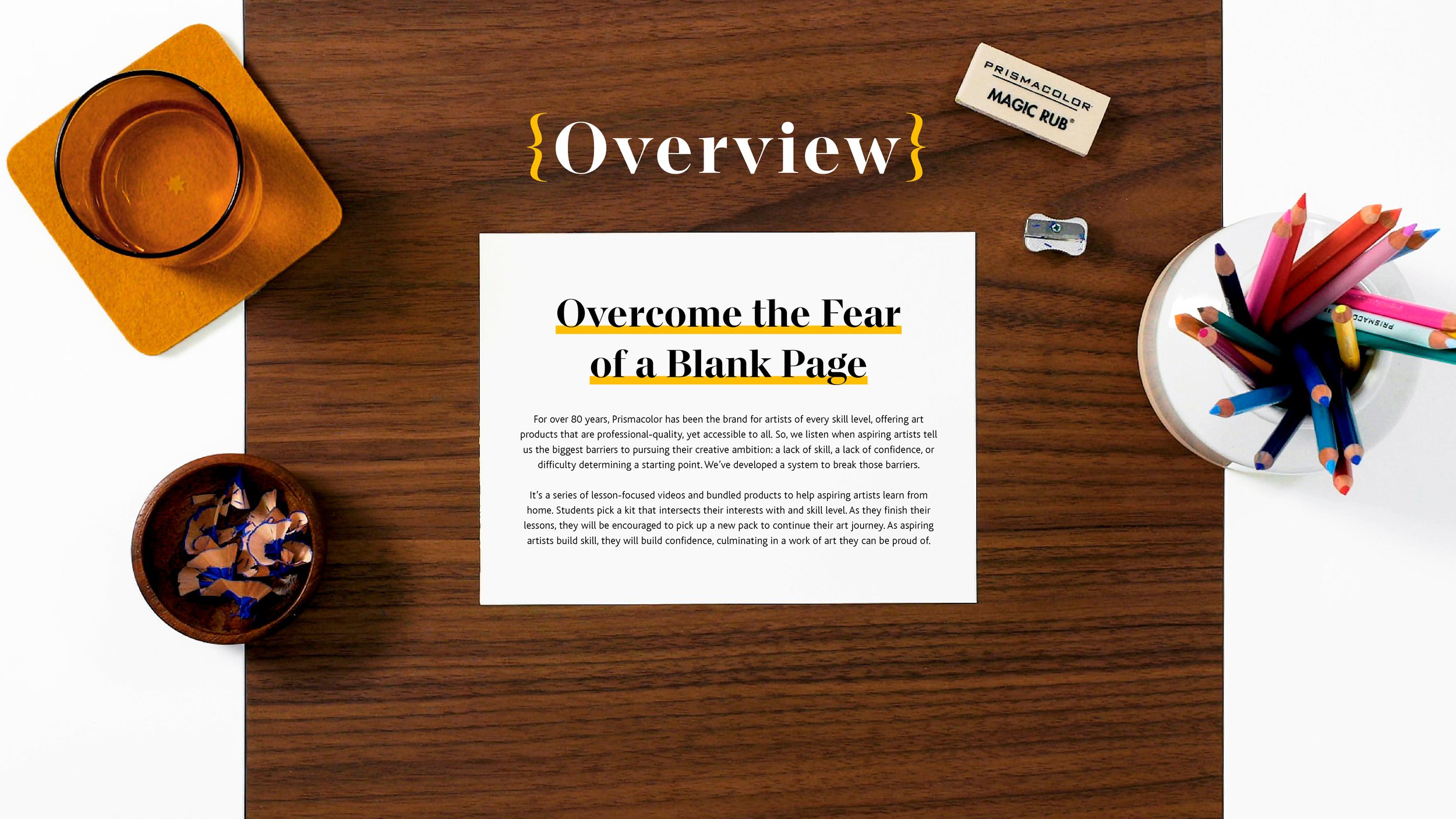
Prismacolor Technique is a learning system built around creativity, instruction, and making.
The goal was simple: help people get better at making things. We built a structured art education platform that paired physical products with clear, approachable instruction, allowing users to build skills over time rather than simply consume content. Lessons were designed to meet creators where they were, encouraging repeat engagement and confidence through practice.
I led the concept and creative direction for the full system, defining how instruction, content, and product worked together across channels. Every decision focused on making creativity feel more accessible, while ensuring the platform could scale, remain consistent, and support long-term engagement.
Instructional Video Content
Prismacolor Technique:
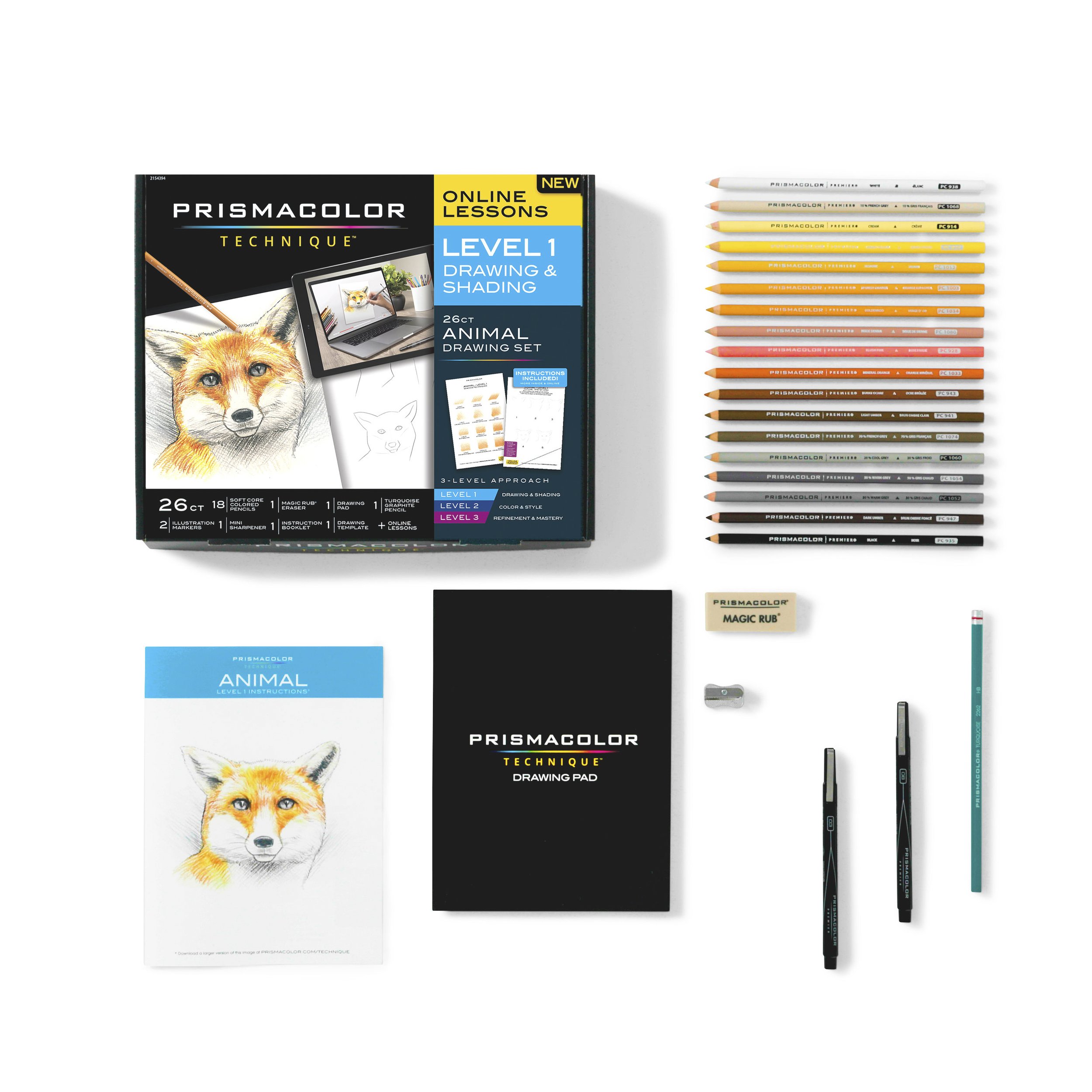
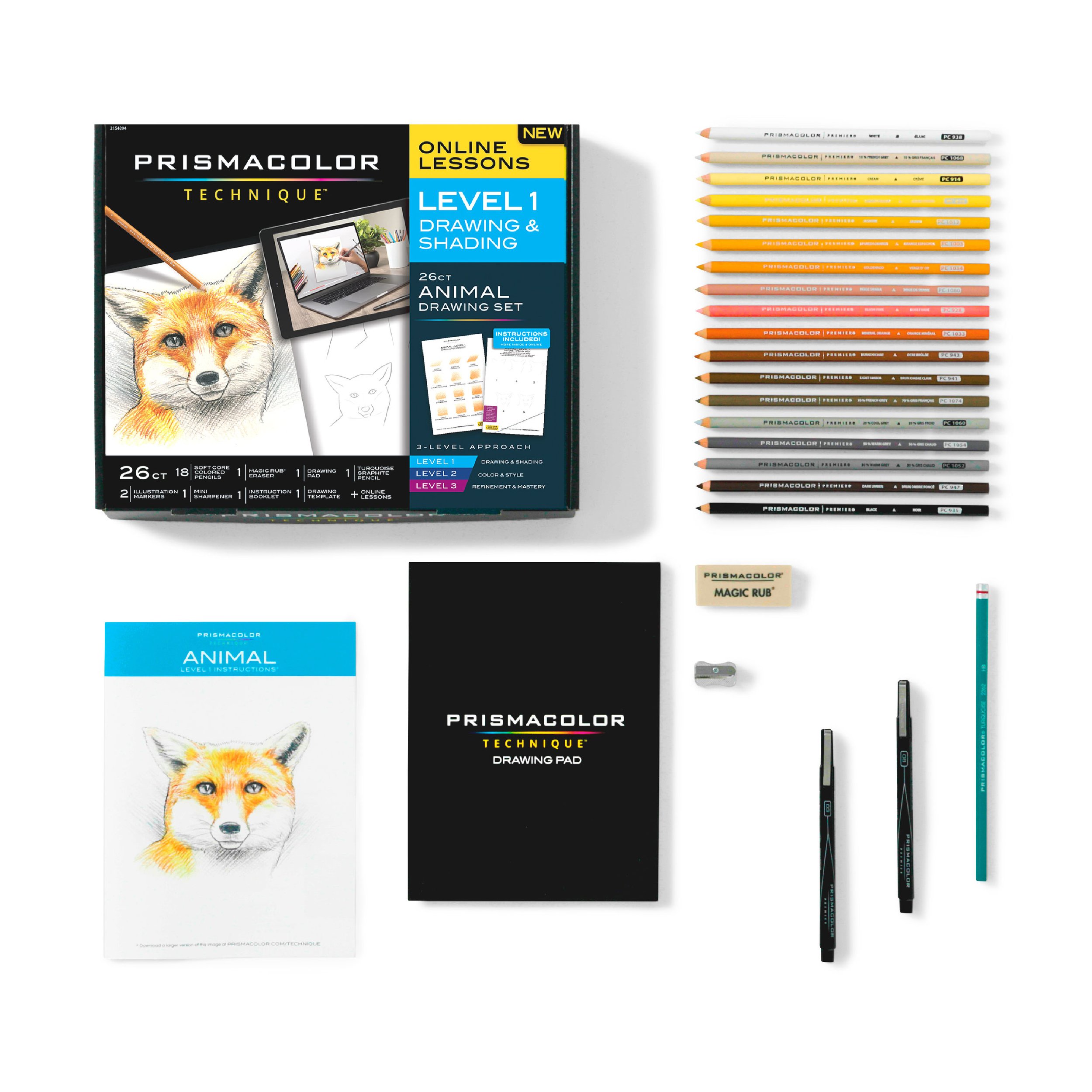
Nature Level 1, Lesson 1
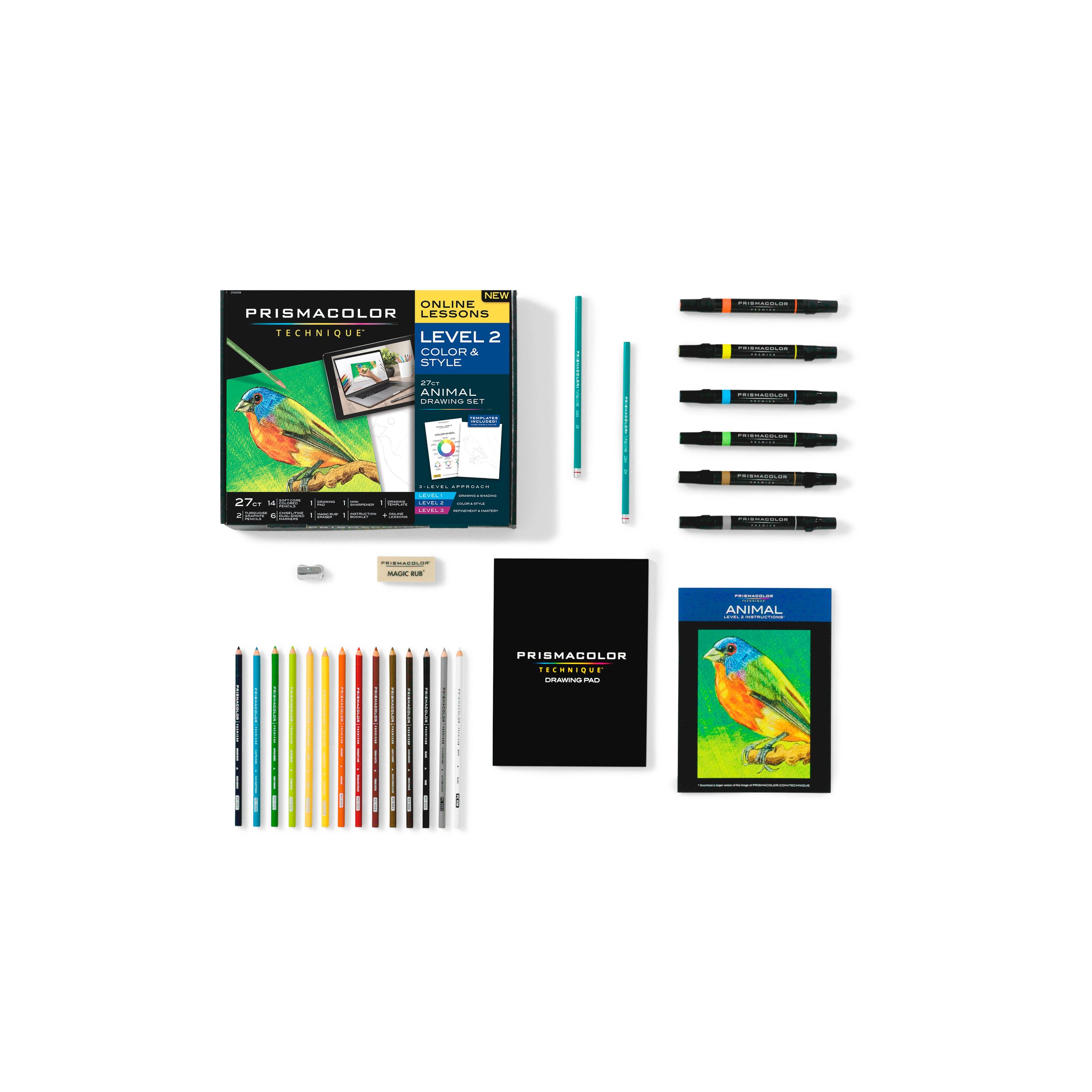
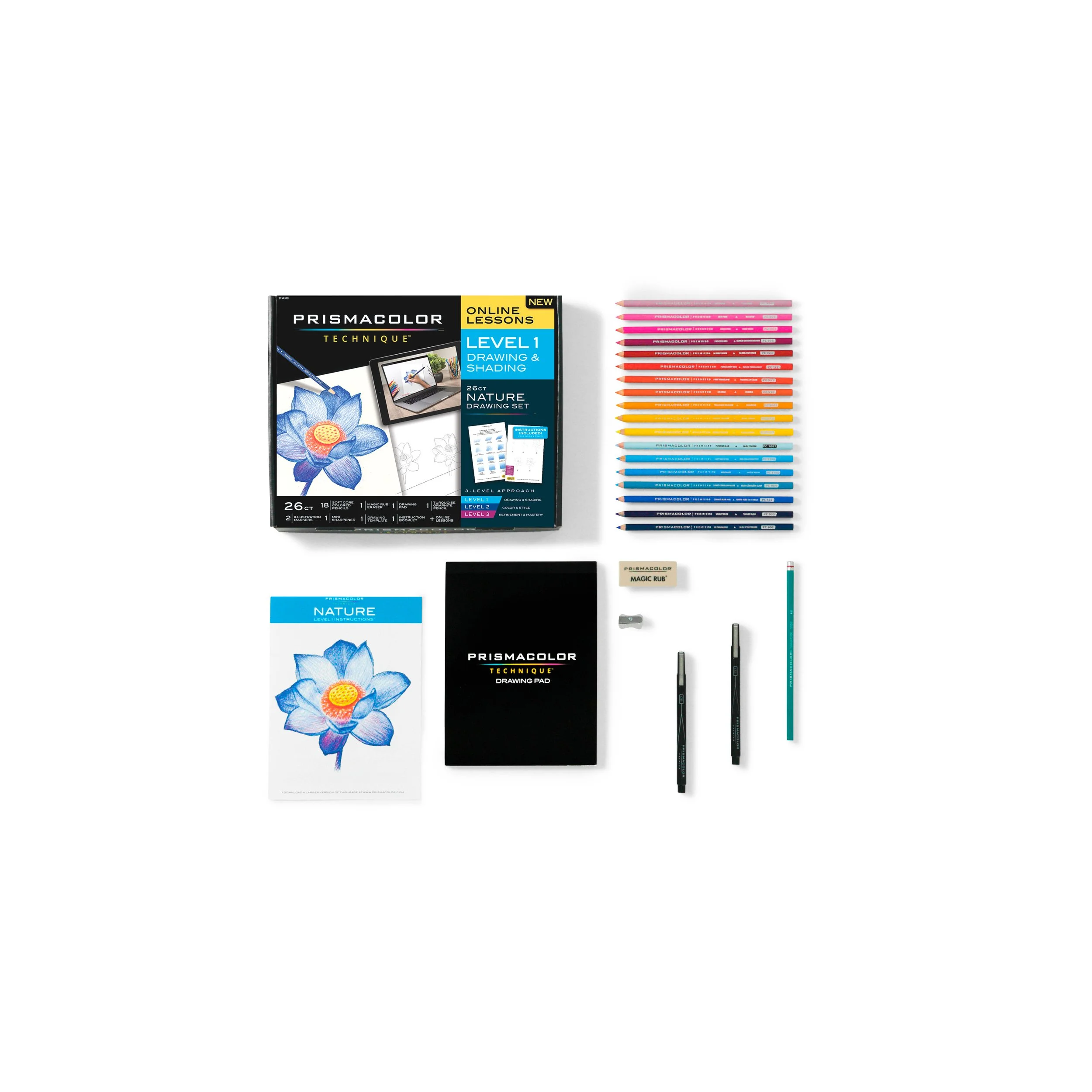
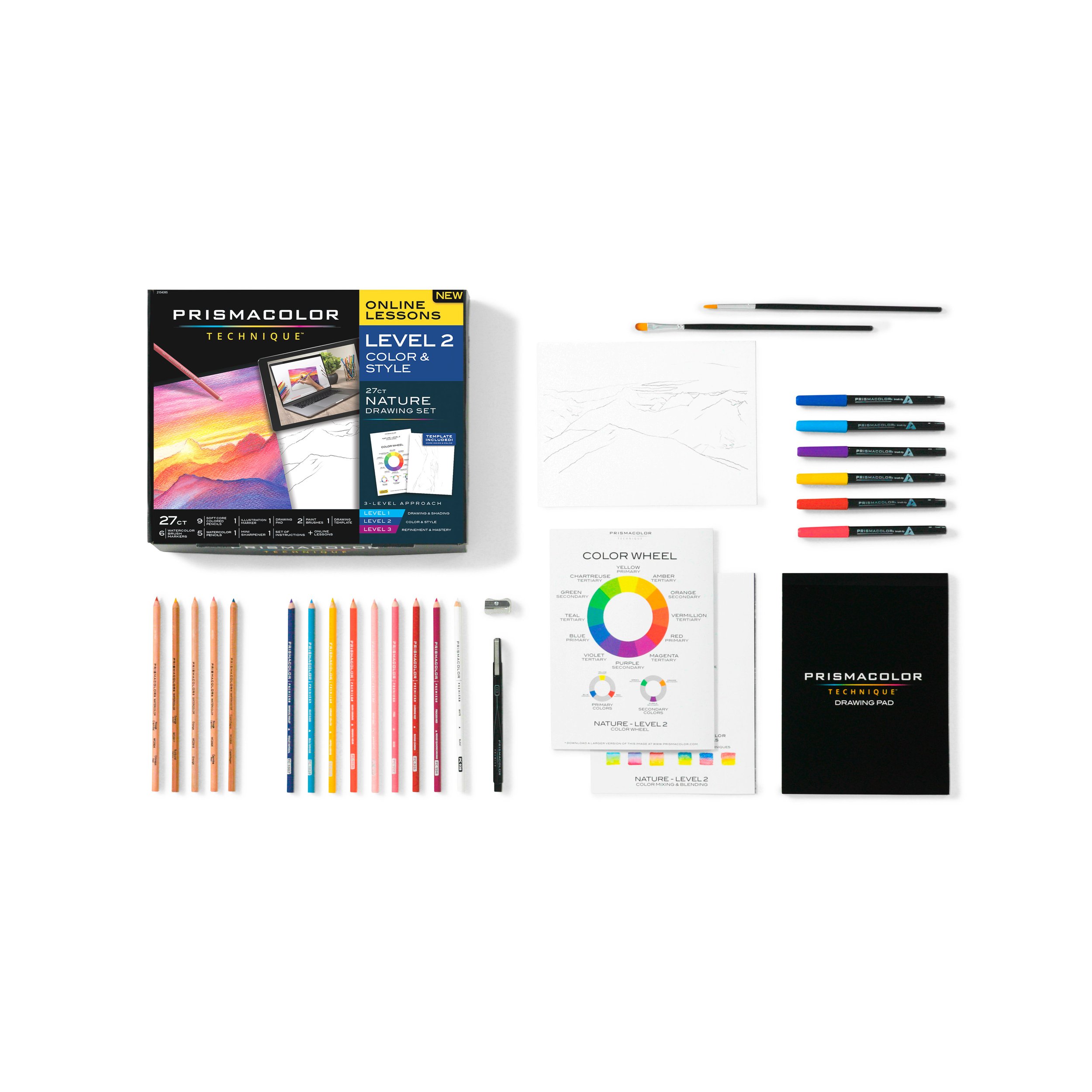
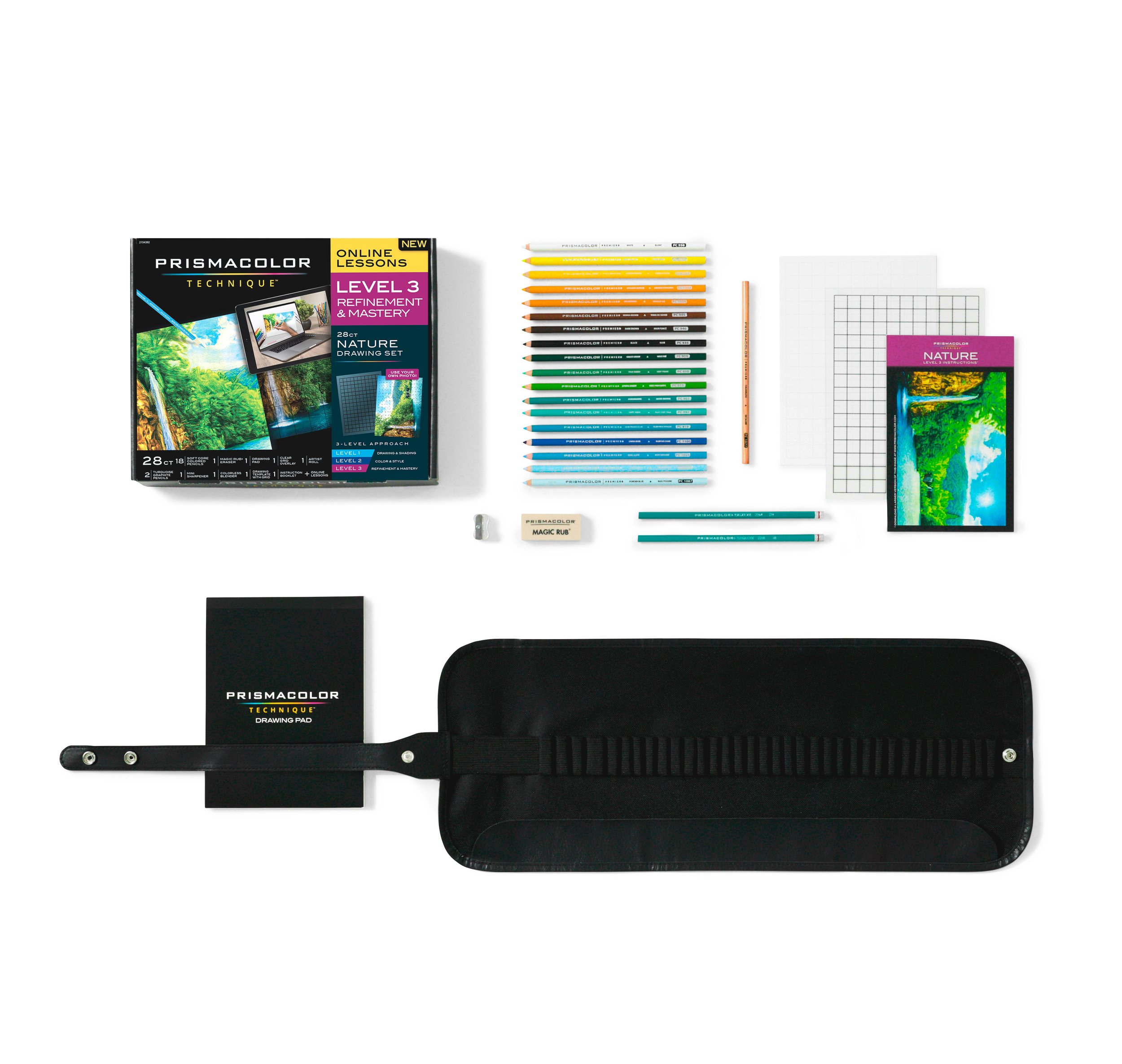
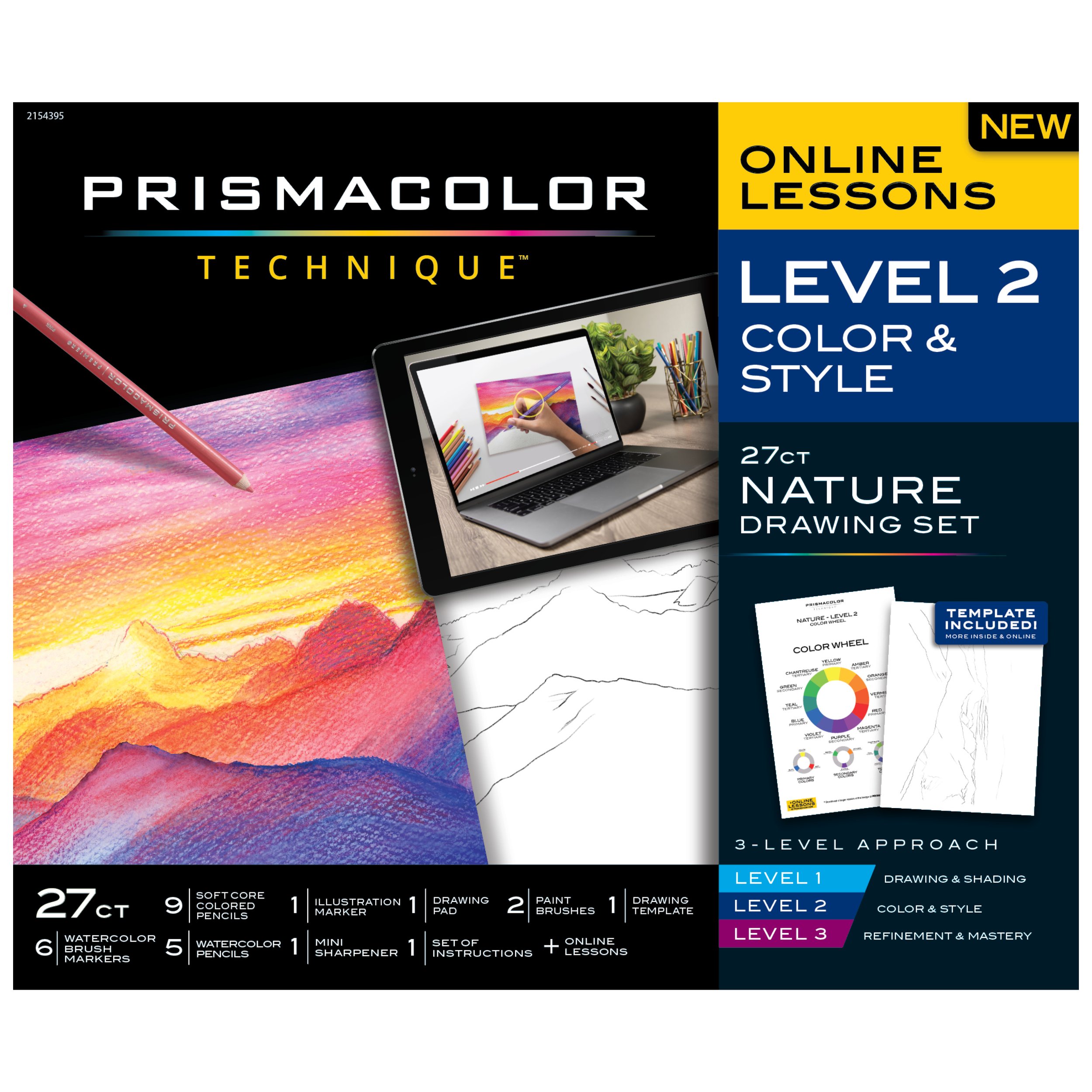
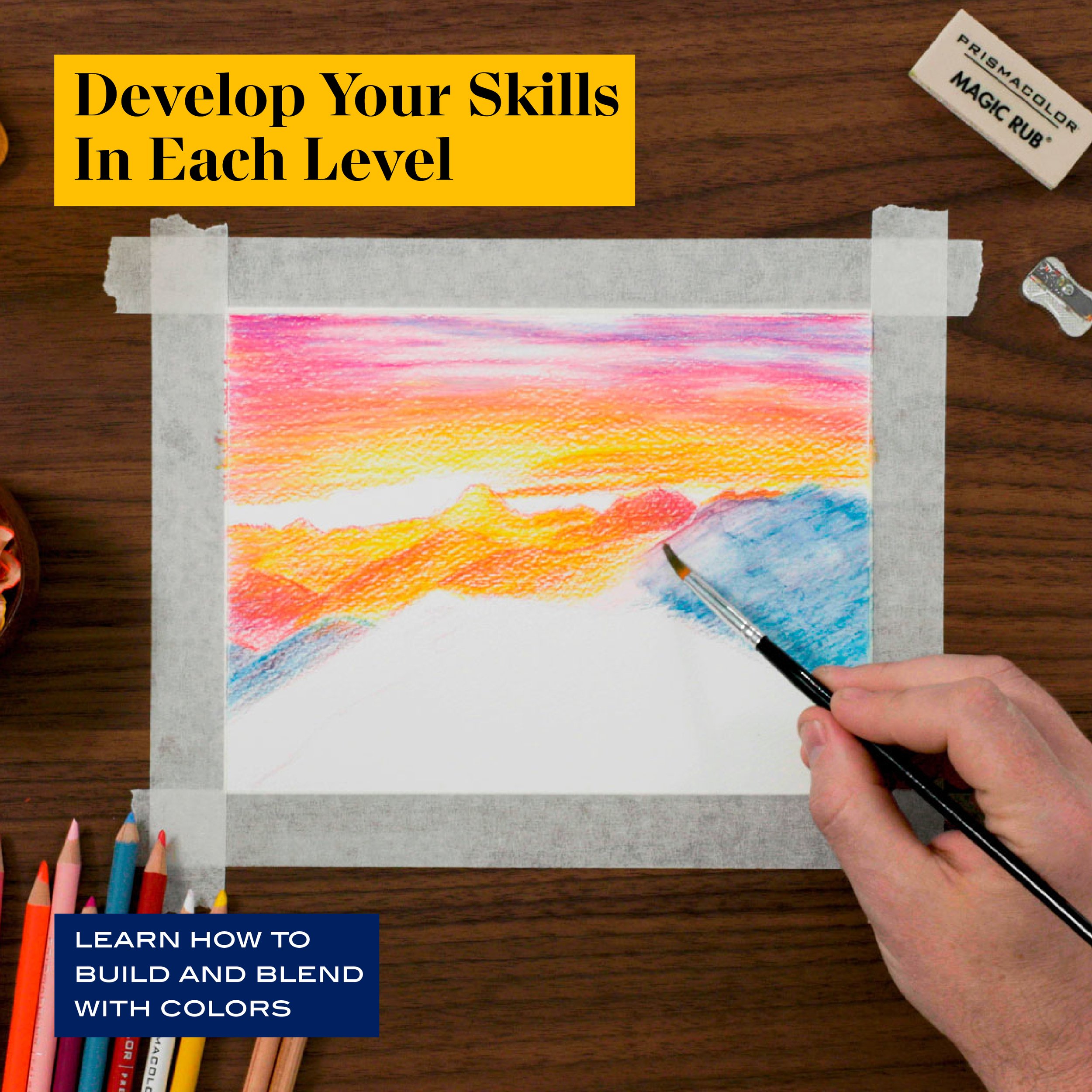
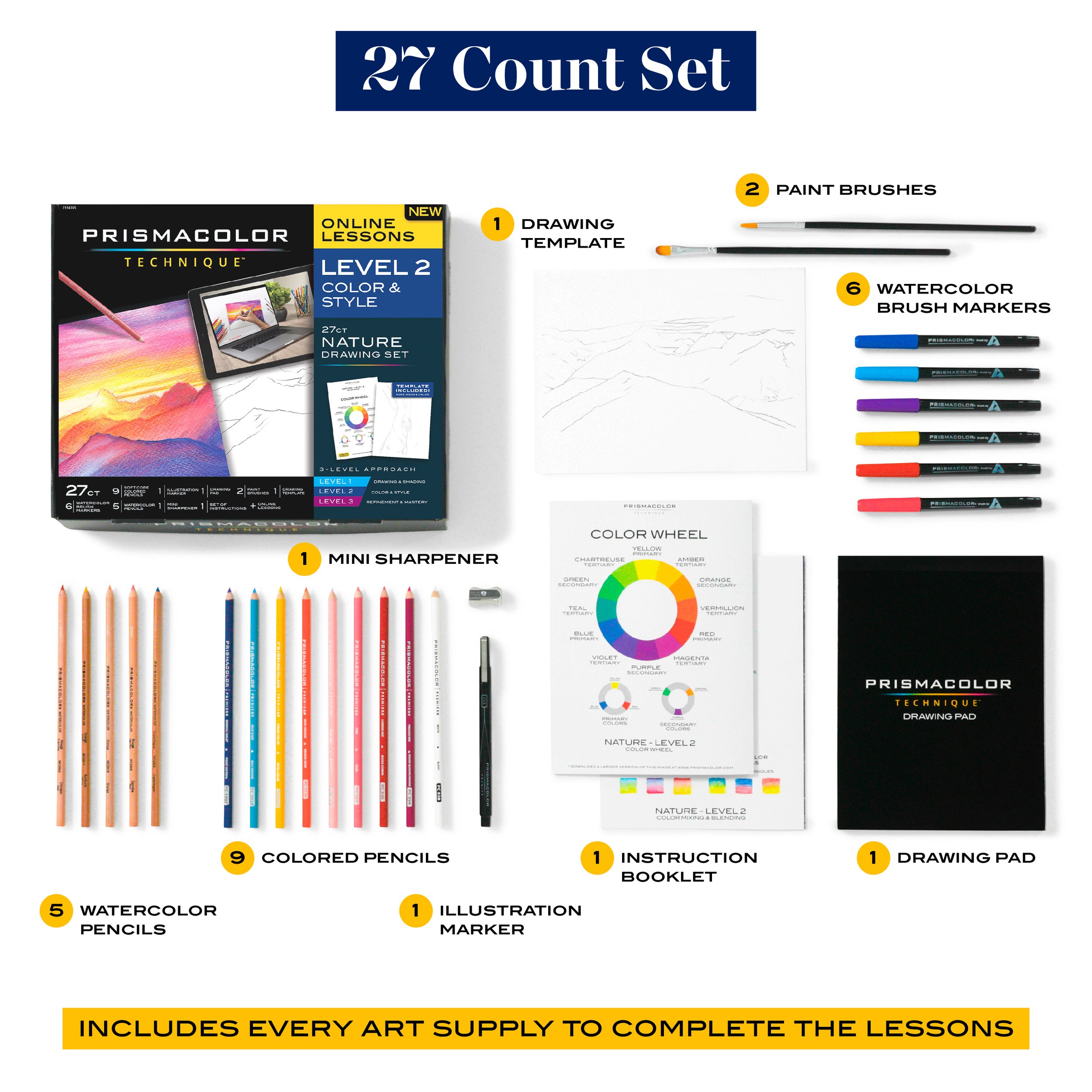
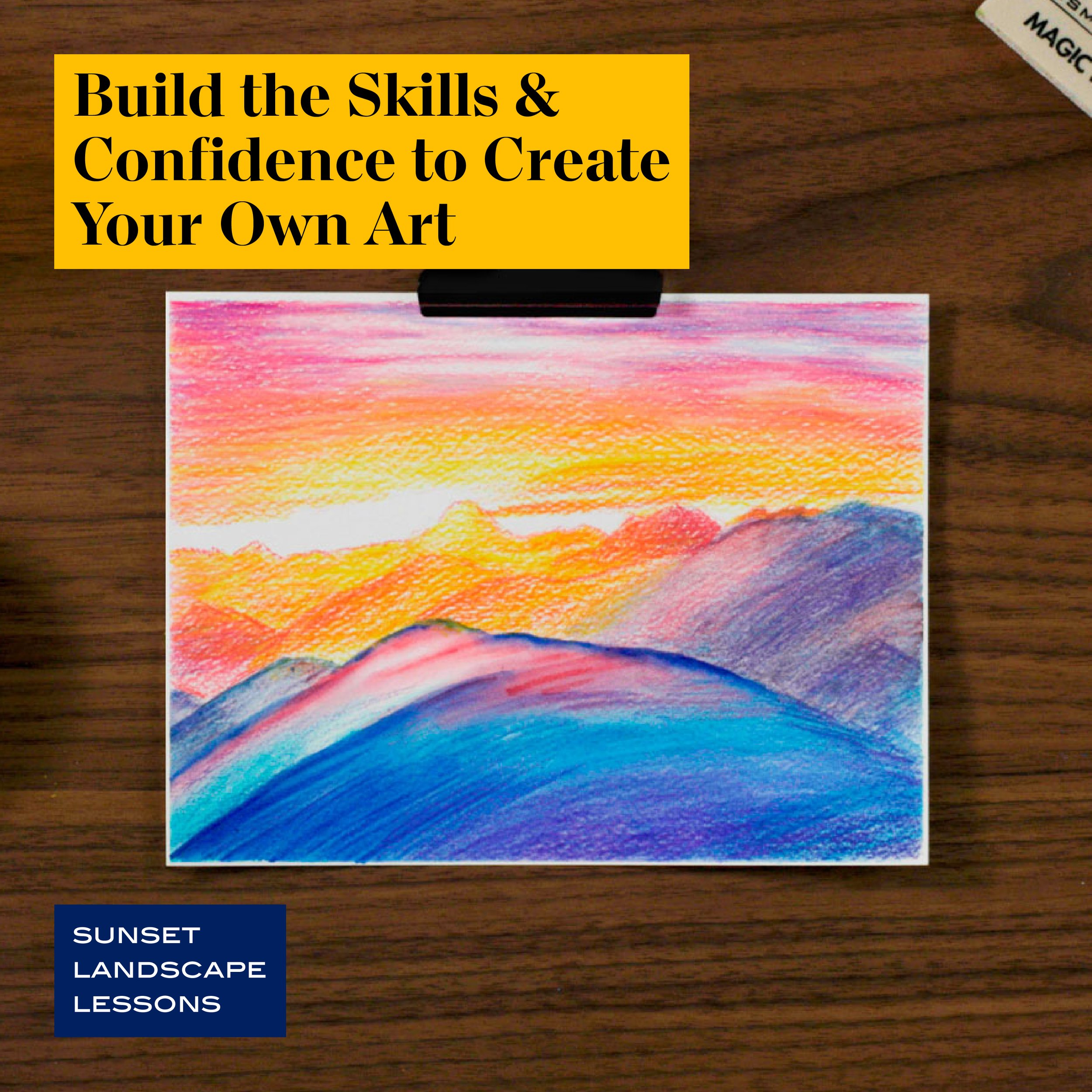
Built around a three-stage learning system, Prismacolor Technique offers structured lessons for different skill levels. To support the curriculum, we created a library of 30+ educational videos, downloadable content, and bonus lessons using the same tools included in each kit.
In the clip seen here, we introduce the Prismacolor Technique, Nature Level 1 kit and program, as well as the subject for this particular lesson set, a flower.
Prismacolor Technique Bonus Video:
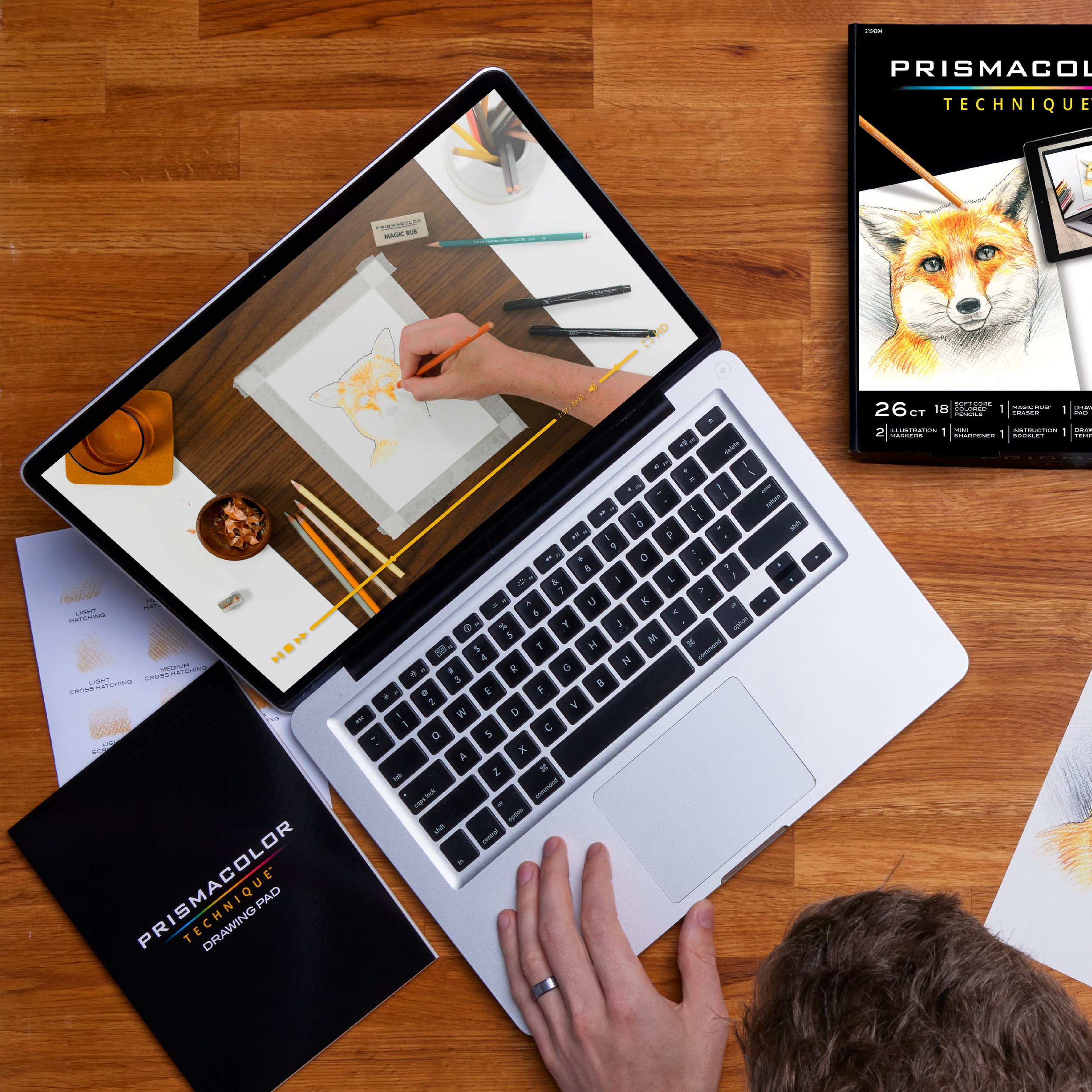
Nature Level 1, Unboxing
To introduce users to the product, a series of unboxing videos showcasing the Prismacolor Technique kit contents was developed. The videos provide a first look at the included materials utilizing thoughtful music carefully synced with the video edit, aligning with the overall aesthetic of the product branding.
Prismacolor Technique Bonus Video:
How to Shade with colored pencils
Each Prismacolor Technique kit includes 3–5 instructional video lessons, guiding users step-by-step through drawing the kit’s featured subject. Within these lessons, we provide short vignettes that dive deeper into essential techniques, reinforcing fundamental drawing skills and giving viewers a quick, targeted lesson on methods that will be used throughout the main sessions.
We also broke these vignettes out into concise pieces of “bonus content” and shared them across Prismacolor’s social platforms and YouTube channel.
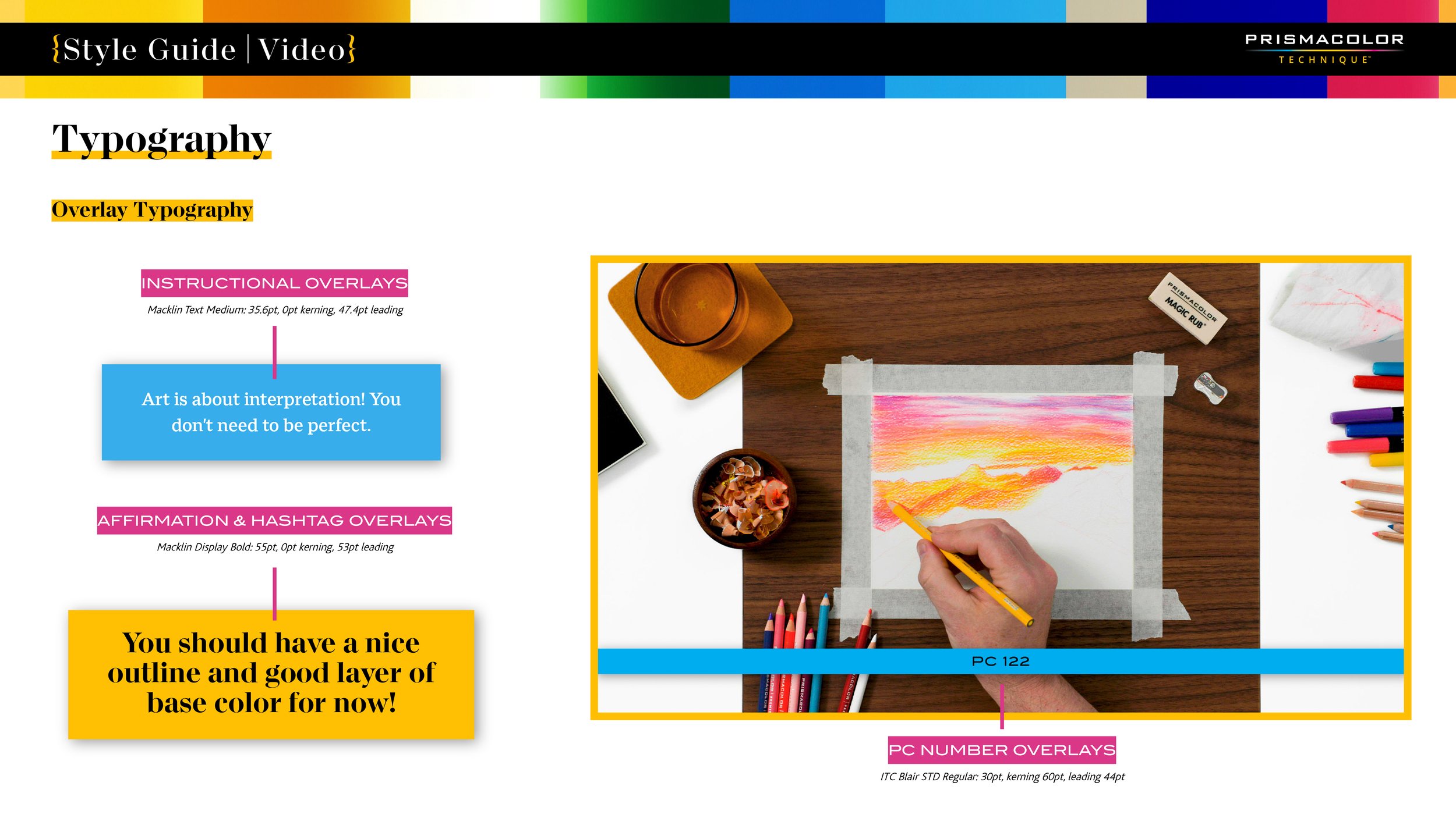
The step-by-step tutorial shown here highlights shading with colored pencils using hatching and cross hatching techniques to bring artwork to life.
Prismacolor Technique Bonus Video:
How to Make a Gradient Background
The tutorial shown here focuses on creating a smooth gradient background with colored pencils. Through layering, blending, and balancing of light and dark tones, users discover how to lay down a vibrant foundation for their artwork without overpowering the main subject.
Through close collaboration with my copy partner and the featured artist, I ensured each step was carefully orchestrated, from shaping an approachable teaching style to planning the visuals. The result is an engaging, hands-on demonstration that empowers artists of all levels to explore their expressive potential.
Prismacolor Technique Bonus Video:
How to Draw Pet Eyes
In this lesson, we turned our focus to capturing the expressive eyes of cats and dogs. I managed everything from the initial concept to the final edit, coordinating shot lists, lighting, and working with my copy partner to guide narrative flow so each demonstration was clearly illustrated. The result is a concise but detailed look at bringing animal portraits to life. Keep an eye out for a cameo from Starlin, copy lead’s Cat pal—he was a natural!
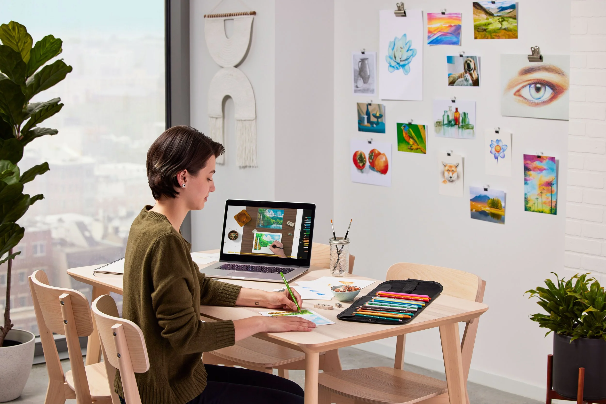
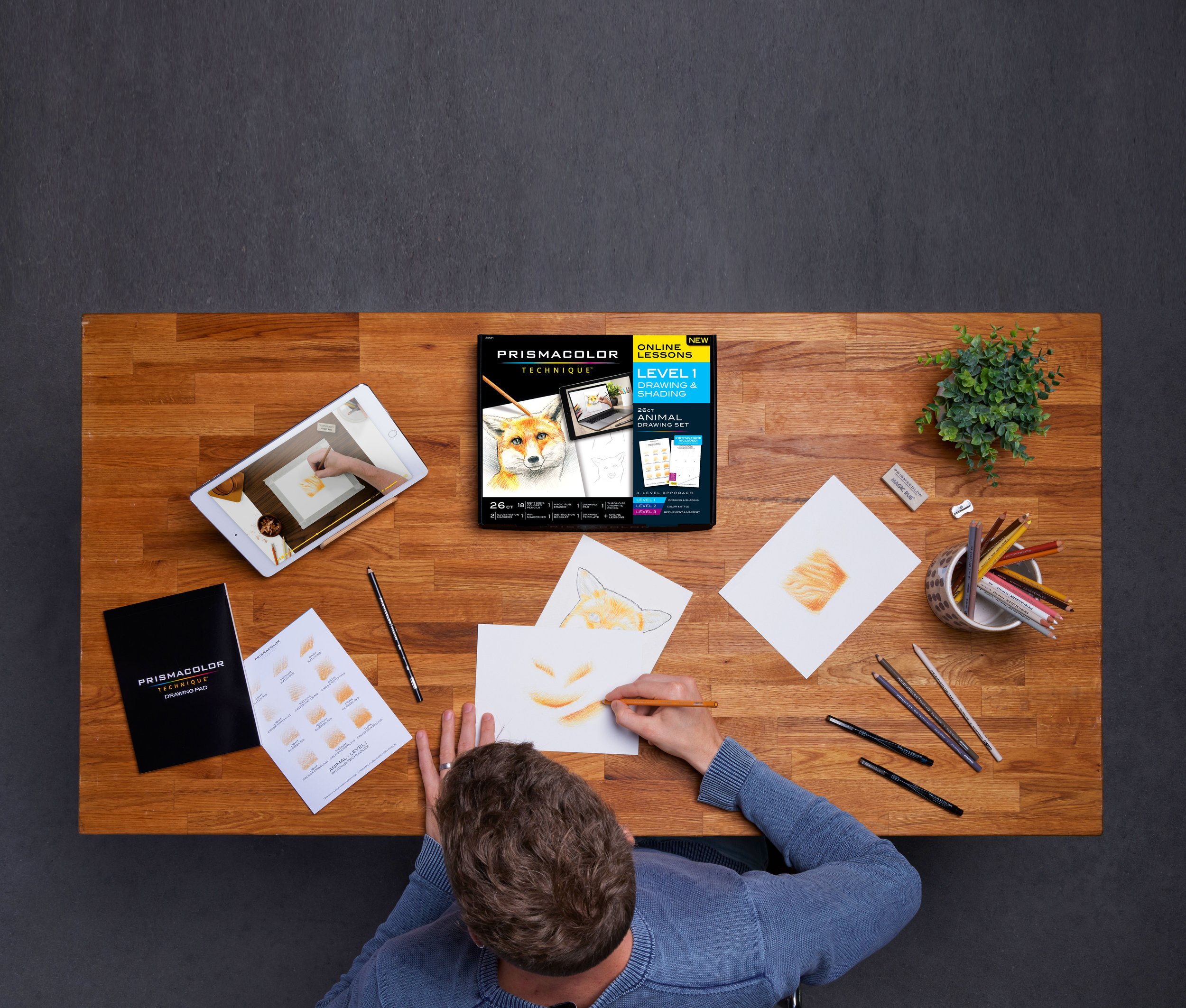
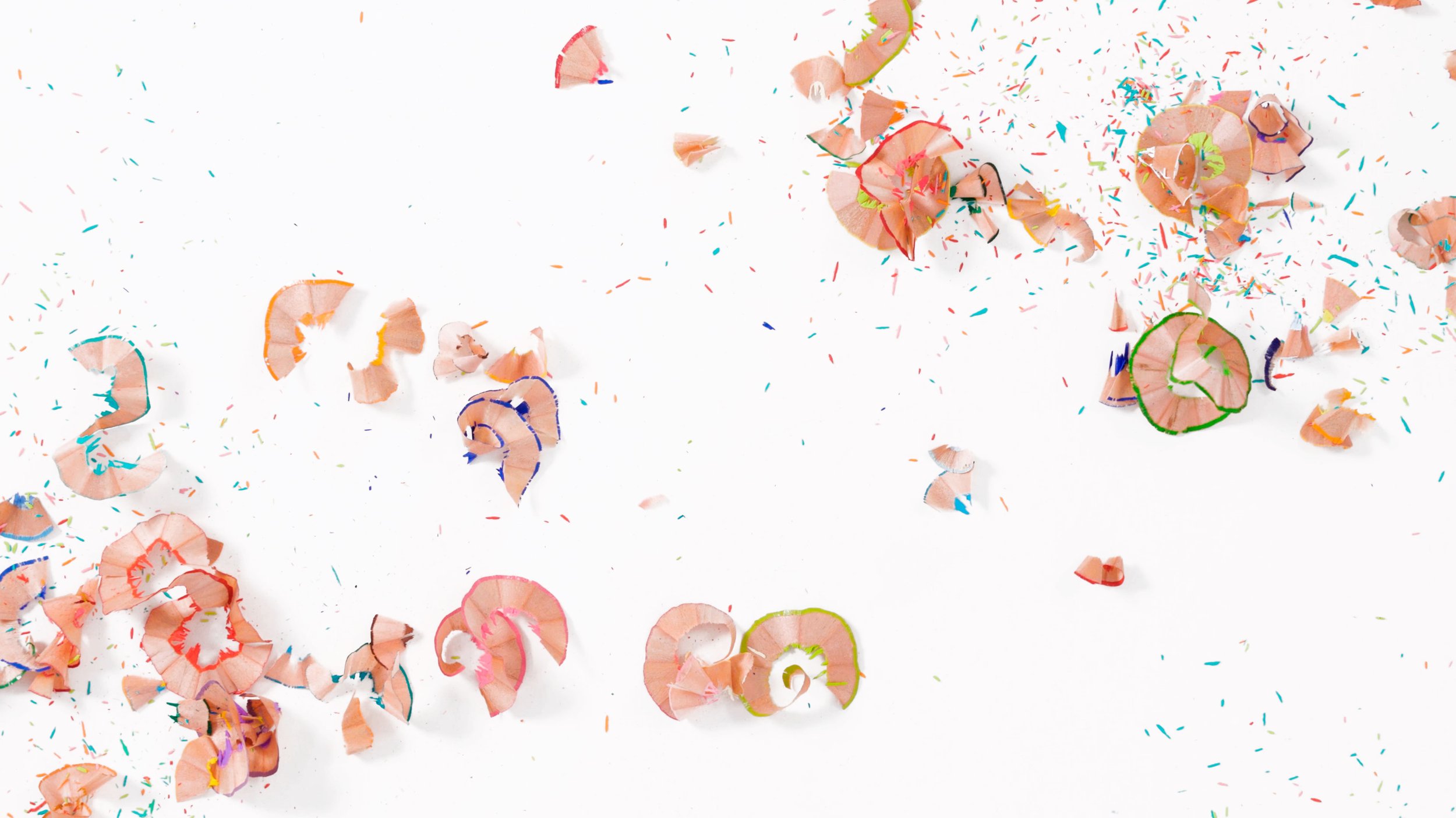
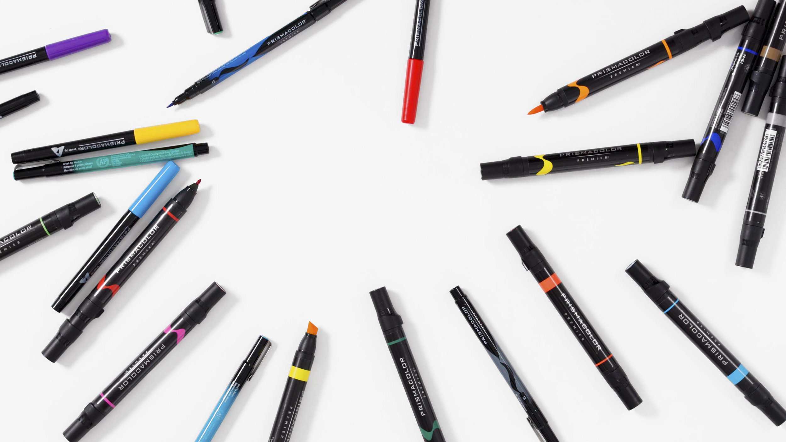
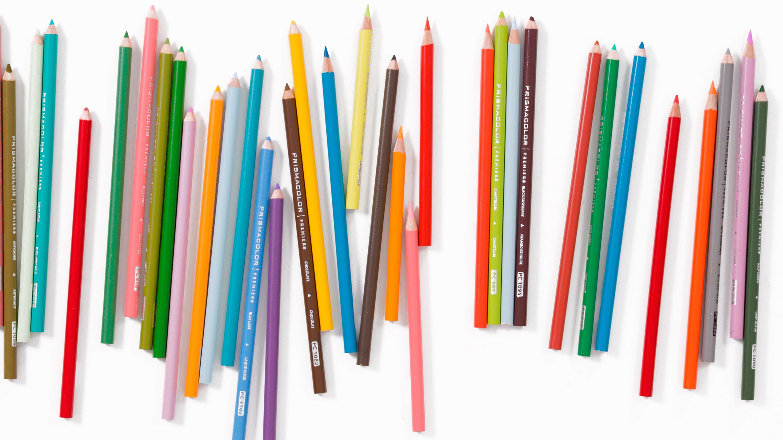
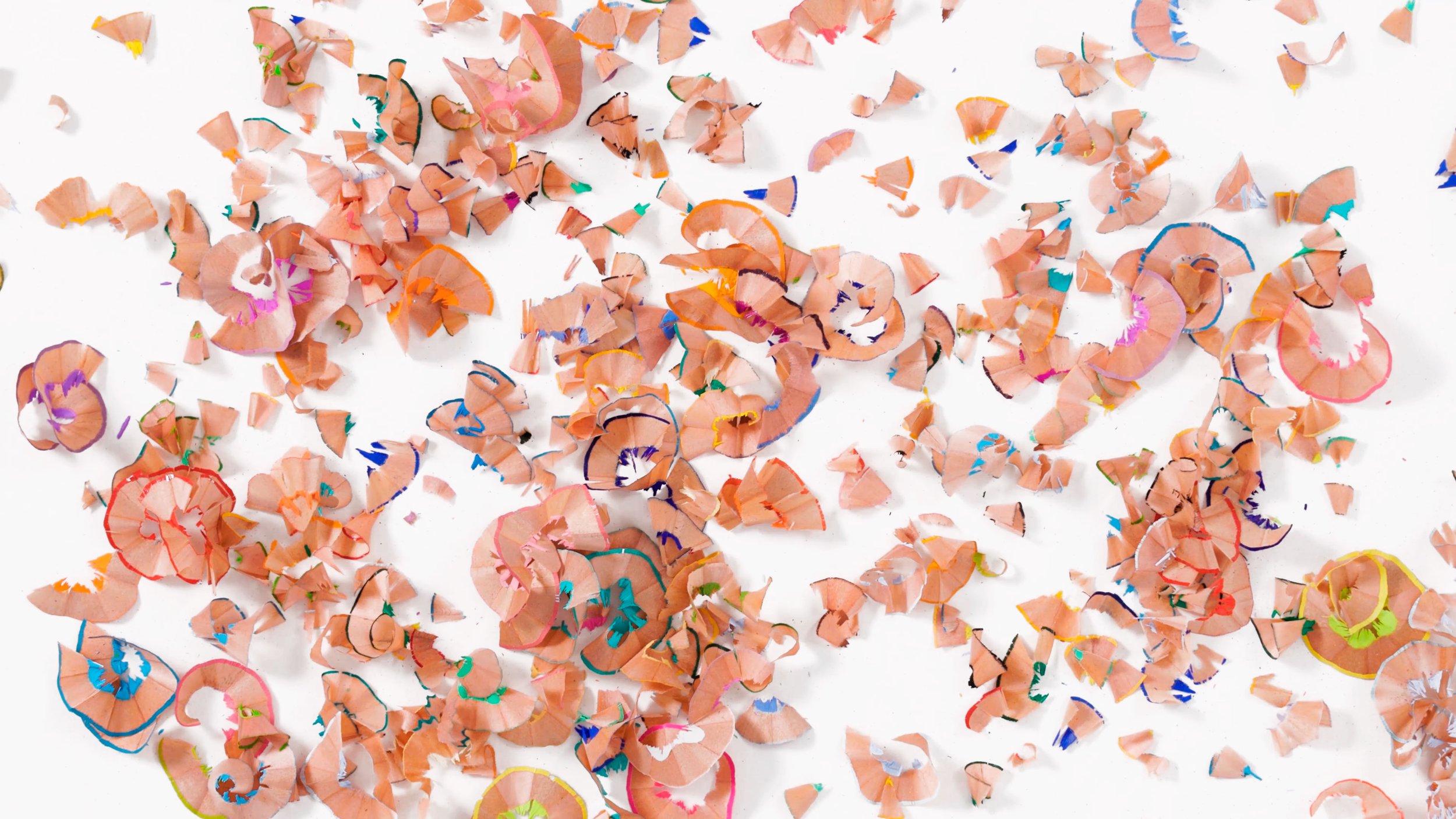
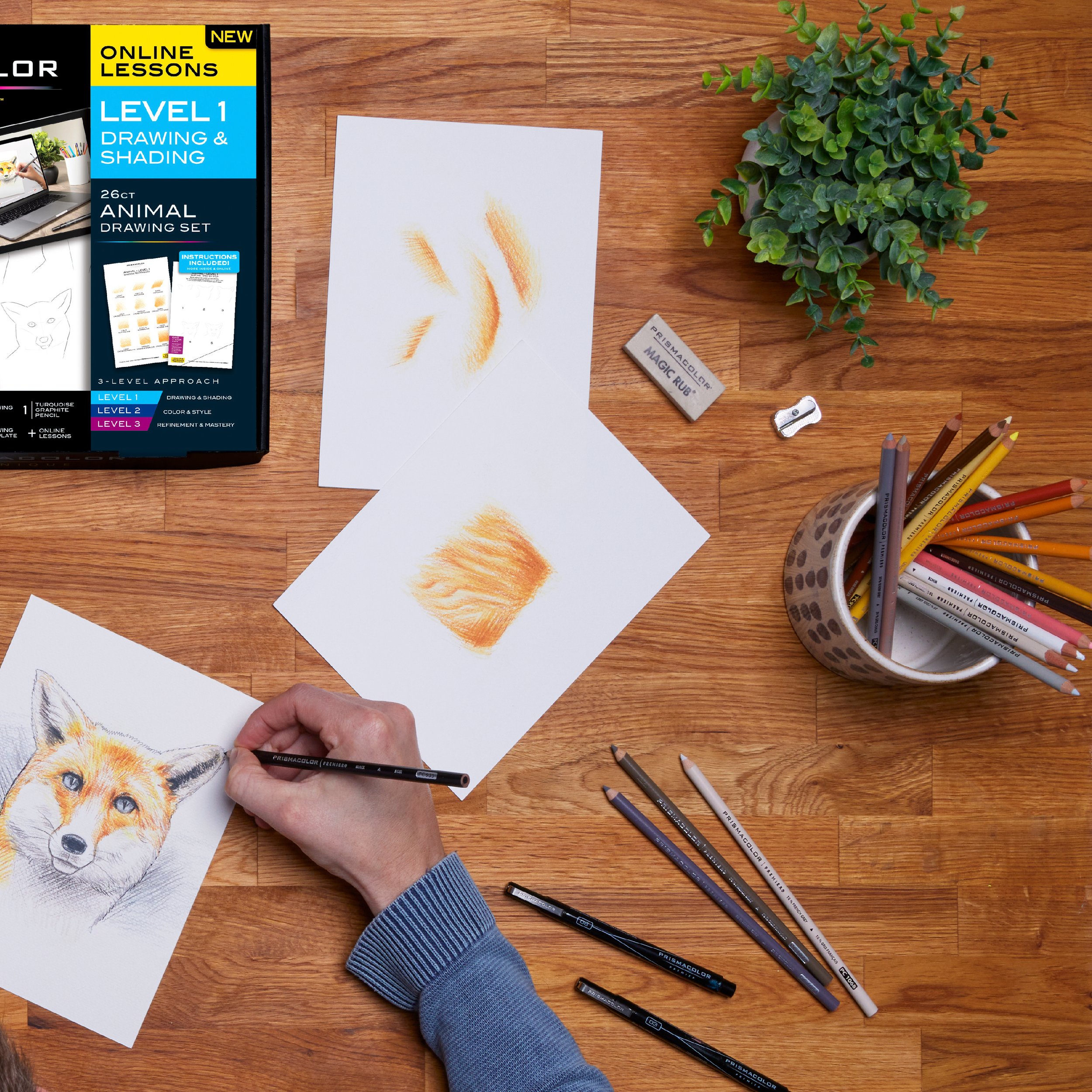
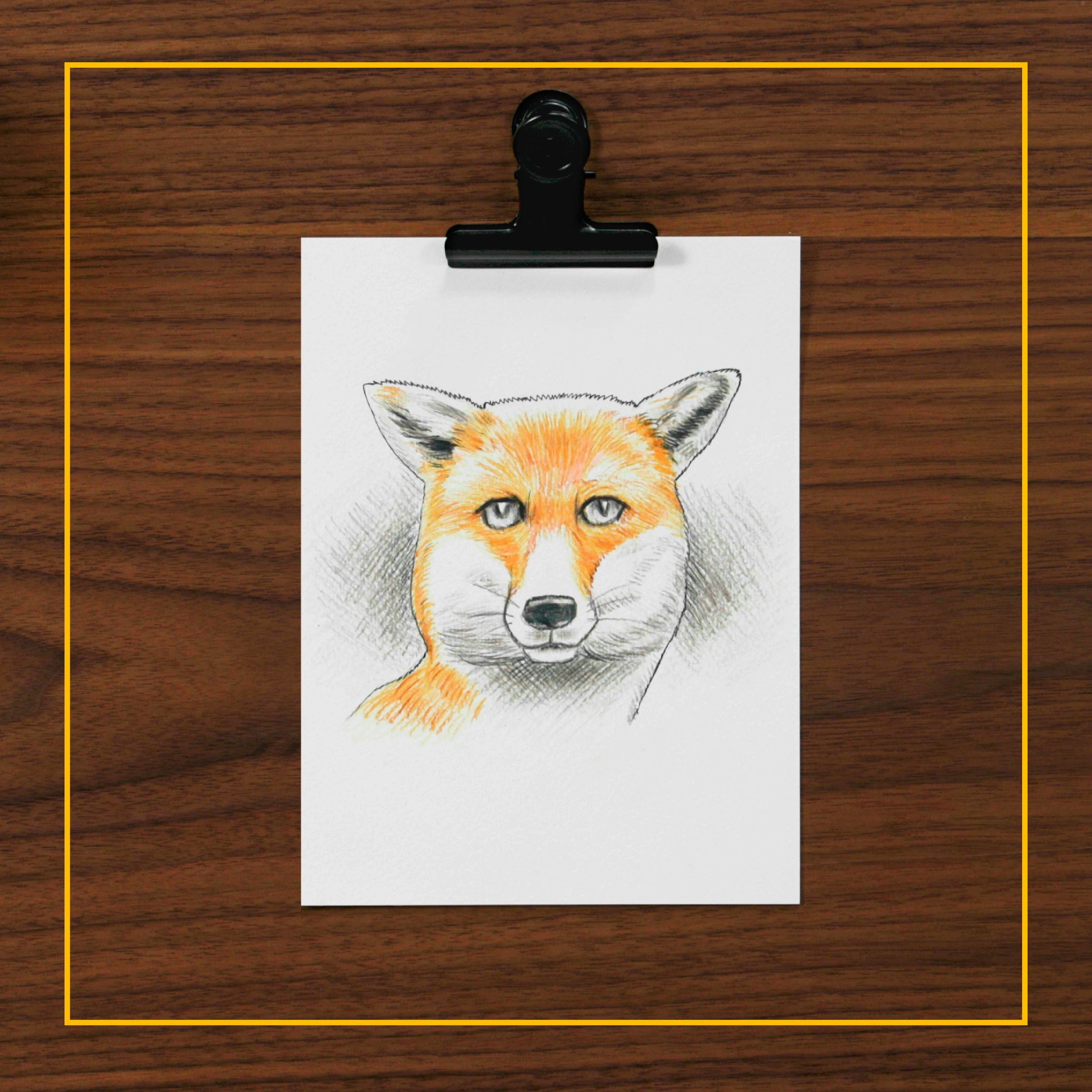
Brand Campaign and Product Photography
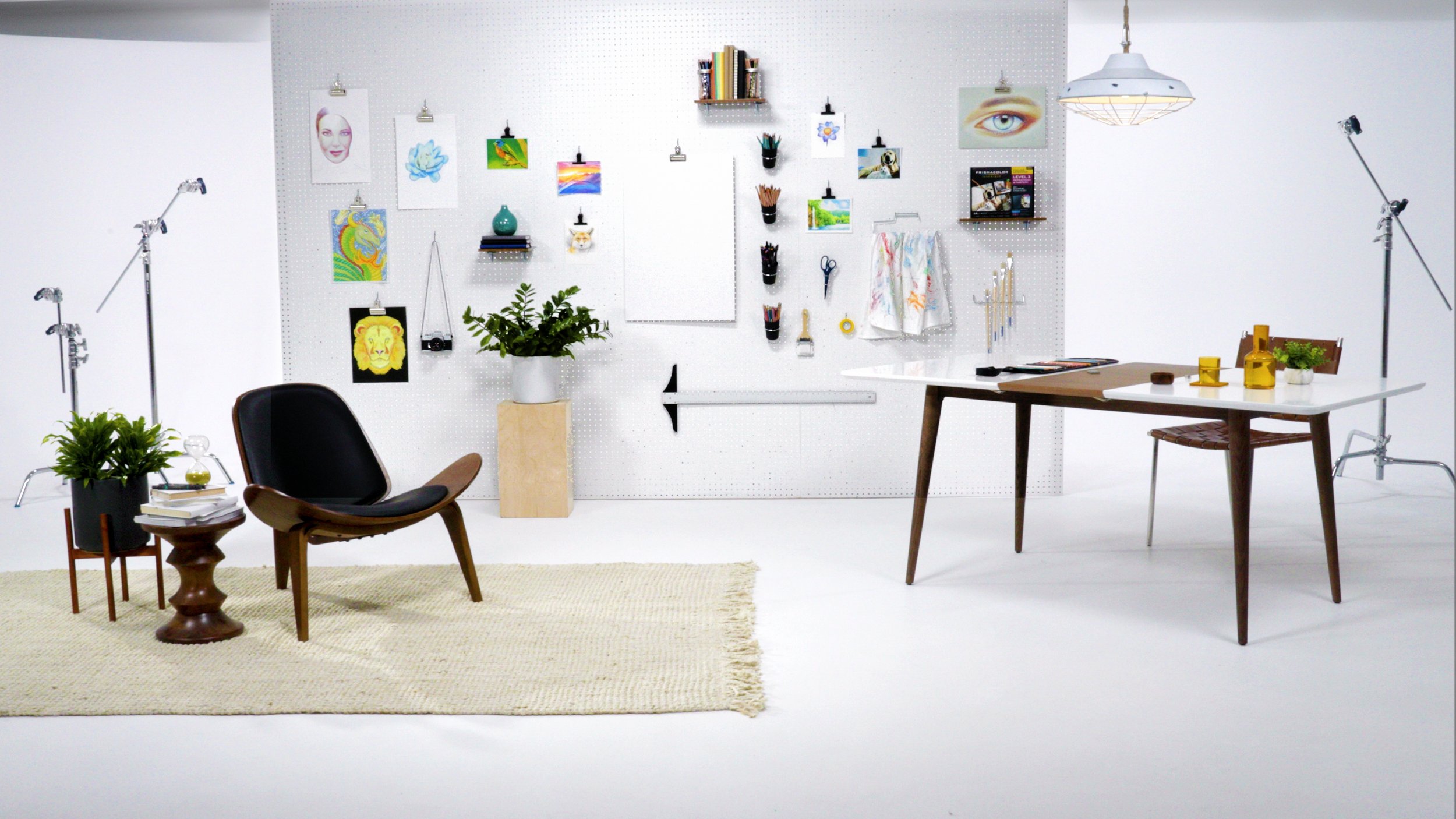
In addition to co-developing and producing the lesson content, I led the creation of static imagery to support branding, and promotional efforts. This included selecting still frames from lesson videos and directing custom photography for both product and lifestyle needs.
I handled all pre-production concepting, planning, on-set styling, and photo direction, directing the studio team while also contributing hands-on to the production process.


Product Landing Page
For the launch of Prismacolor Technique, I designed and developed an interactive landing page within Prismacolor’s website, transforming a rigid platform into a seamless, engaging experience. Working within strict functionality constraints, I reimagined modules (using strategic graphics, images, and layout adjustments) to create a dynamic, intuitive user experience while ensuring full platform compatibility. I conducted extensive testing across devices and collaborated with technical web designers to optimize assets for responsiveness, content safe-zones, and breakpoints. The result was one of the highest-performing pages in Newell Brands’ Writing division, driven by high-quality visuals, engaging video, and valuable instructional content.
Social Content and Curriculum Sampling
Working closely with our Social Media Strategy team, I developed a diverse range of assets for both paid and organic social media campaigns.
For paid social, we focused on quickly showcasing the product and its results with minimal copy. These assets were used in sponsored in-feed posts, stories, Idea Pins, and YouTube ads.
For organic content, we emphasized the creative process. Assets featured stop-motion, fast-paced video edits, and mini-lessons from the core curriculum, offered as free content so users could sample the teaching style before purchasing. These were used in organic posts, stories, Idea Pins, and on Prismacolor’s YouTube channel.

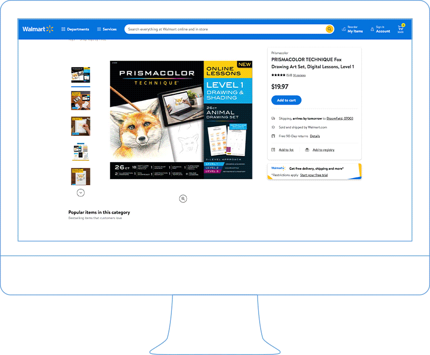
eCommerce
For retail eCommerce sites, I oversaw product detail page content that blended lesson visuals, lifestyle photography, and product imagery to create an engaging first impression. Contextual overlays were added to provide clear narrative and product context, ensuring customers quickly understood Prismacolor Technique at a glance.

Planning and Documentation
A project of this scale required extensive research, strategic planning, pitching, and documentation. Every phase was meticulously mapped out to ensure nothing was left to chance, keeping the project on schedule and ensuring on-time delivery for both online and in-store launches.
Below is a selection of key documents that showcase the detailed work and strategic decisions behind Prismacolor Technique.
PITCH DECK

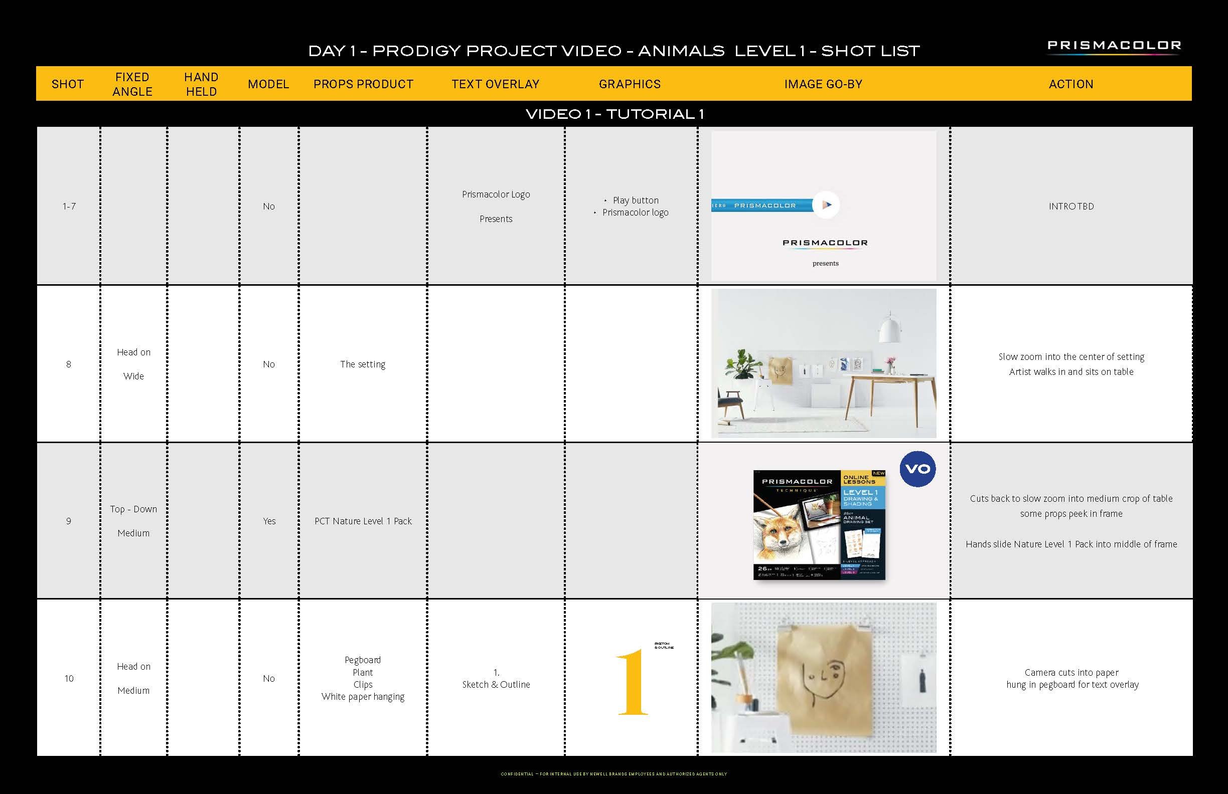
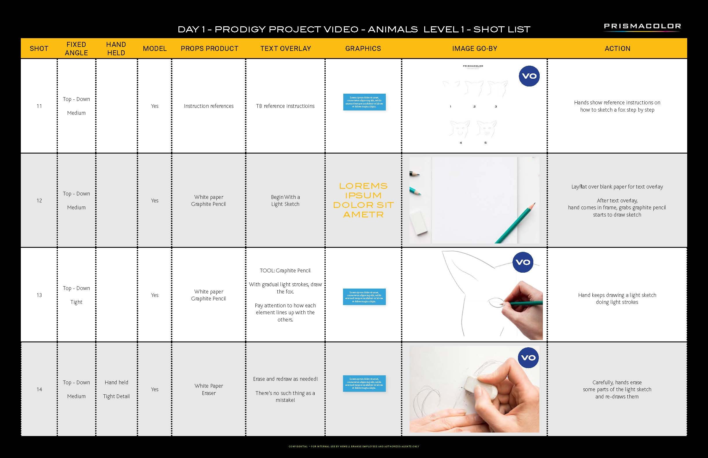
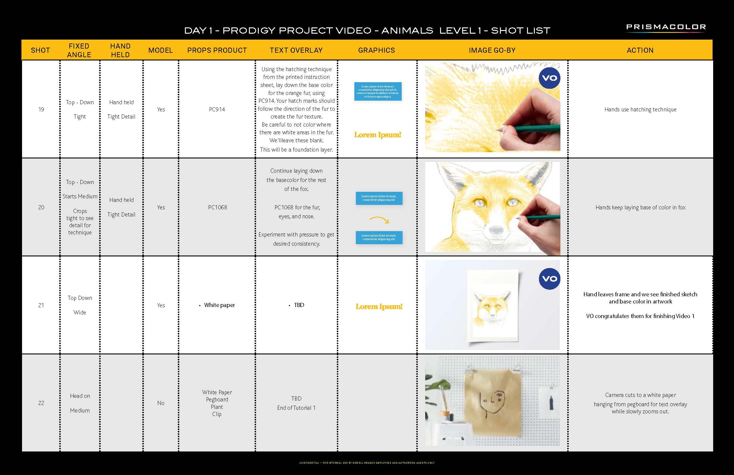
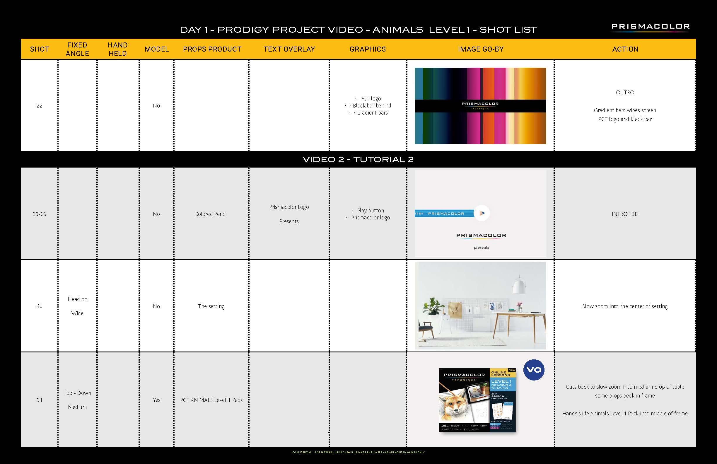
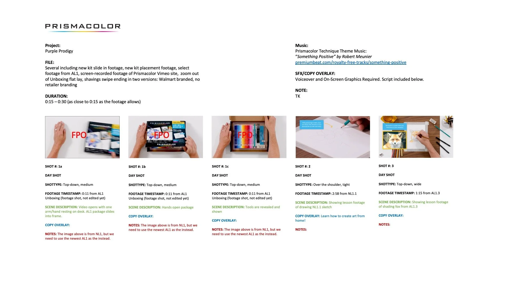
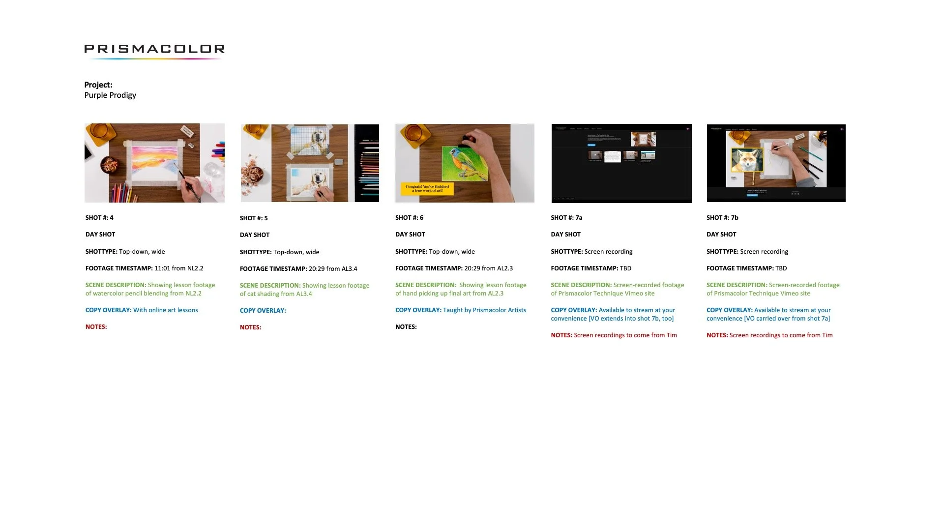
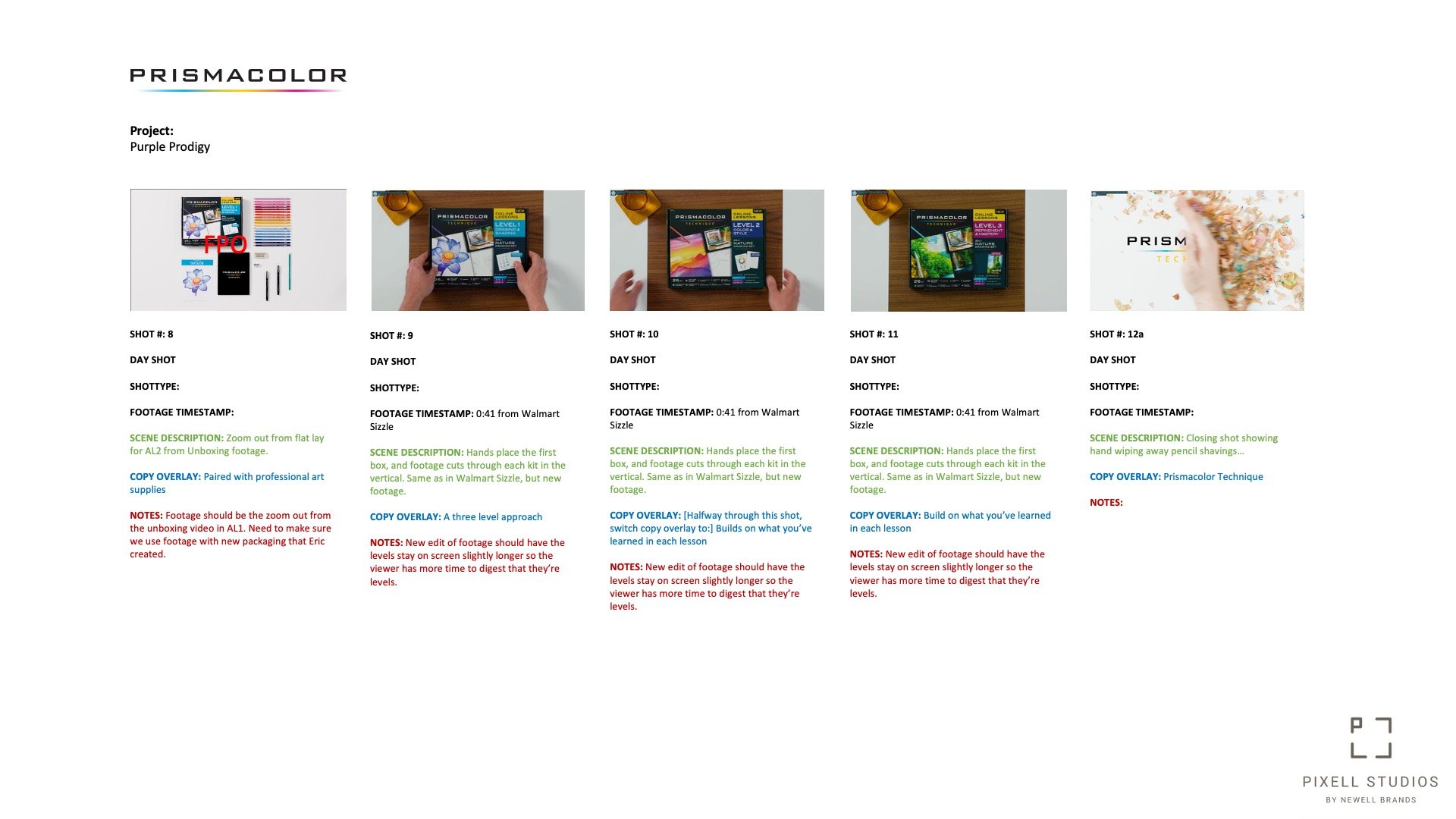
LESSON SHOT LISTs

STORYBOARDs
Style Guide


Bringing
Prismacolor
Technique
to Life
Prismacolor Technique was one of the most complex projects I led at Newell Brands, spanning concept development, video production, photography, digital design, social content, eCommerce, and print. Every element had to work together, not just visually, but structurally, supporting a system designed to grow with the user over time.
What made this project meaningful was the clarity of purpose behind it: make creativity more accessible, and give people the confidence to keep making things. The campaign, the content, and the product were all built to serve that goal.