


Paper Mate Scented Flair
Creative Director:
Sima Patel
Art Director:
Tim Petrochko
Photographer:
Mike Troast
Food & Floral Stylist:
Edward Gallegos
Producers:
Regina Griffin
Jonathan Danial
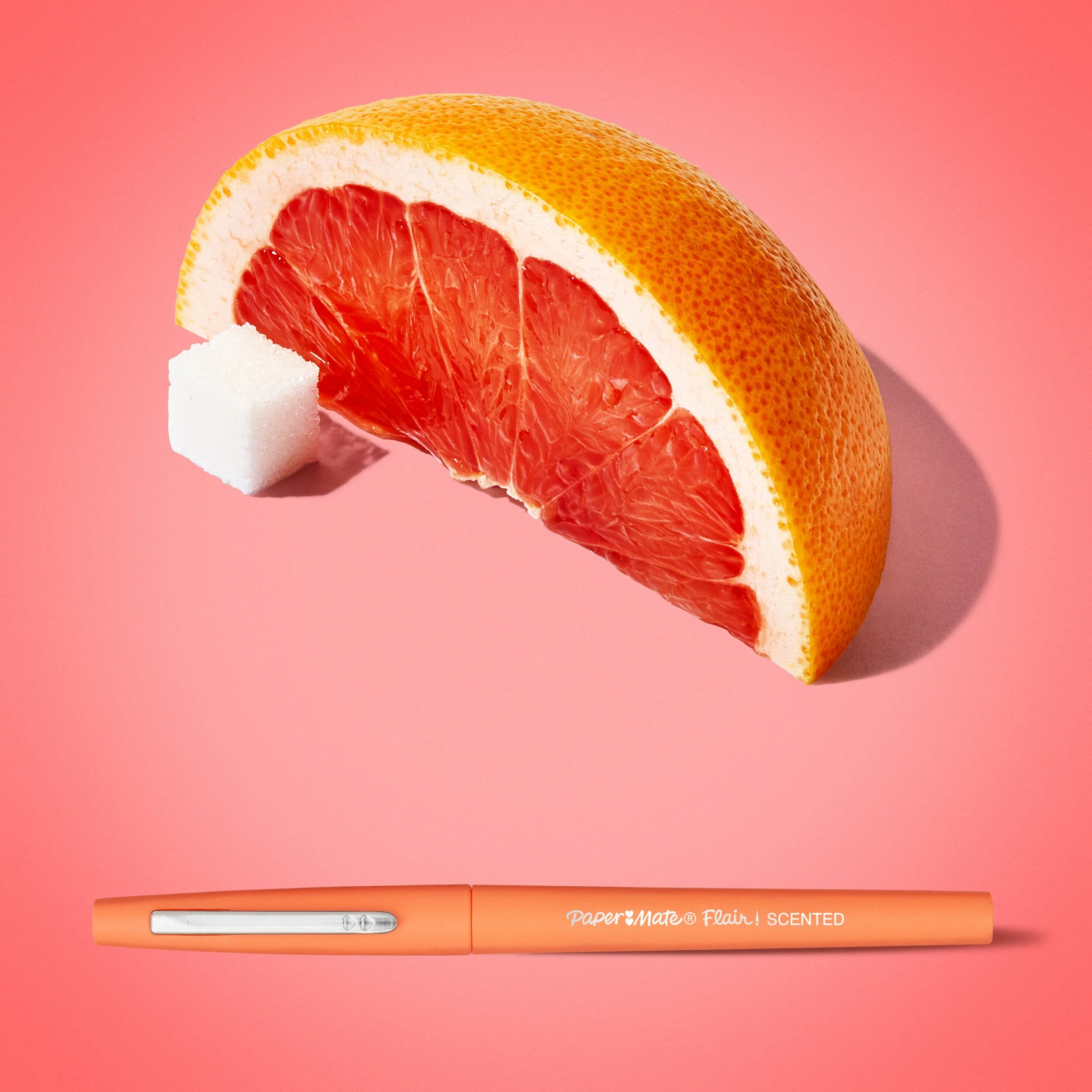
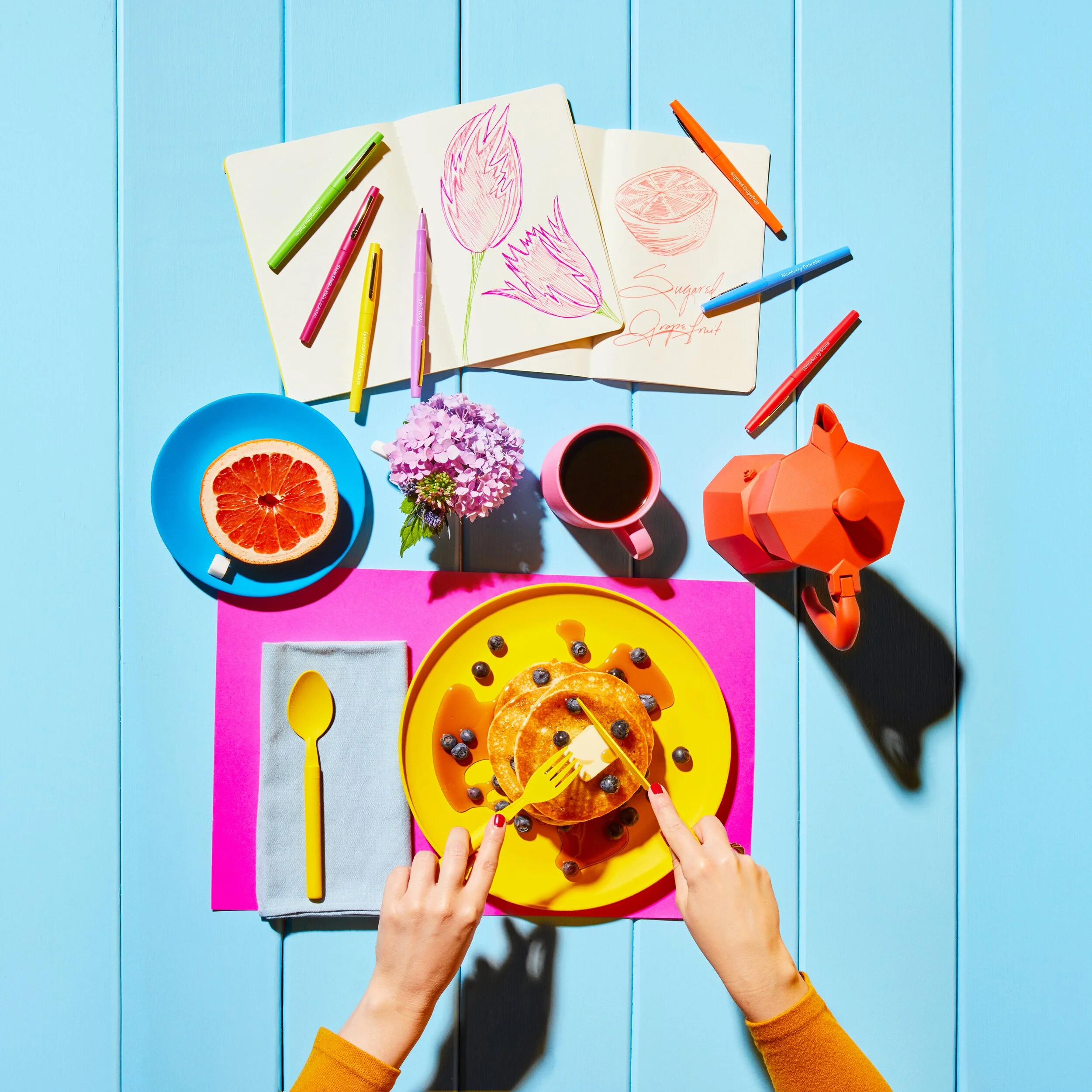
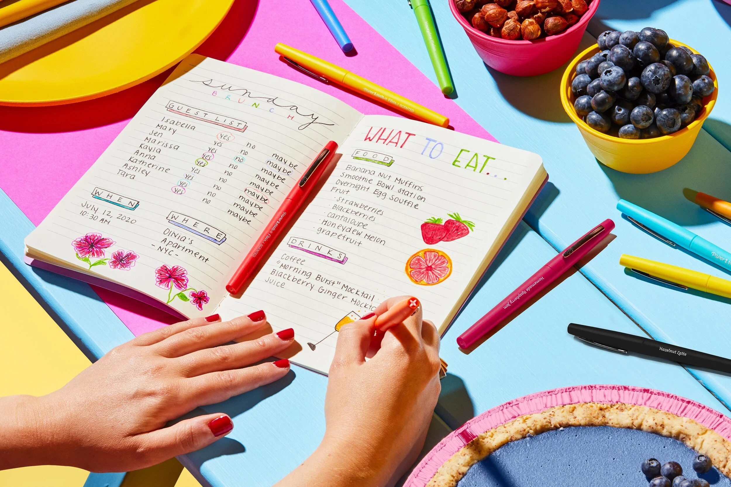
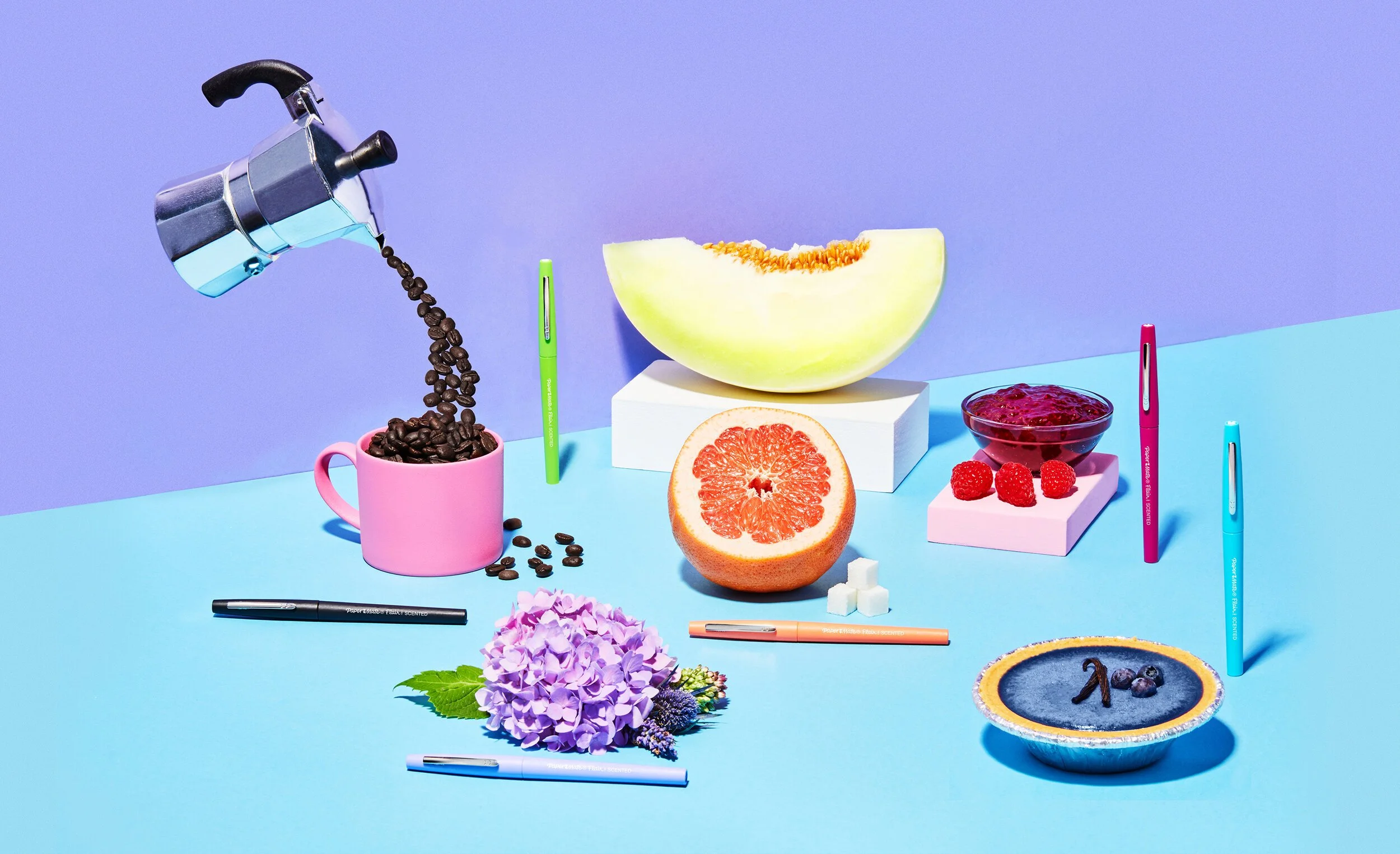
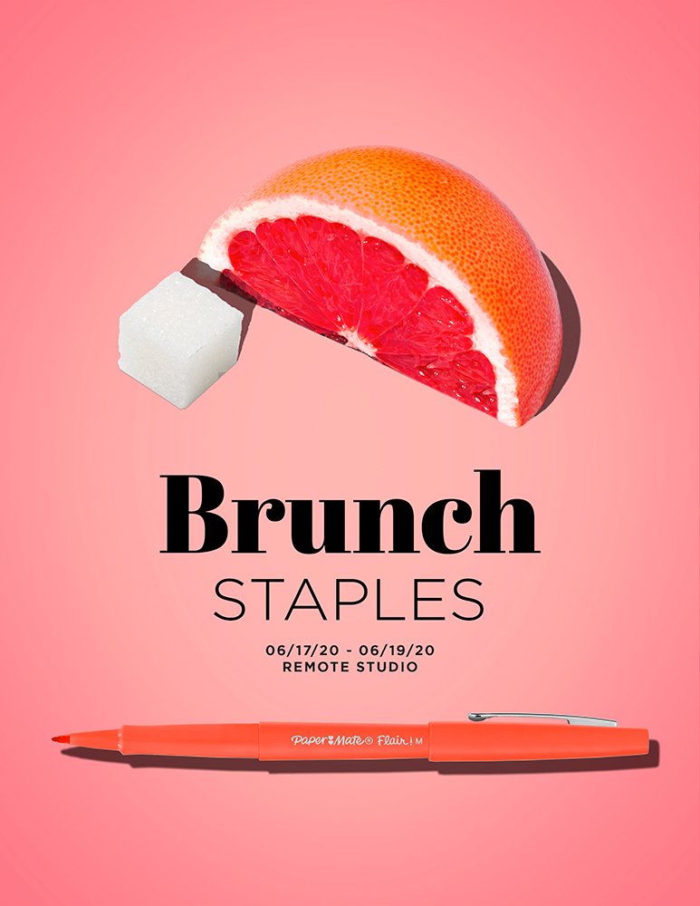
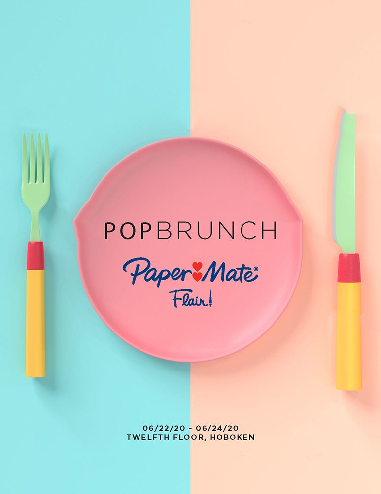
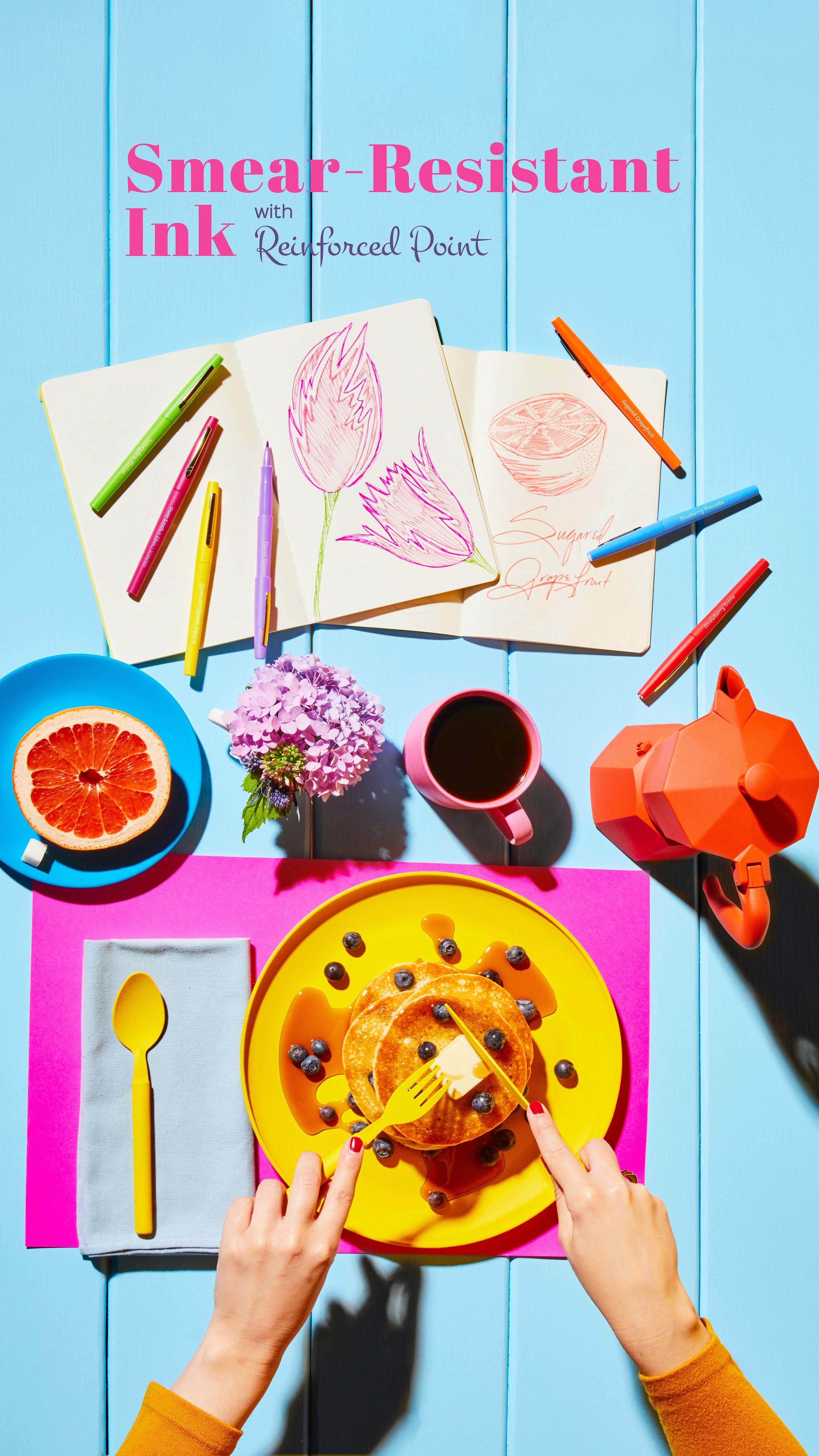
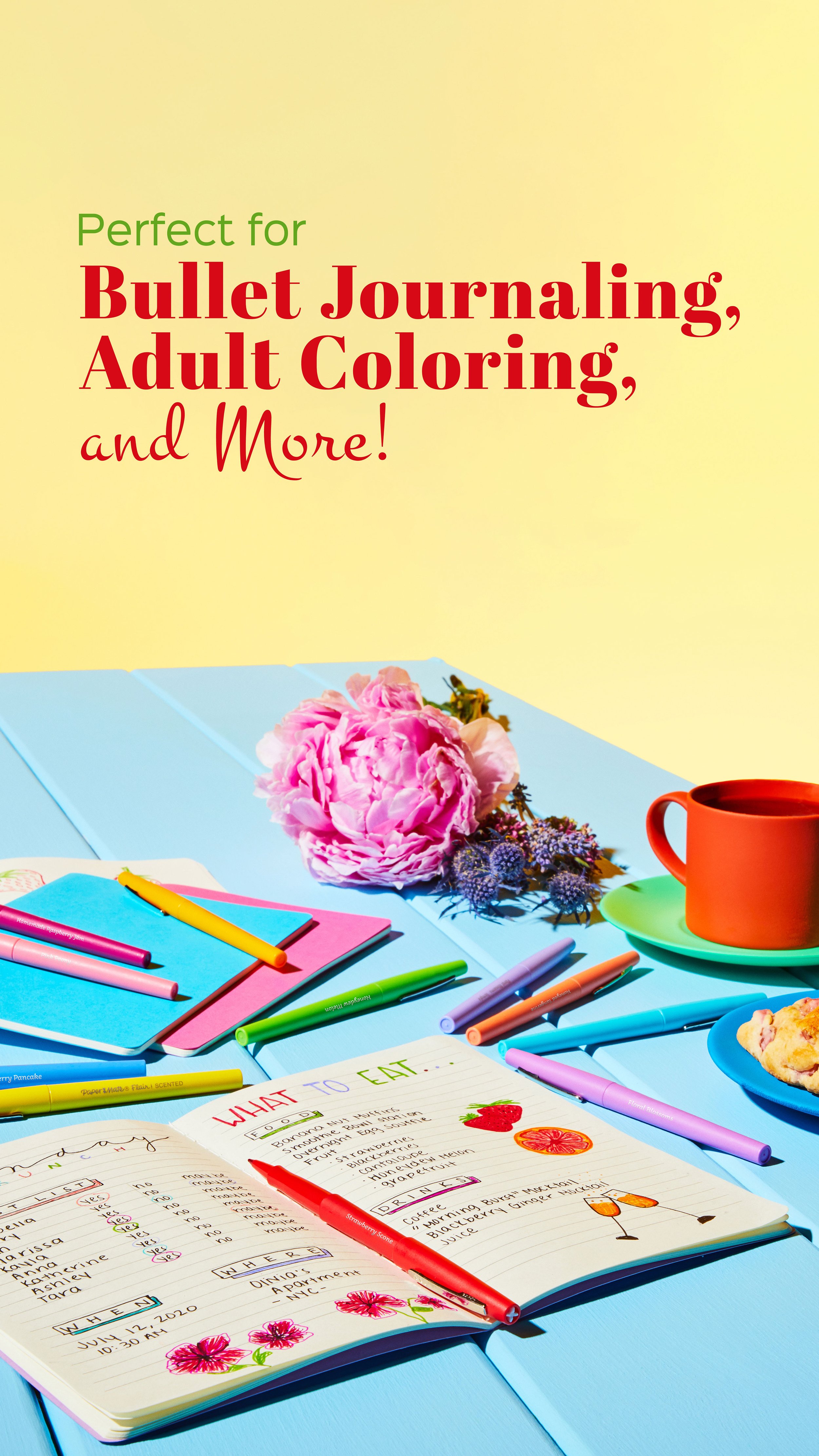
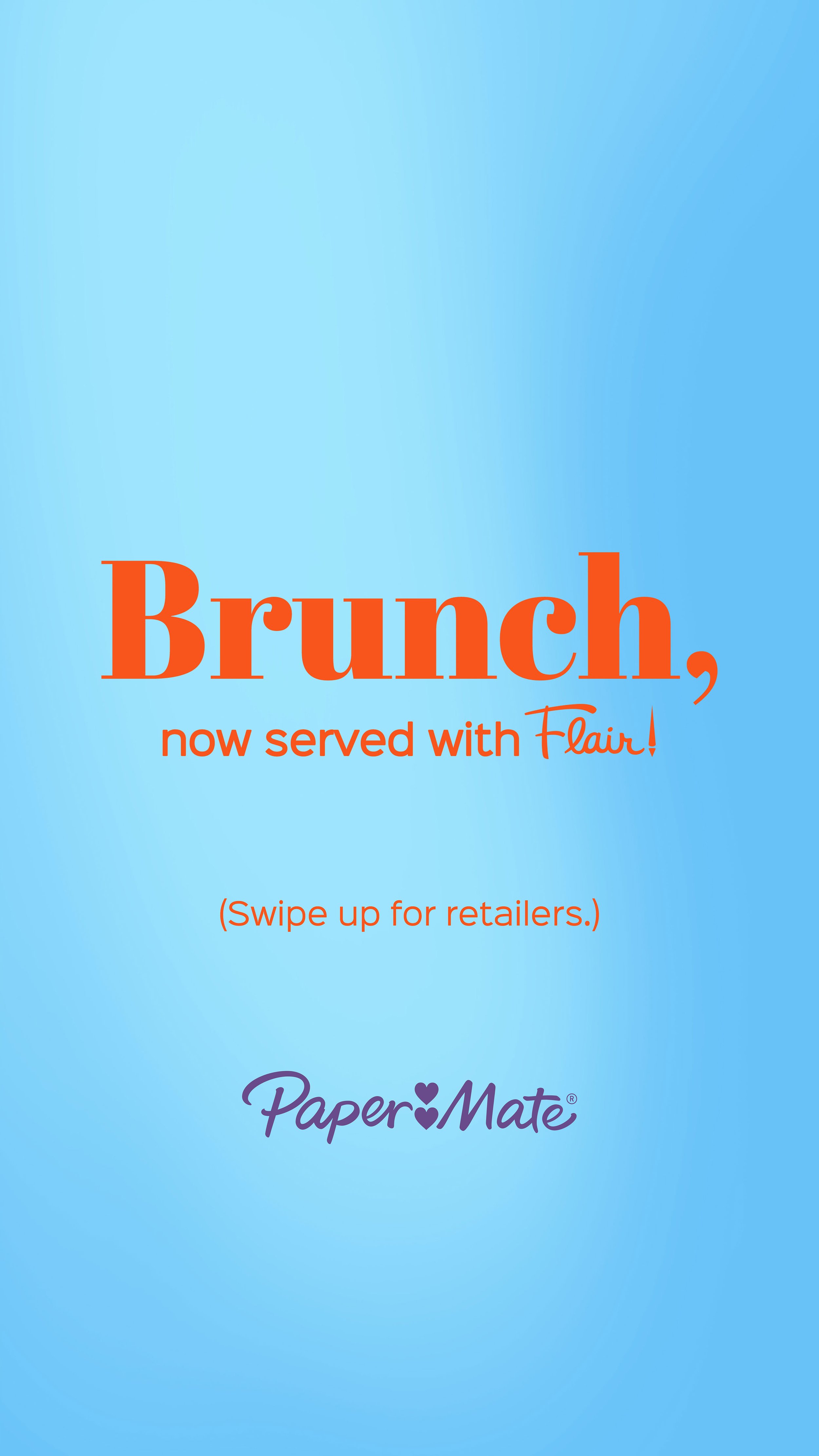
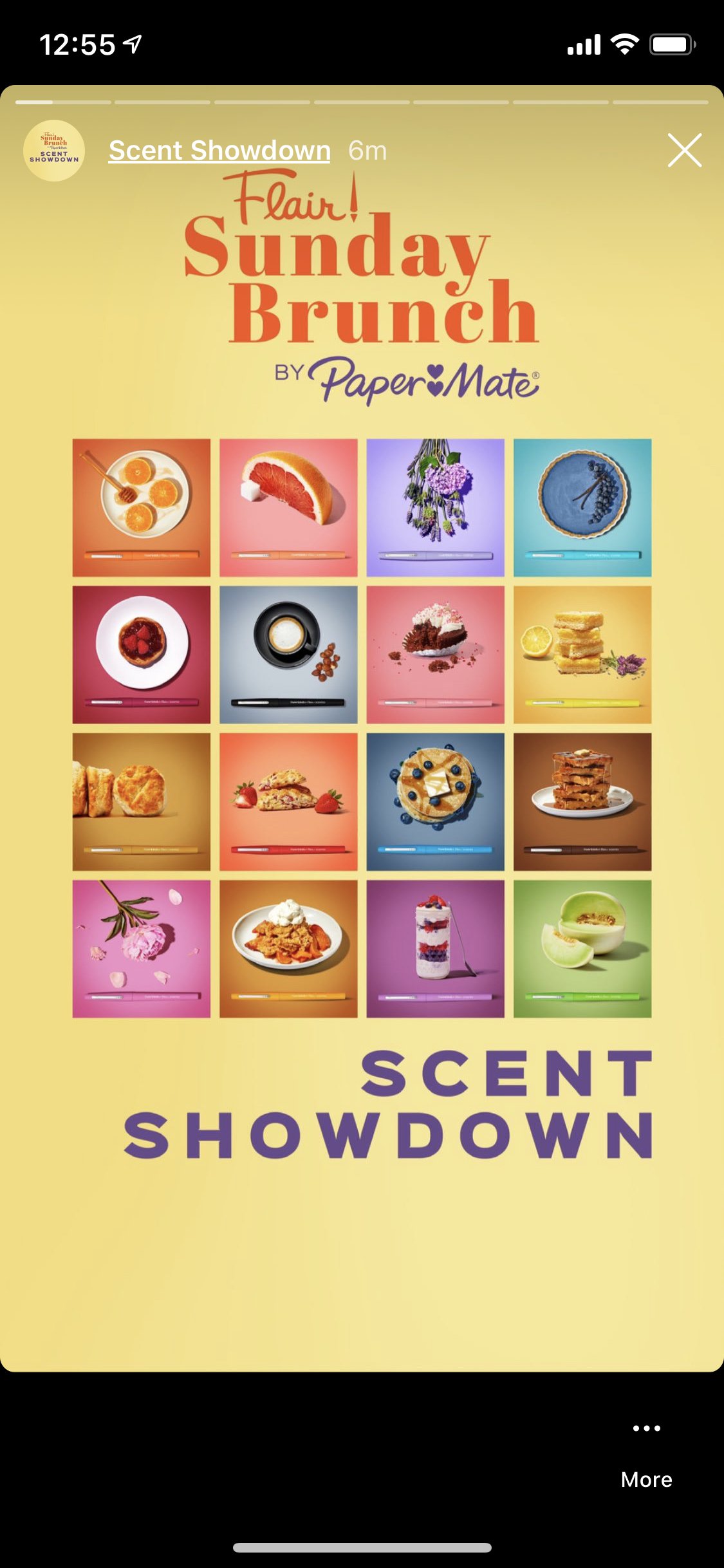
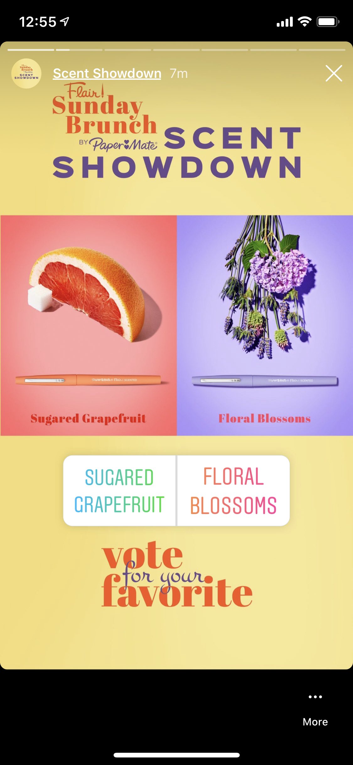
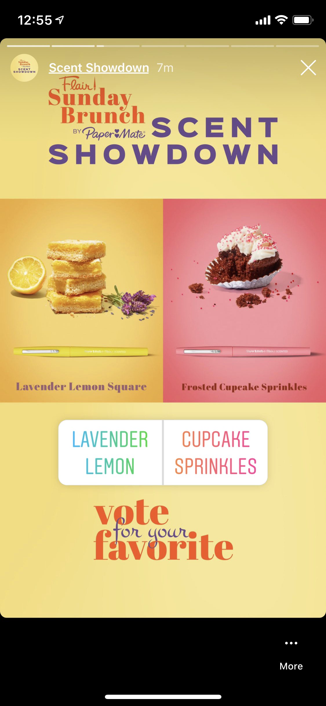
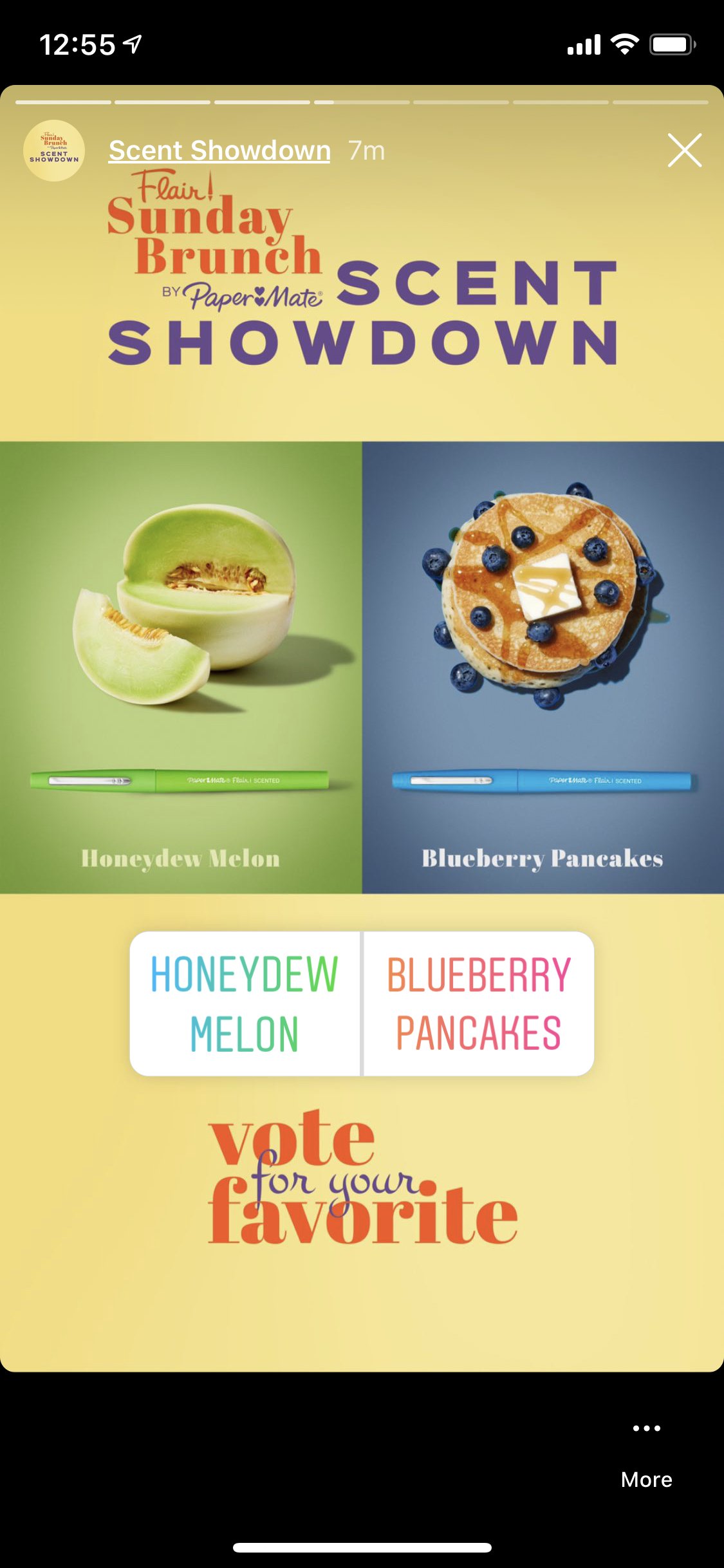
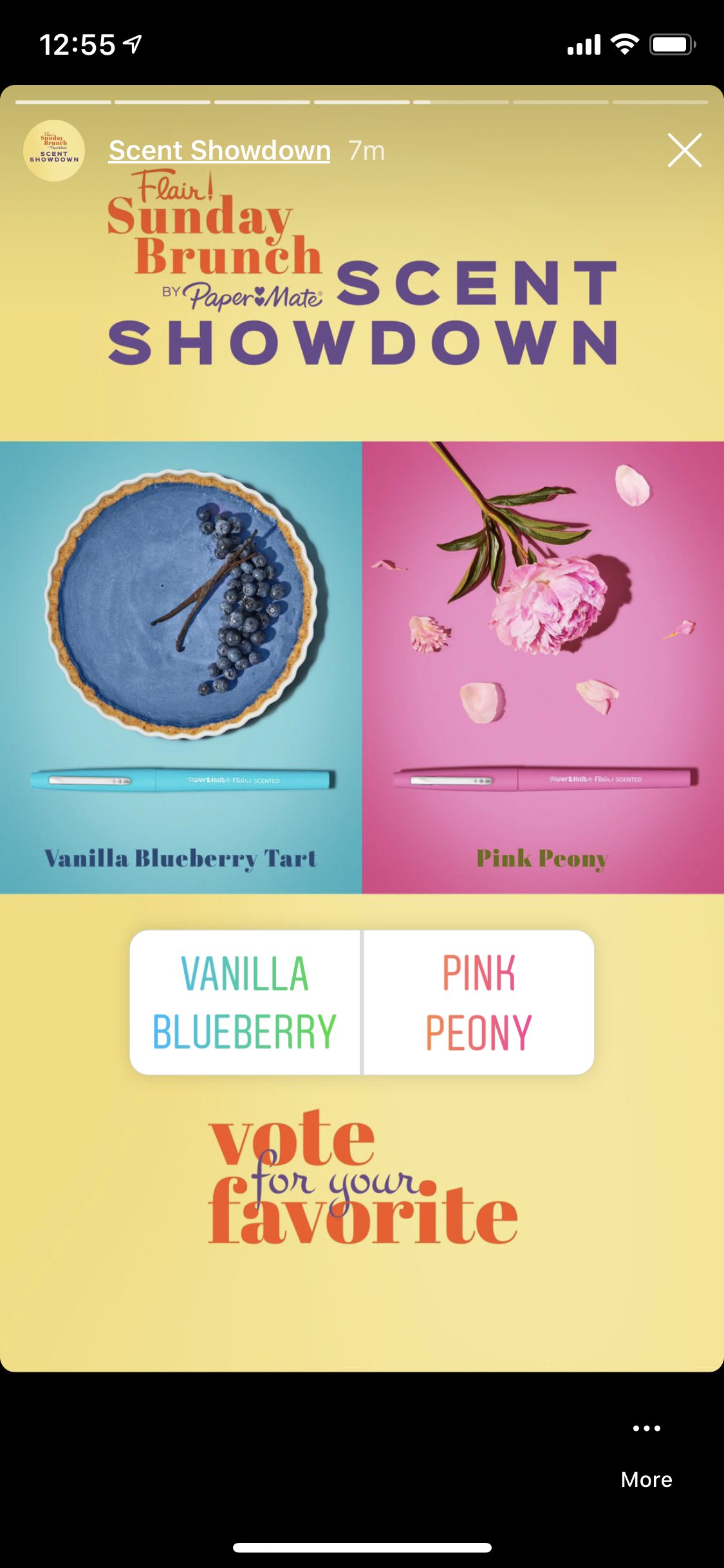
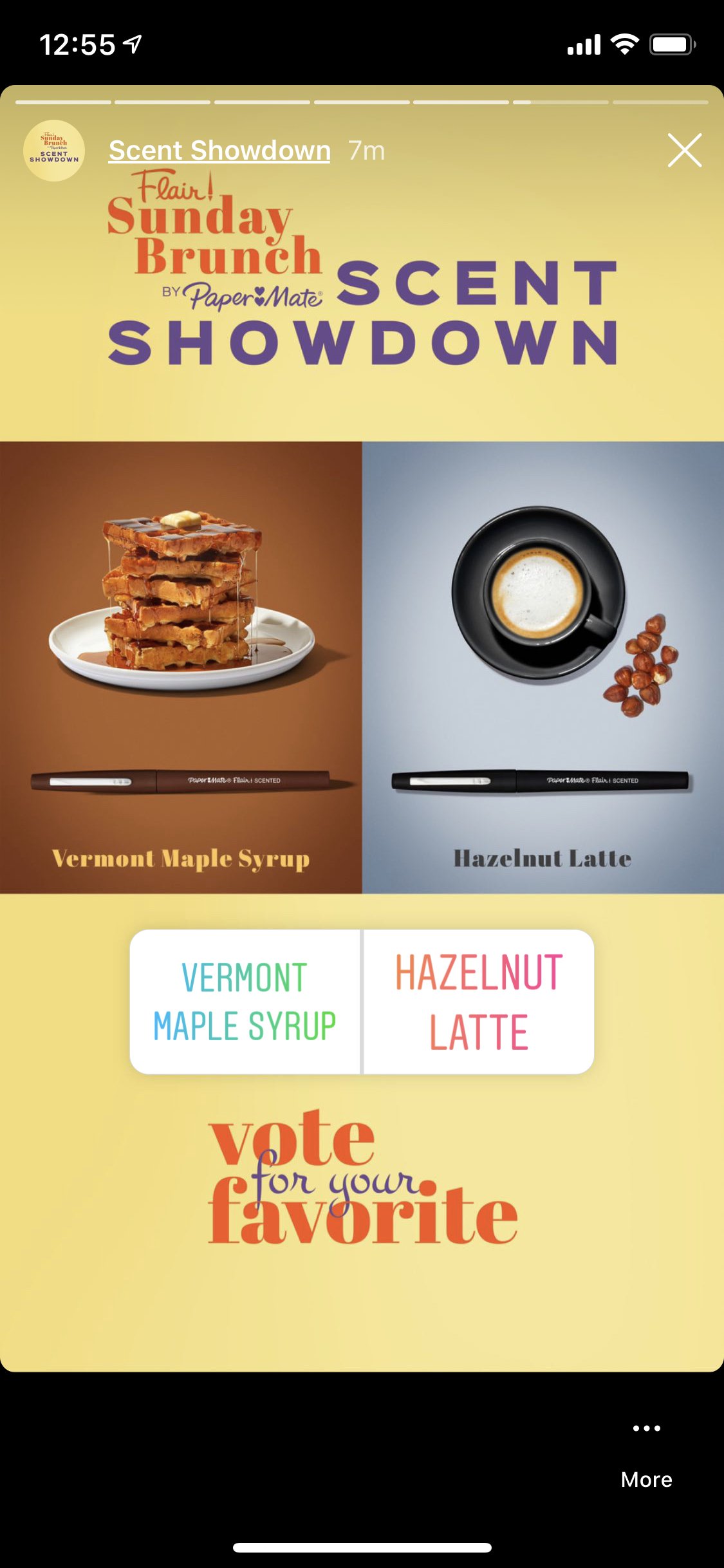
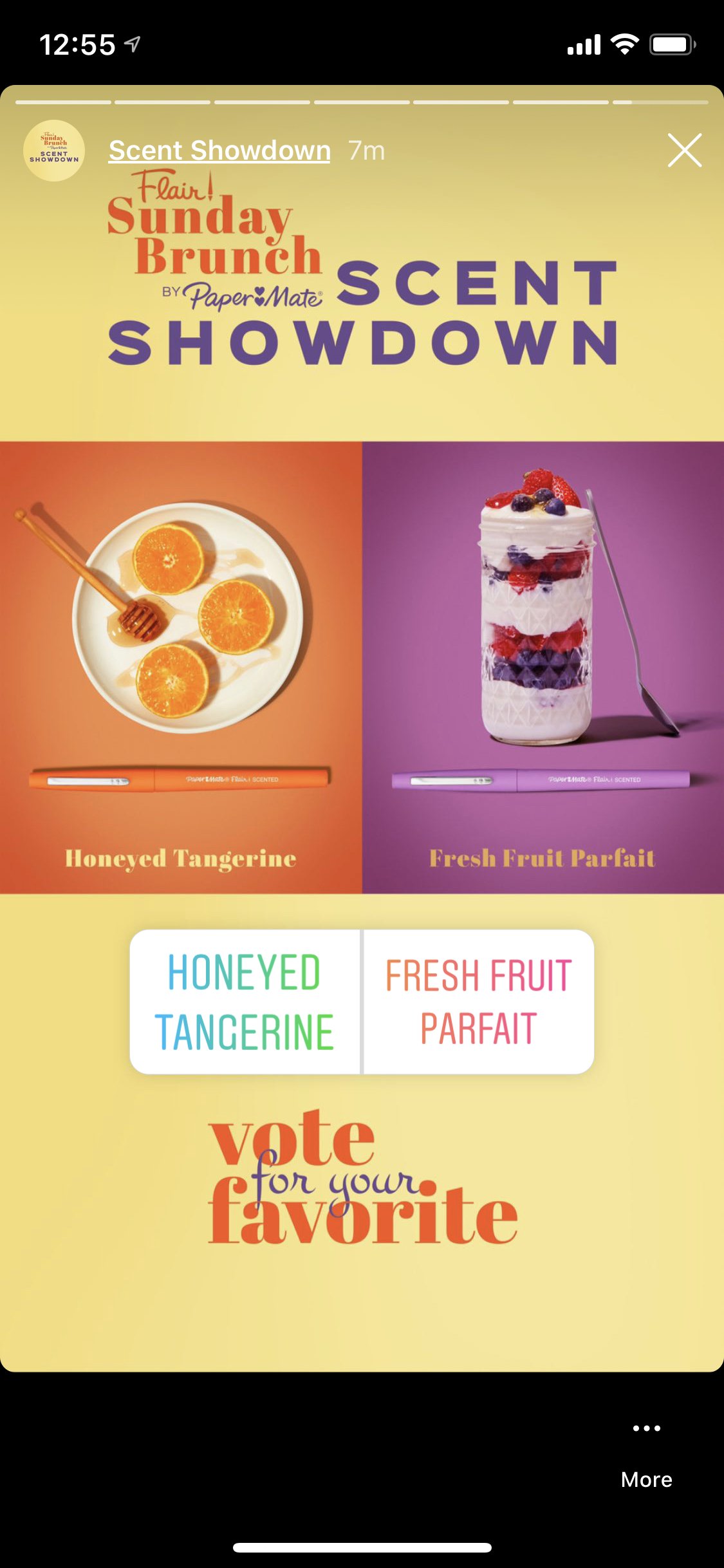
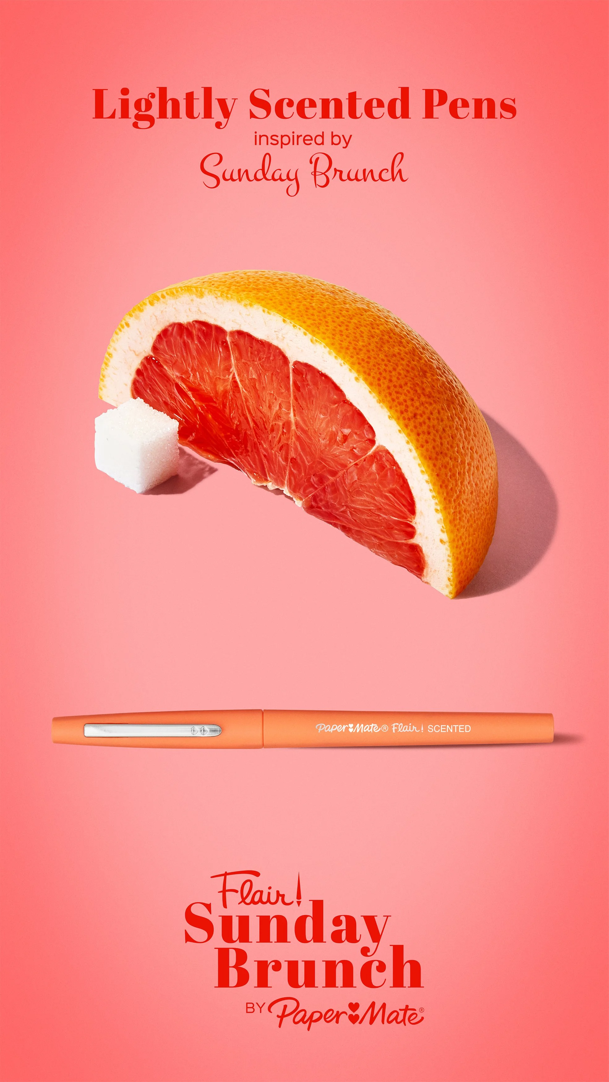
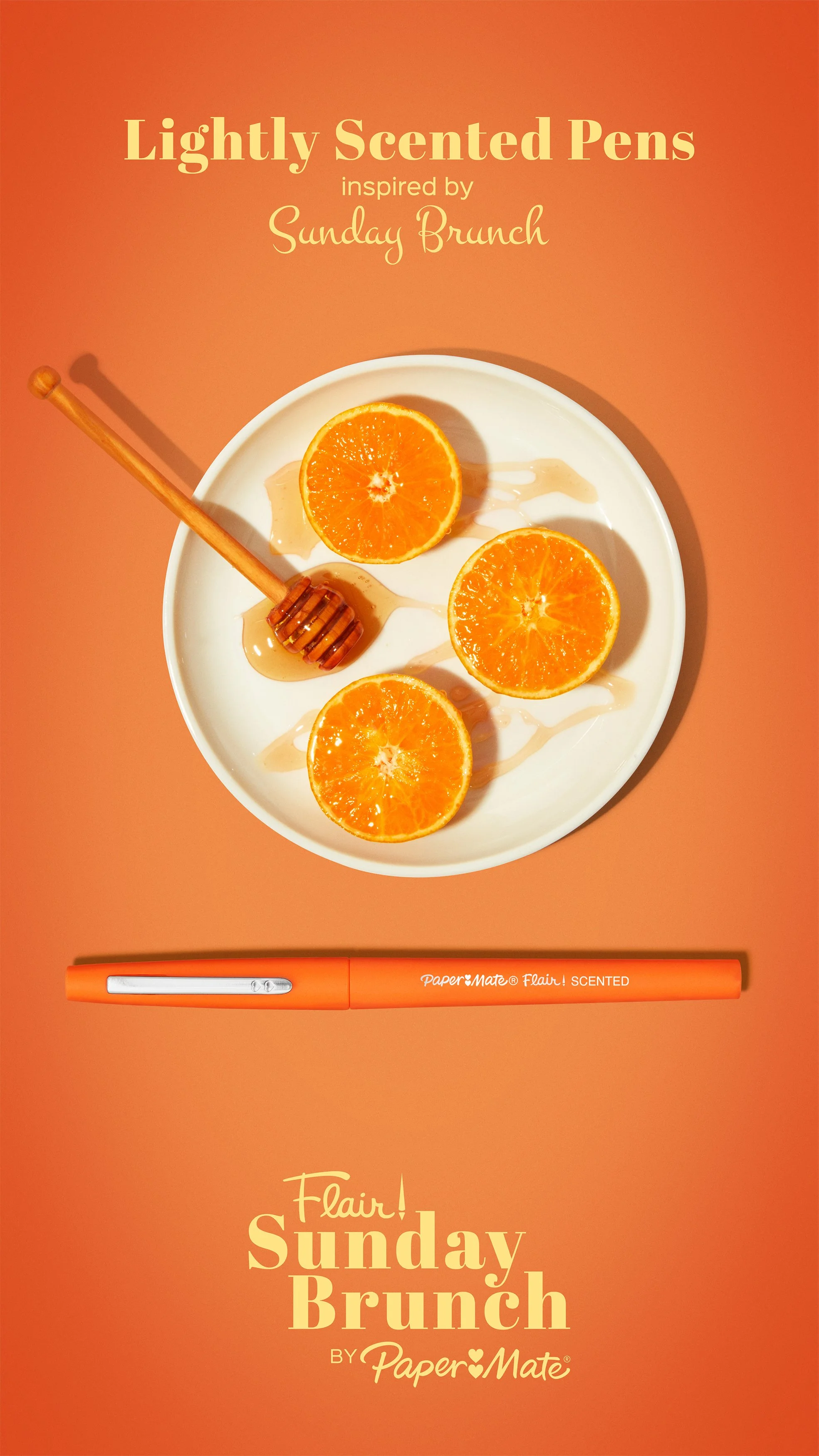
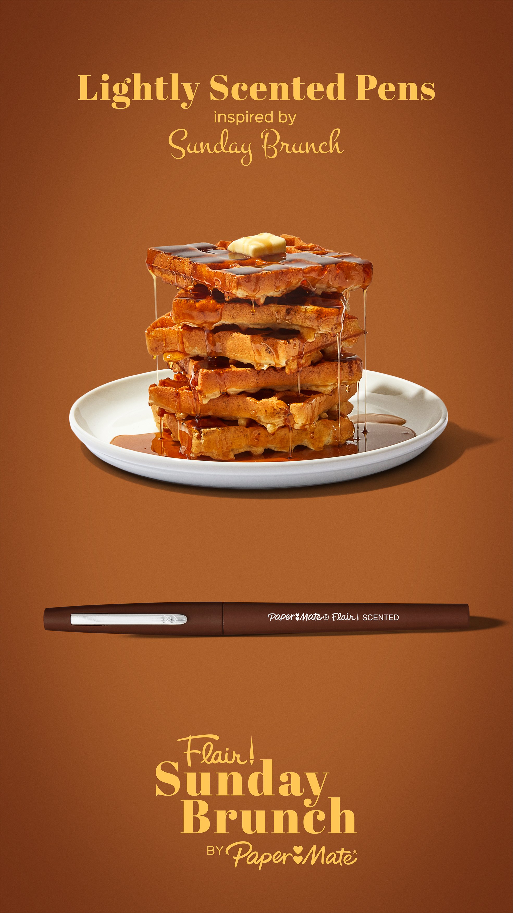
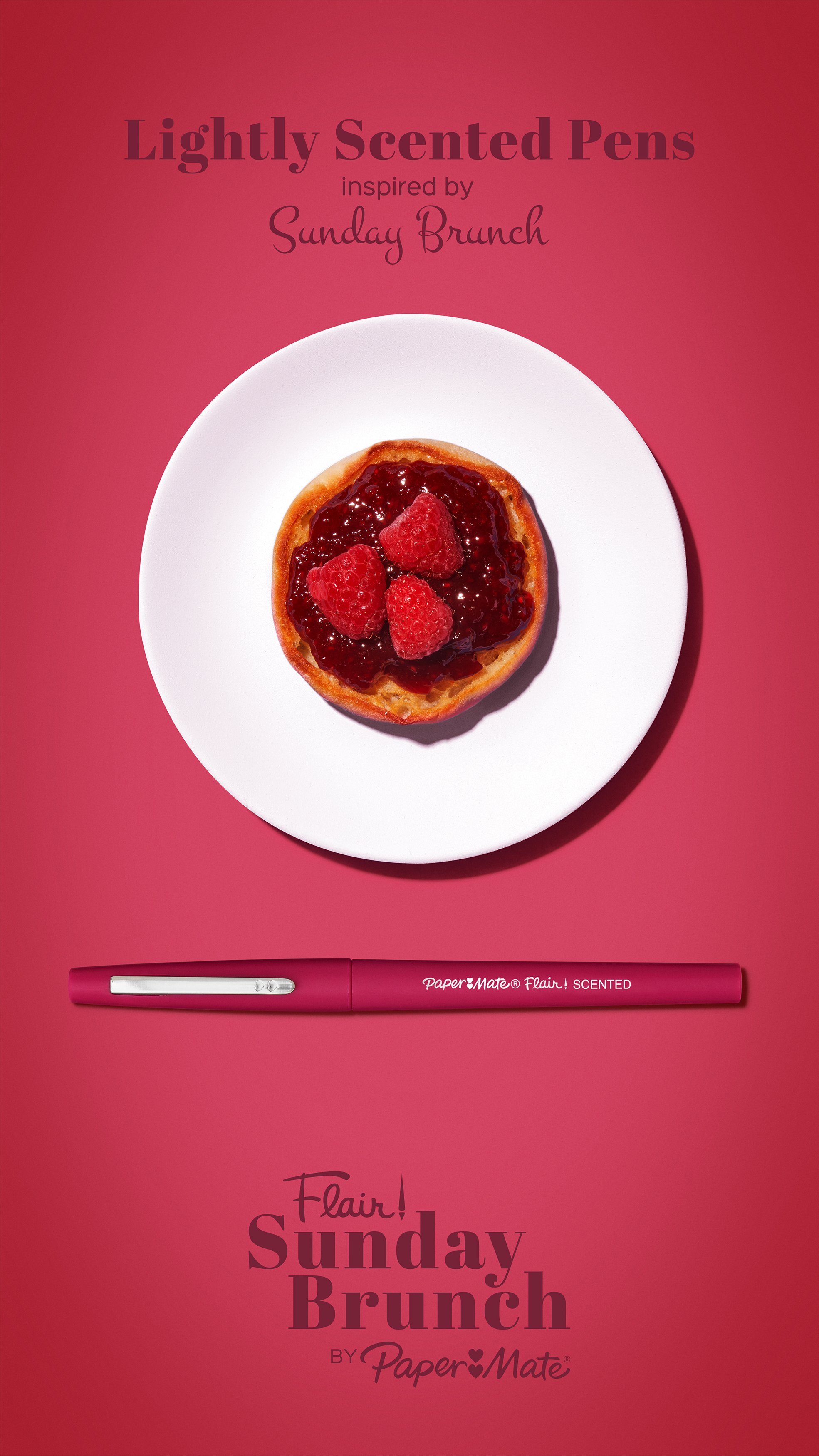
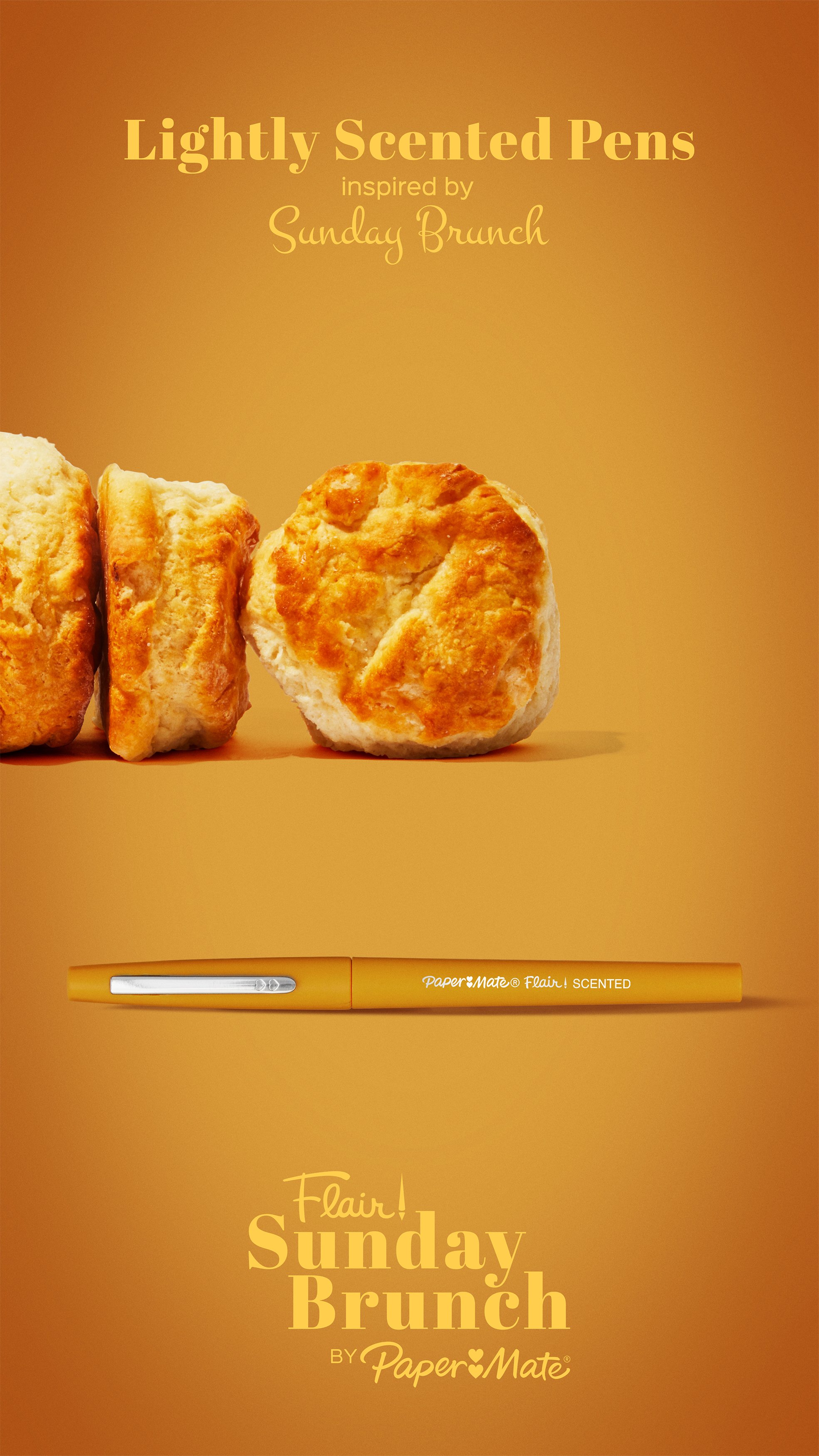
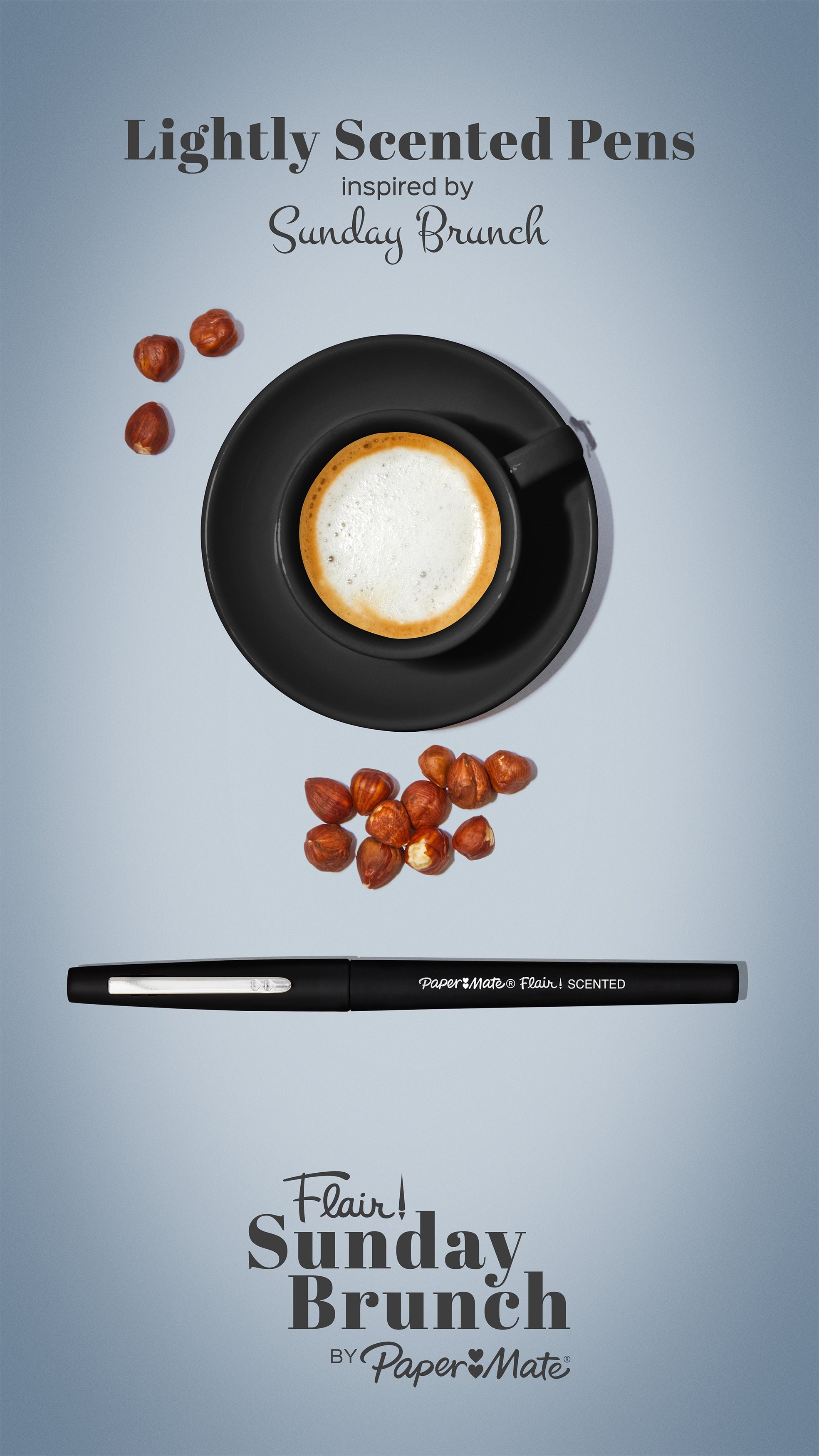
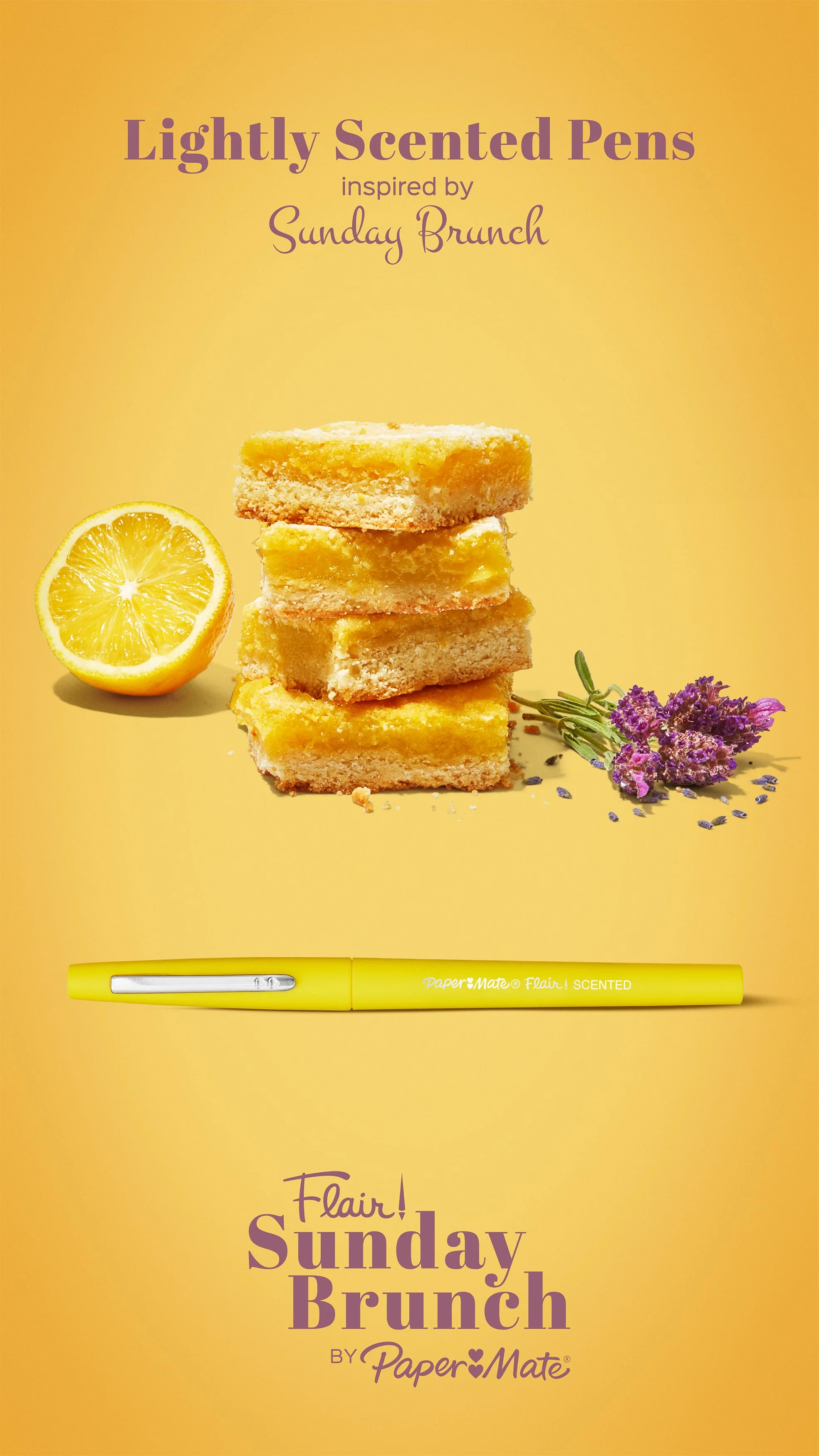
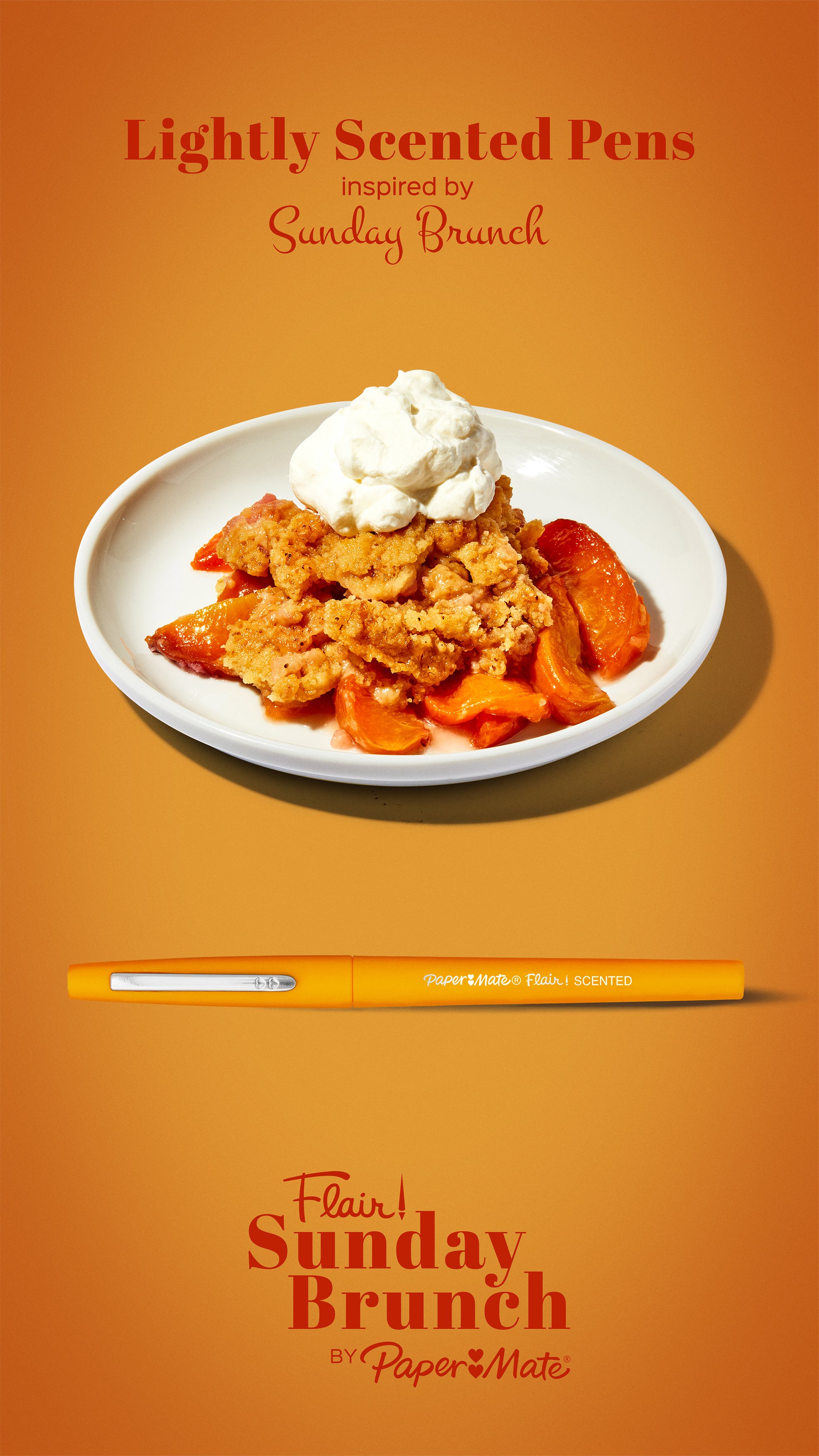
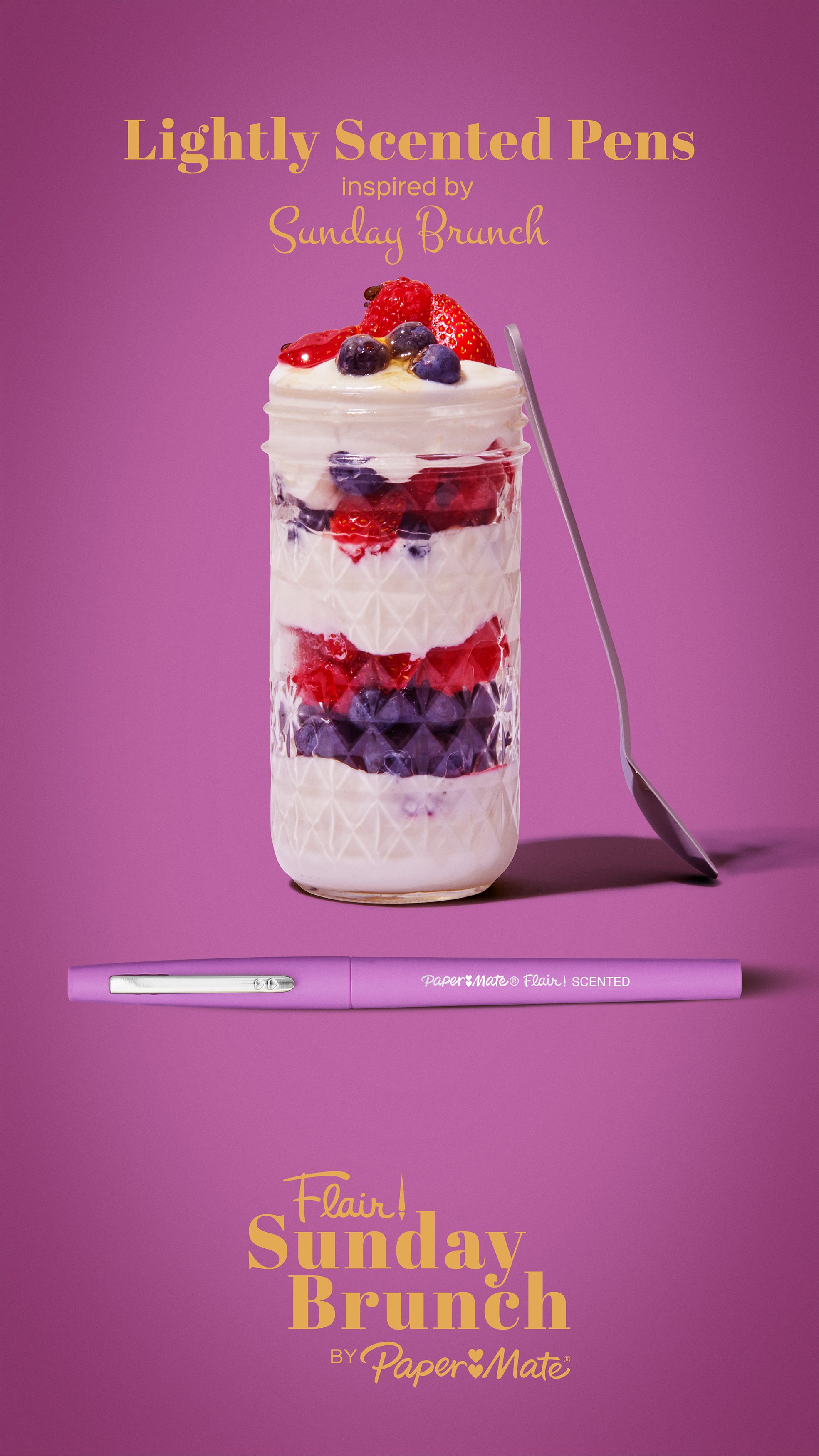
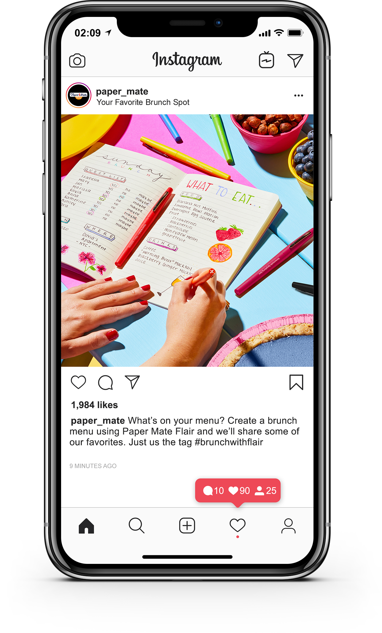
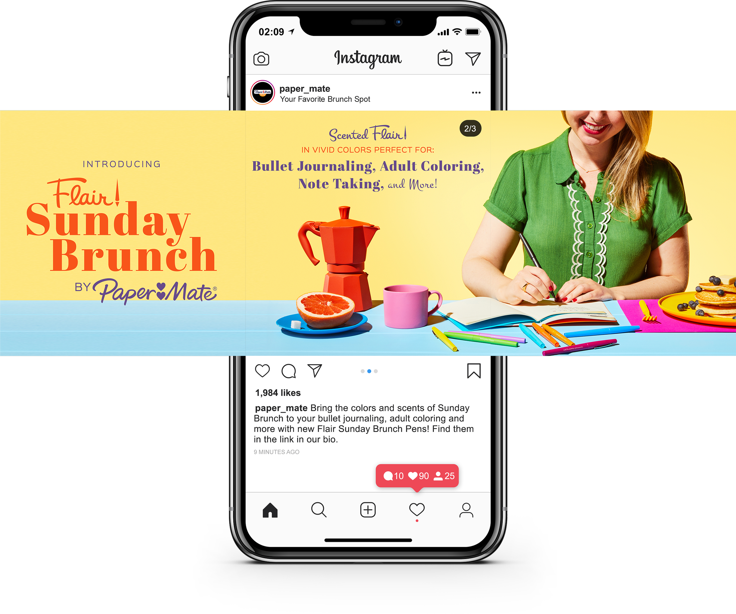
When Paper Mate introduced a scented addition to their iconic Flair felt-tip pen line, a collection inspired by Sunday brunch, I led the creative development of photo content designed to bring the product's personality to life. The goal was to highlight the playful new scents while shifting the brand's image to feel more fun, fresh, and modern.
Given full creative freedom within the “Sunday Brunch” theme, we pitched three concepts, two of which, Pop Brunch and Brunch Staples, were chosen. Both leaned into bold colors, a surreal vibe, and intuitive product storytelling that made the connection between scent, style, and creativity instantly clear.
Pitch & Prep
Starting with the brunch theme provided by the product team, I developed three bold concepts designed to capture attention and reflect Paper Mate’s playful, colorful identity. After two concepts were chosen by the product team, the prep work began.
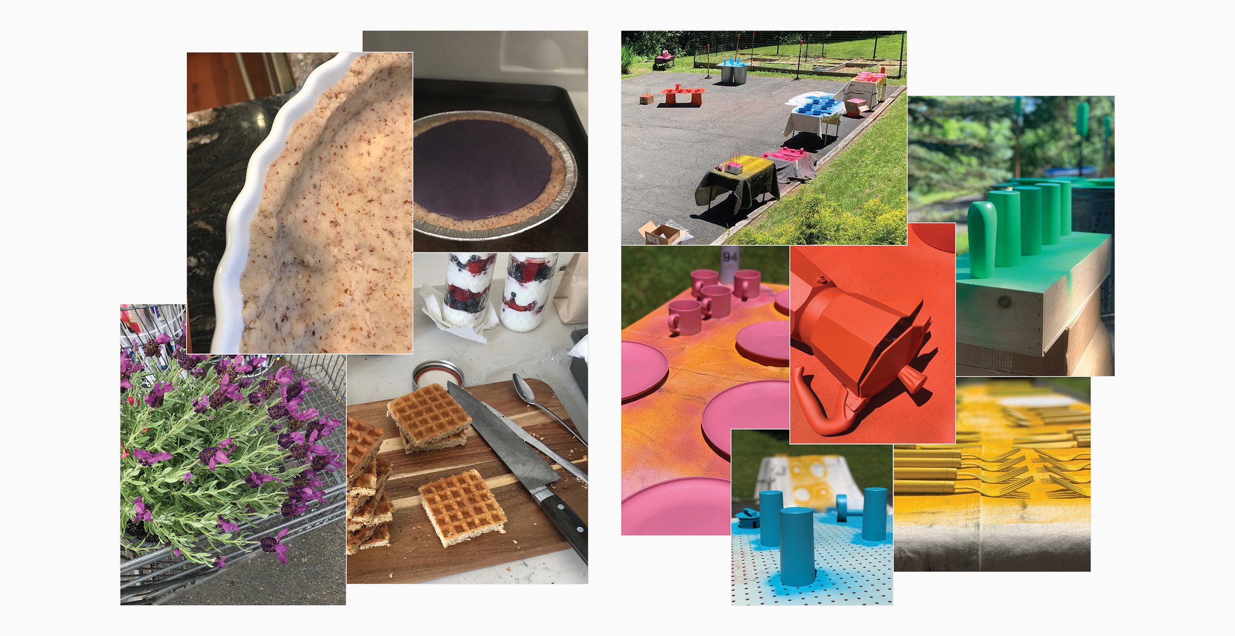
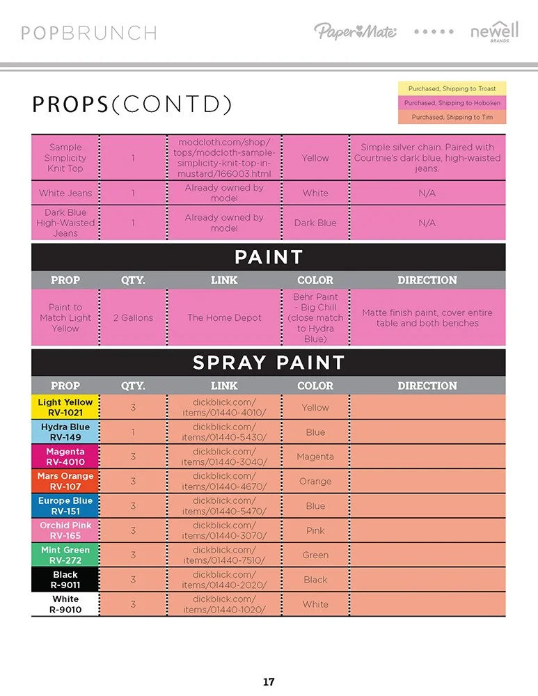
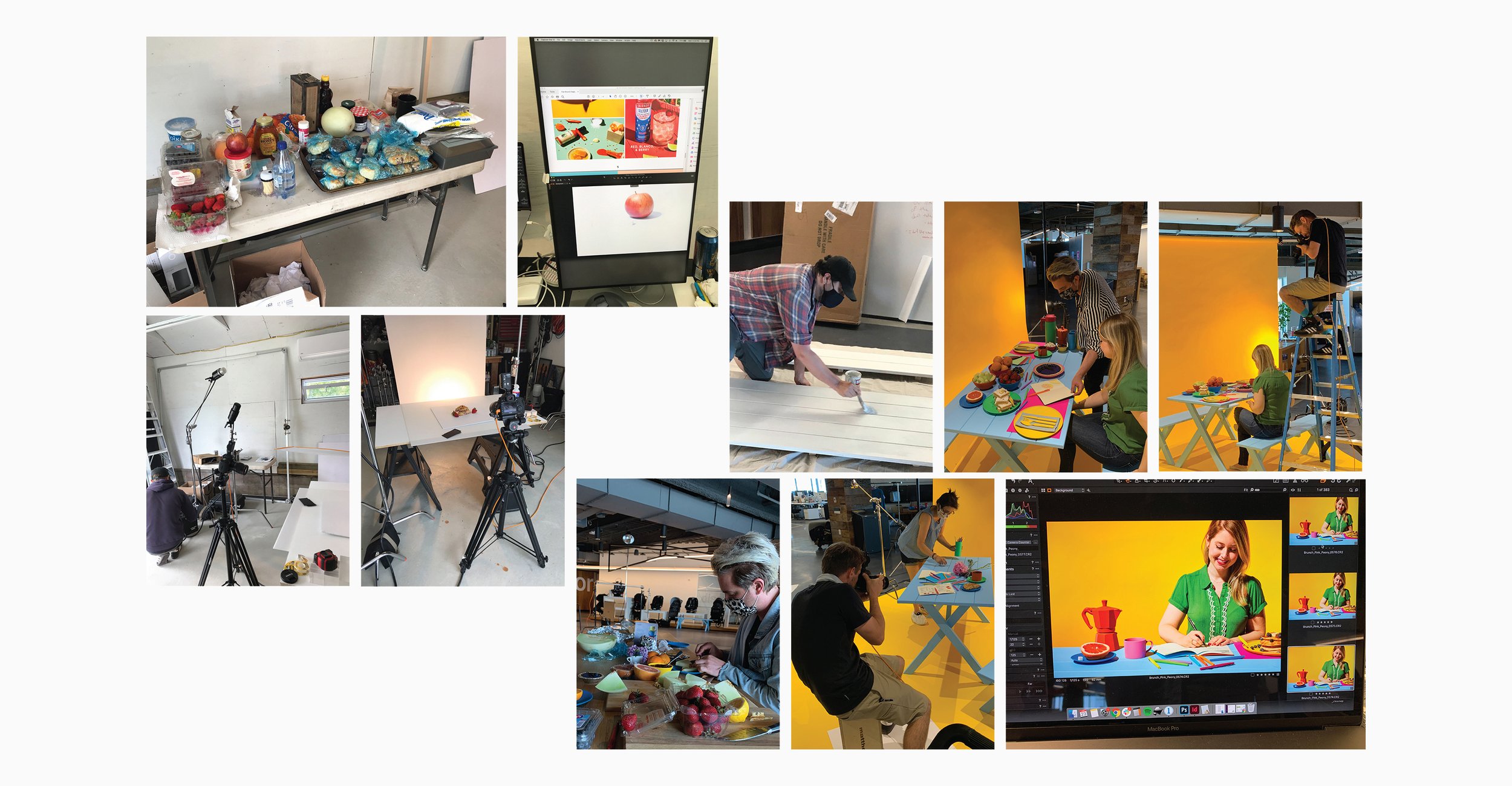
The pandemic posed unique challenges. All prop sourcing, wardrobe selection, and set design were managed remotely, relying almost entirely on online shopping without the benefit of in-person review (with the exception of grocery and floral items). In addition to overseeing the creative vision for both concepts, I handled prop building, painting, and assembly for POP Brunch.

Documentation
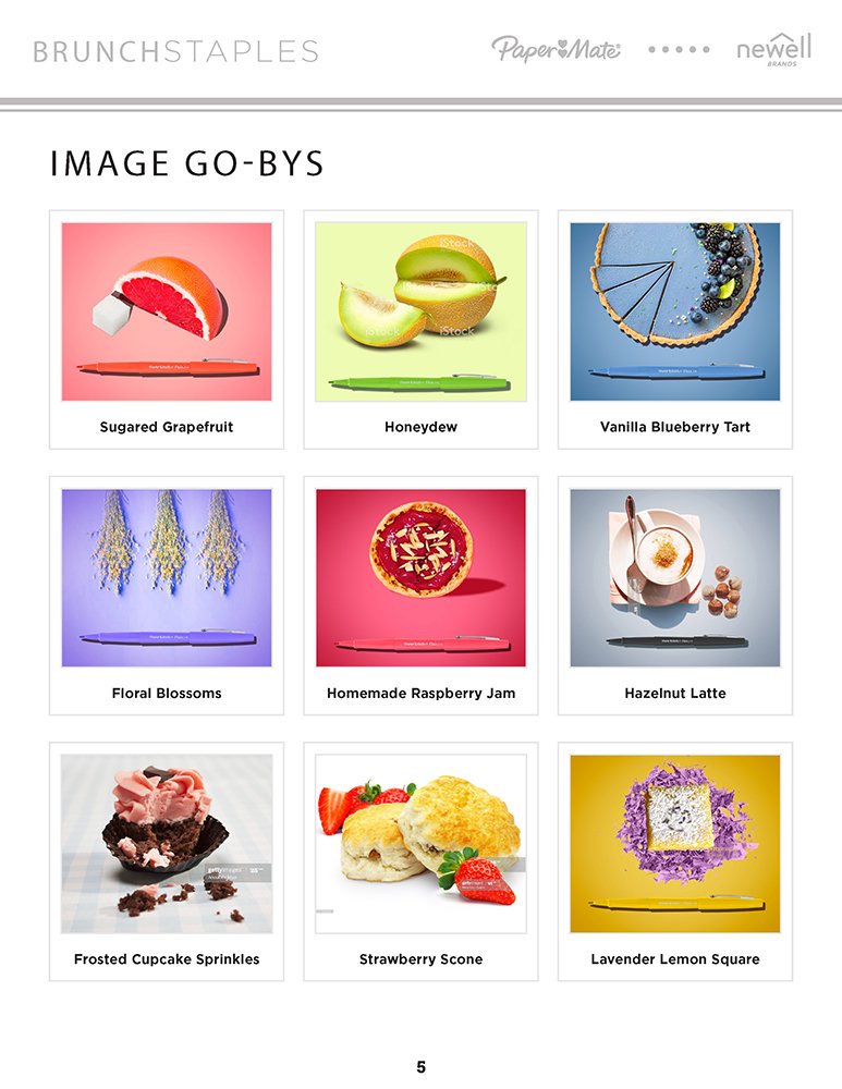
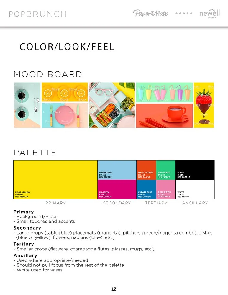
To keep the project organized and on track, I created a comprehensive pre-production document that served as the blueprint for the entire shoot. This document included shot lists, prop lists, grocery lists, shot types, shot mockups, and a detailed prop painting plan.
It ensured that every creative and logistical detail was accounted for, making it easy to coordinate remotely with the team and streamline execution on set. This level of planning was especially critical given the COVID-19 restrictions, allowing us to stay aligned despite working from different locations.


Execution
The project was executed in two distinct parts:
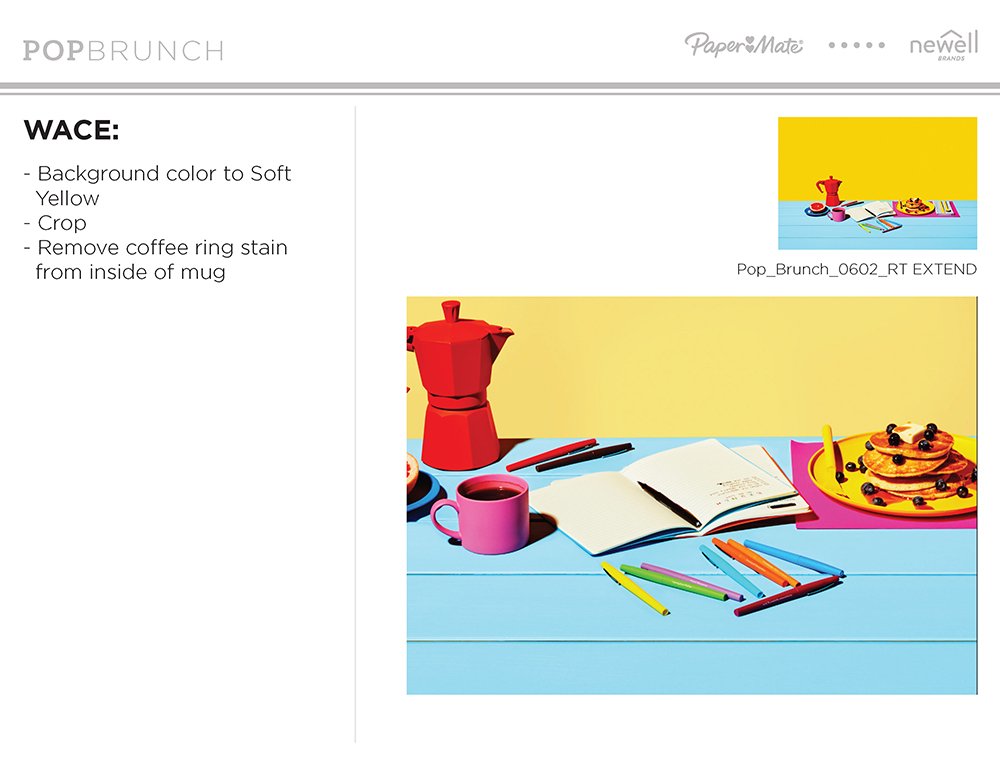
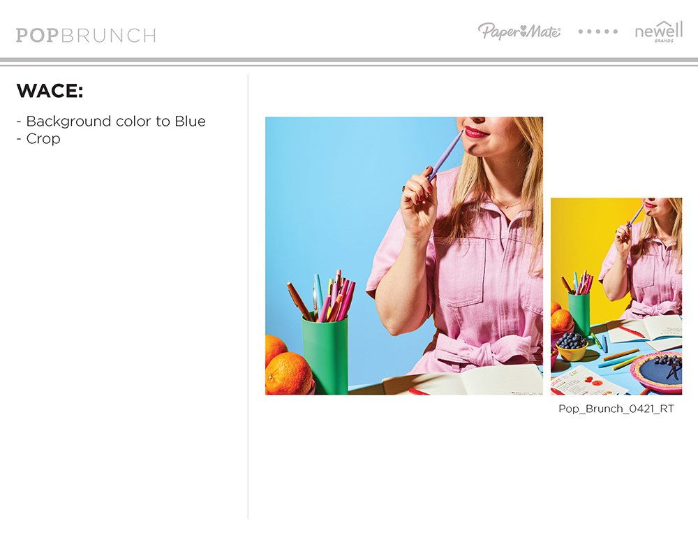
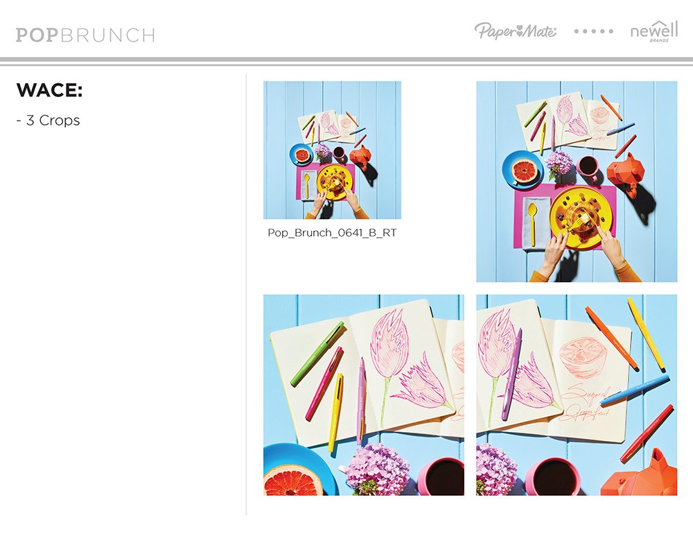
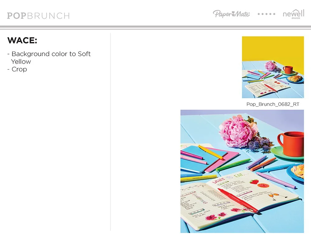
Brunch Staples focused on pairing product shots with food and floral elements. The shoot took place over two days in our Photographer’s home studio on Long Island, with remote oversight from me in New Jersey. On set, our Food Stylist handled meticulous prep, creation, and styling to bring the vibrant, fresh aesthetic to life.
POP Brunch involved three days of prop preparation, including painting and assembly, followed by a two-day in-person shoot held in our empty office, secured with special permission during the COVID-19 lockdown. We maintained strict COVID protocols, working with a lean on-site team of five to ensure safety without compromising creative quality.
I was responsible for concept development, styling, lighting direction, color palette, wardrobe, and prop usage, ensuring the final images perfectly reflected the creative vision pitched to the product team.
Post-Production
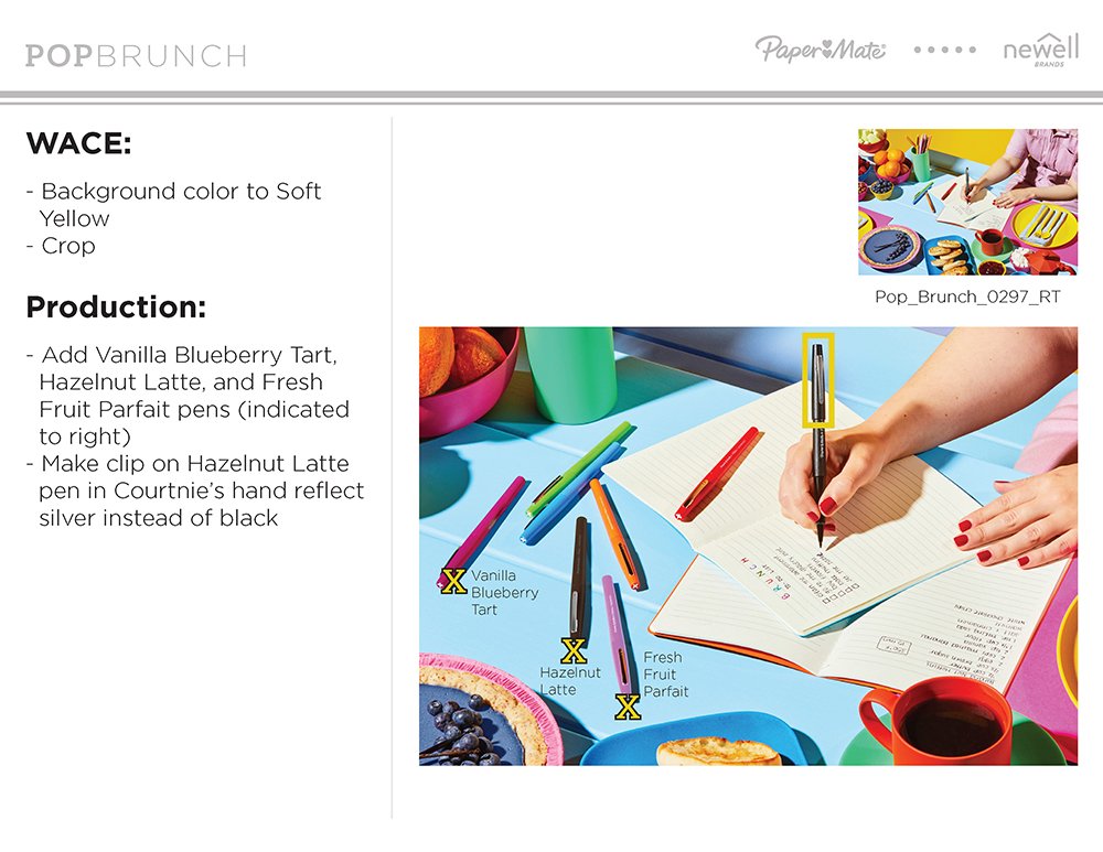
Following the shoot, the images underwent multiple rounds of meticulous post-production work to ensure consistency and enhance the visual impact. This included:
color correction
Background changes
Retouching
Product logo addition
Compositing to achieve stakeholder requests.
Collaboration with our editing team was streamlined through clear communication and the reference materials I provided, ensuring the final images stayed true to the original vision.
Completion


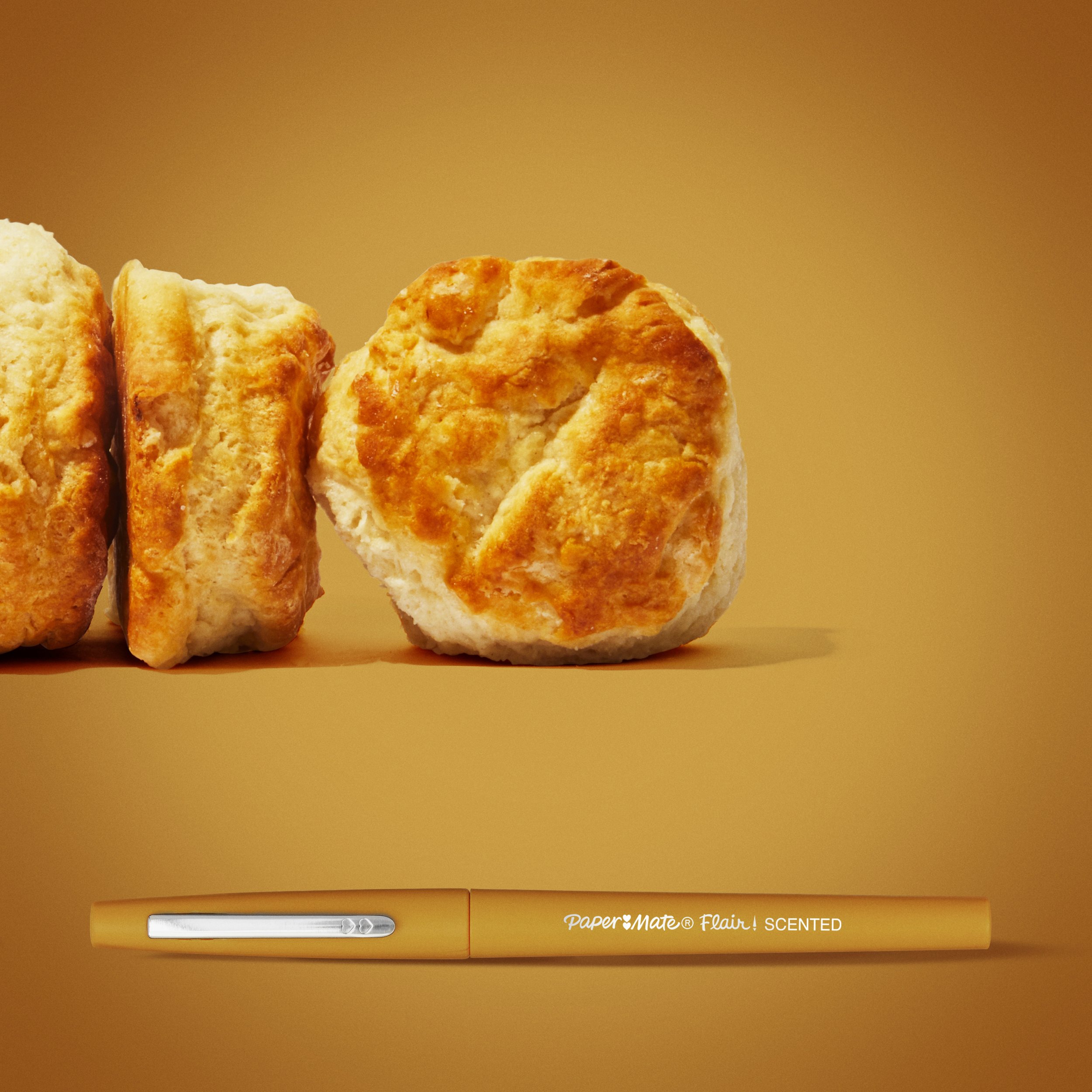
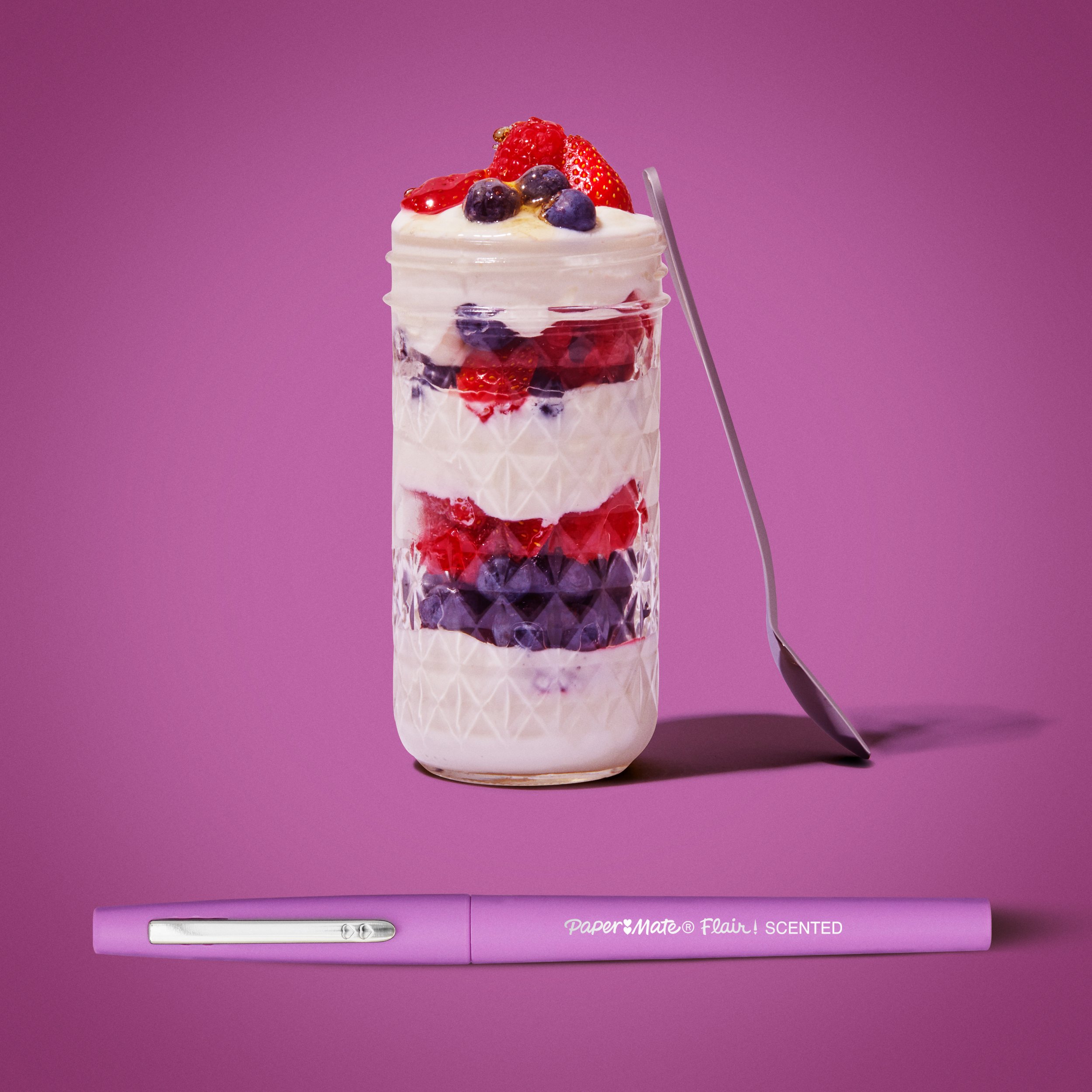


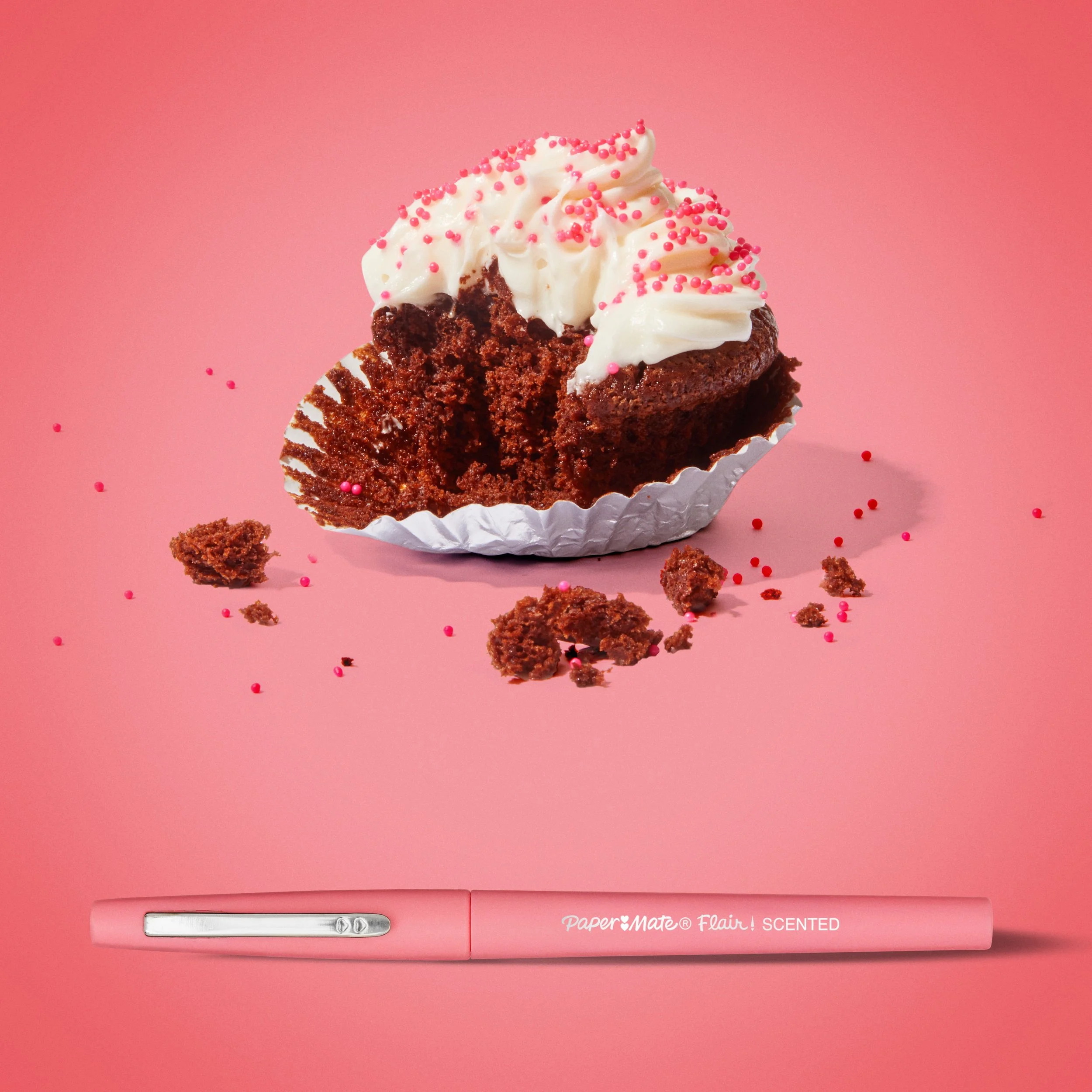

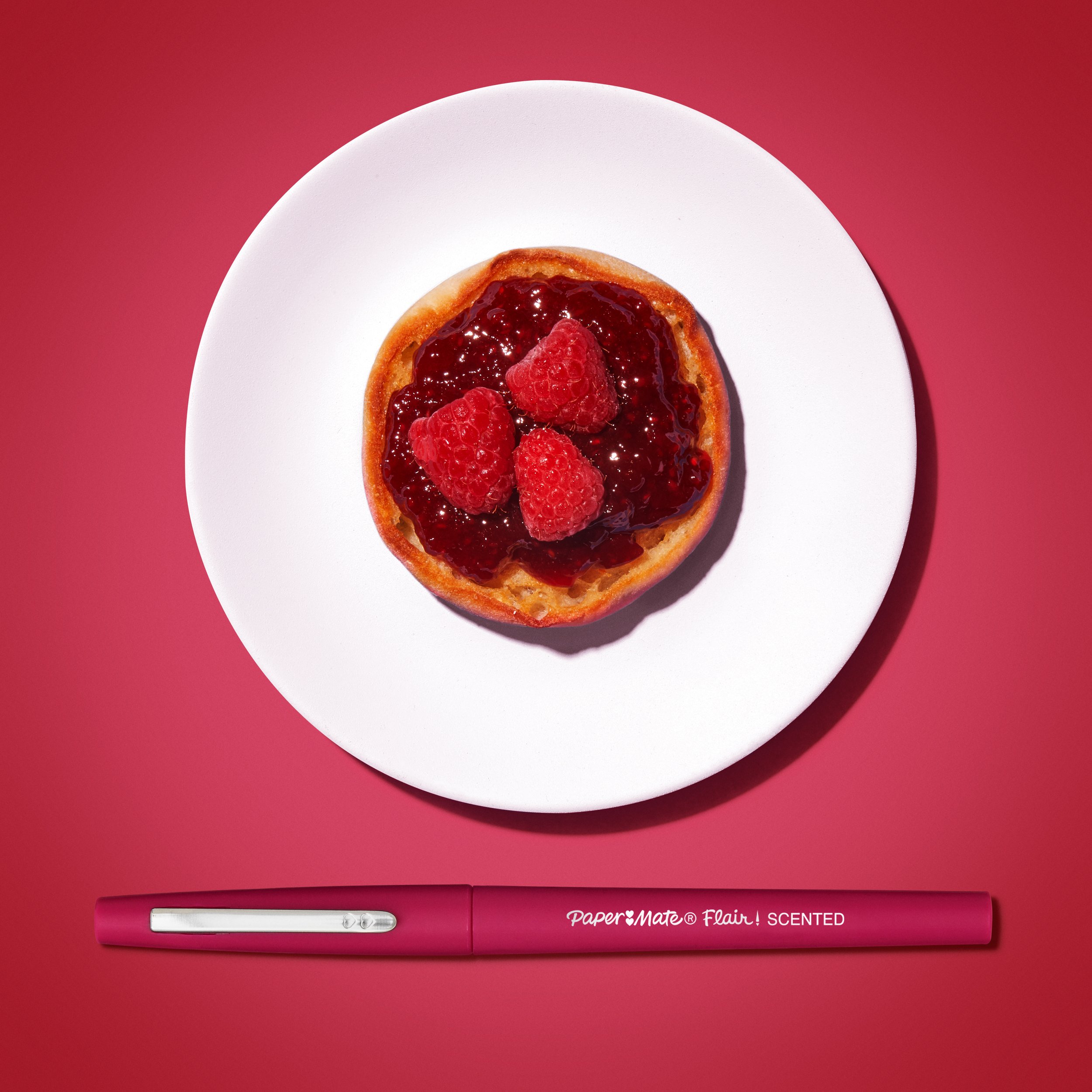


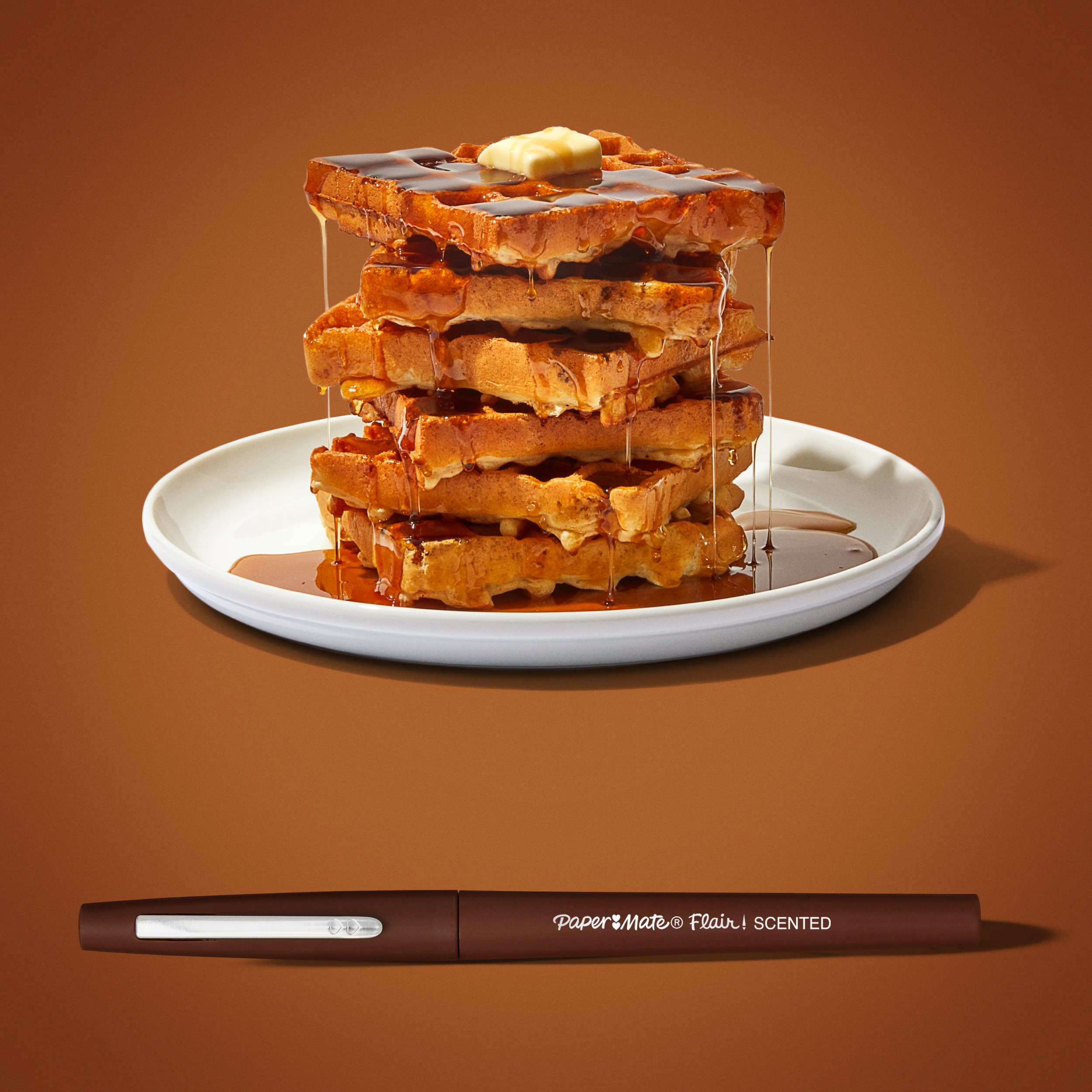

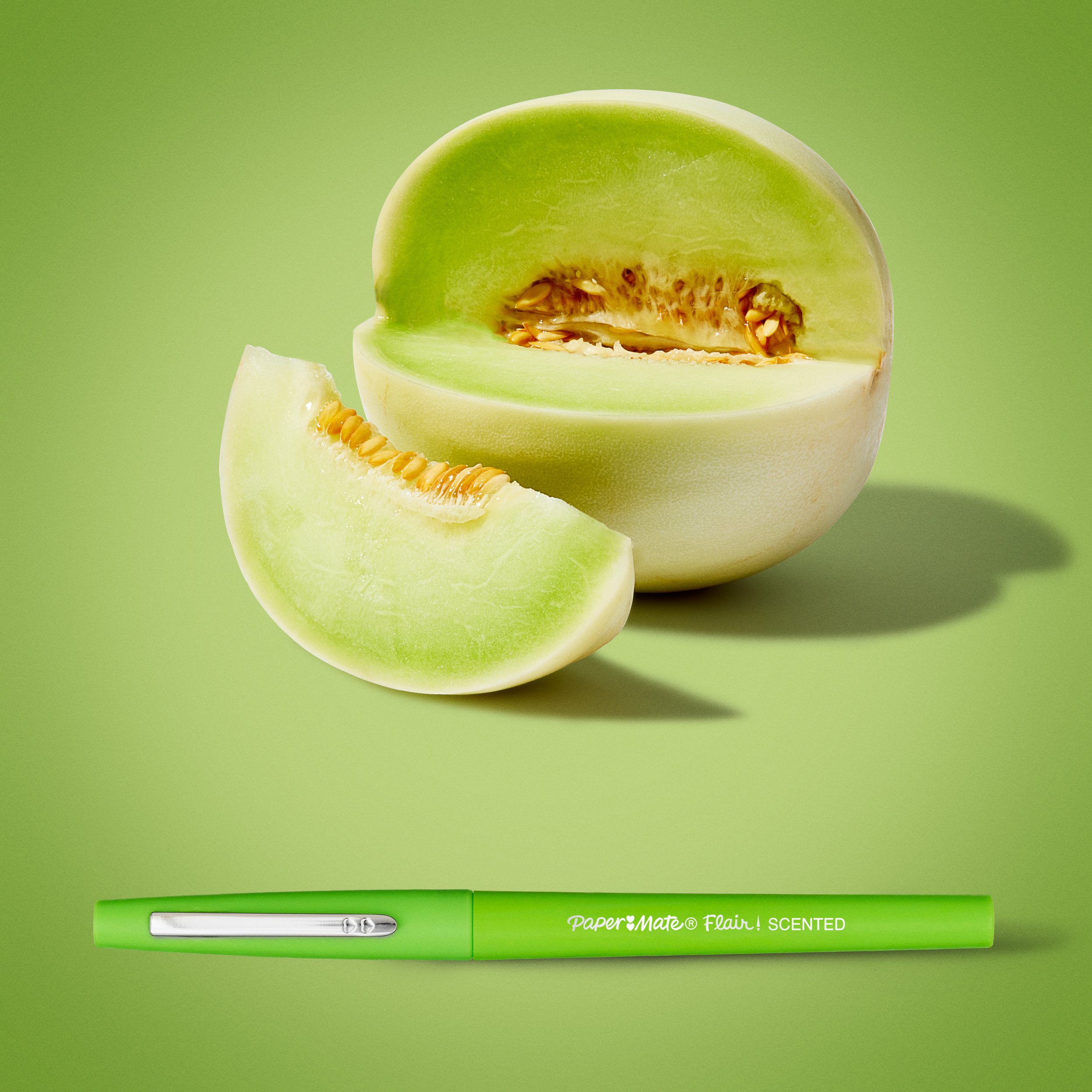


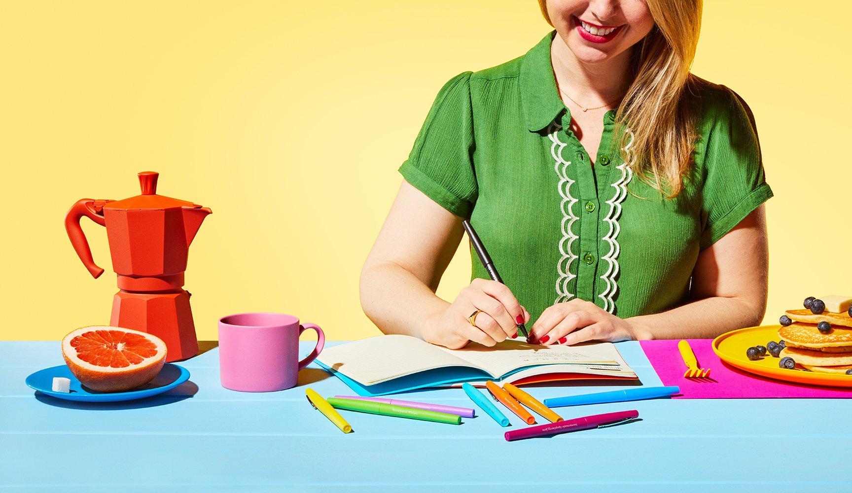
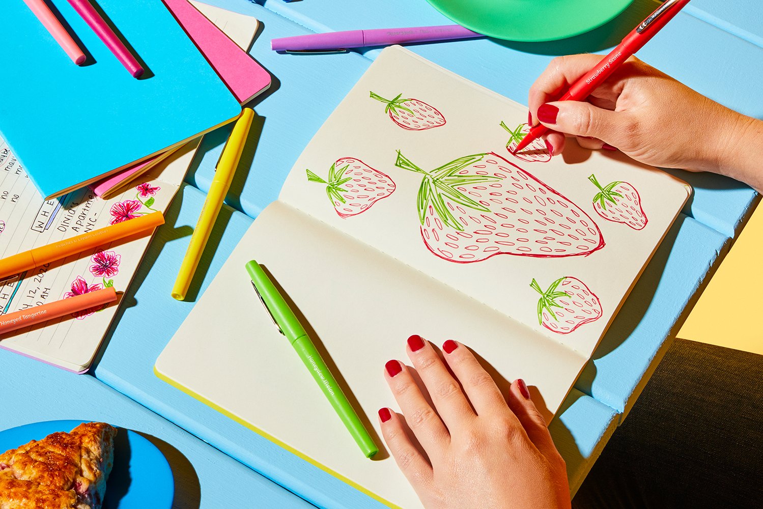


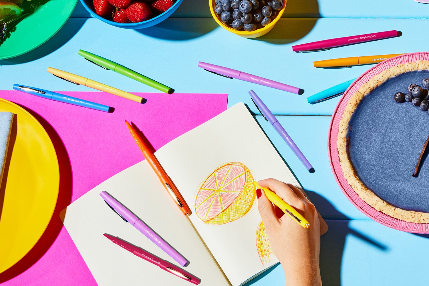
Image Usage
& Distribution
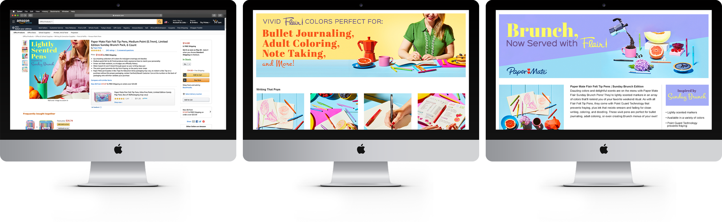
The final assets were used across a variety of platforms and ways to maximize their impact:
eCommerce & Web:
Product detail pages for major retailers like Amazon, Target, and Walmart
Banner ads and website visuals that aligned with the campaign's aesthetic
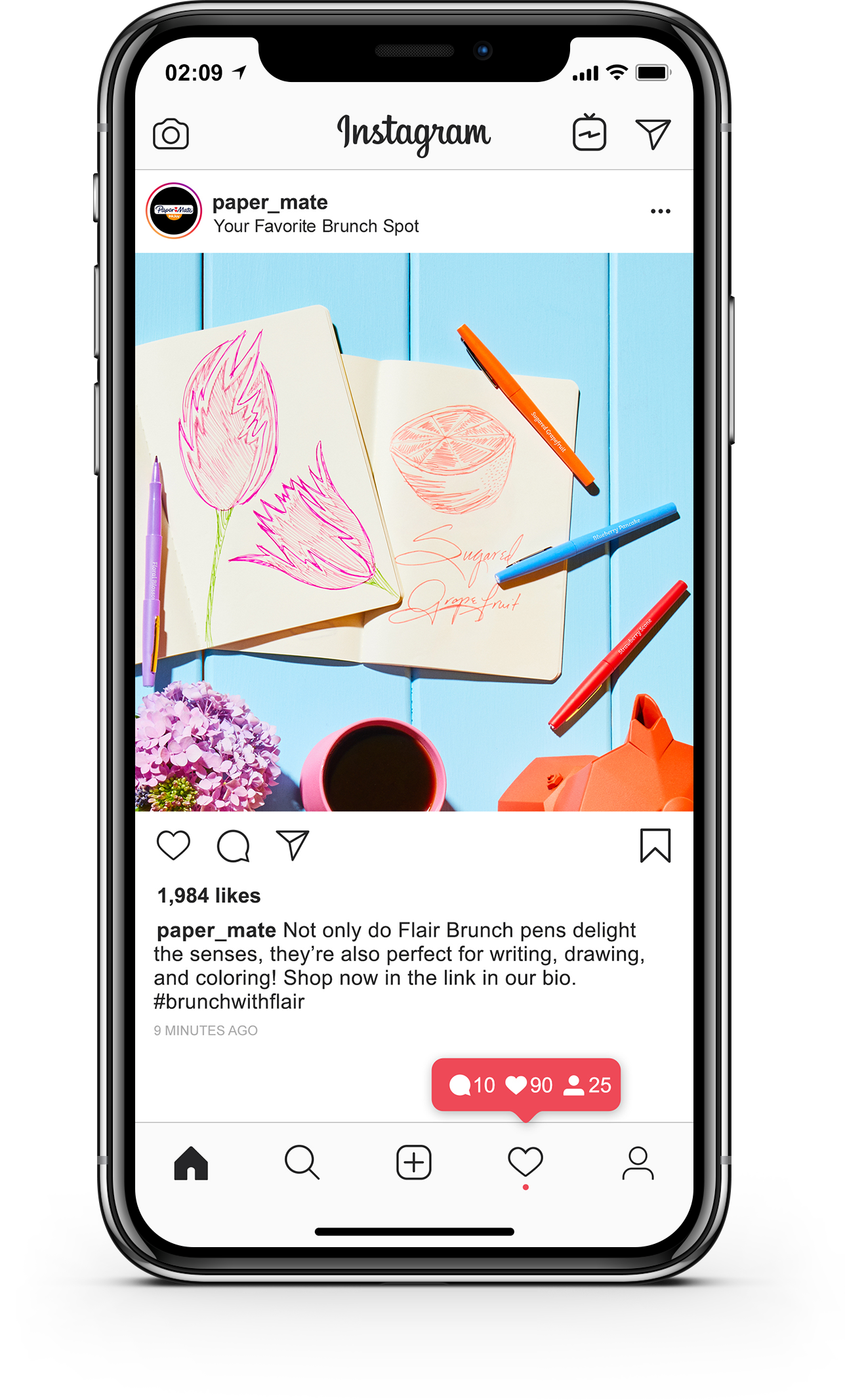
Social Media:
Paid and organic content
Static posts and carousel ads showcasing the bold visuals
Instagram Stories and Reels
Internal & External Marketing:
Sales presentations, promotional materials, and internal presentations, and marketing materials, receiving widespread recognition within the organization
eCommerce
SOCIAL - Stories & MAIN


Branded
Brunch
The imagery became some of the most widely used assets in Paper Mate's library, featured across major retail platforms, social campaigns, and internal presentations. The Scented Flair line saw strong market reception, and the success of this collection contributed to Paper Mate's continued expansion of themed Flair collections in the years that followed.